Posts from February 2015 (33)

February 20, 2015

Why we have controlled trials


joc80747f2

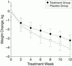
The graph is from a study — a randomised, placebo-controlled trial published in a top medical journal — of a plant-based weight loss treatment, an extract from Garcinia cambogia, as seen on Dr Oz. People taking the real Garcinia cambogia lost weight, an average of 3kg over 12 weeks. That would be at least a little impressive, except that people getting pretend Garcinia cambogia lost an average of more than 4kg over the same time period.  It’s a larger-than-usual placebo response, but it does happen. If just being in a study where there’s 50:50 chance of getting a herbal treatment can lead to 4kg weight loss, being in a study where you know you’re getting it could produce even greater ‘placebo’ benefits.

If you had some other, new, potentially-wonderful natural plant extract that was going to help with weight loss, you might start off with a small safety study. Then you’d go to a short-term, perhaps uncontrolled, study in maybe 100 people over a few weeks to see if there was any sign of weight loss and to see what the common side effects were. Finally, you’d want to do a randomised controlled trial over at least six months to see if people really lost weight and kept it off.

If, after an uncontrolled eight-week study, you report results for only 52 of 100 people enrolled and announce you’ve found “an exciting answer to one of the world’s greatest and fastest growing problems” you perhaps shouldn’t undermine it by also saying “The world is clearly looking for weight-loss products which are proven to work.”


[Update: see comments]

February 19, 2015

London card clash sensitivity analysis

The data blog of the Daily Mirror reports a problem with ‘card clash’ on the London Underground.  You can now pay directly with a debit card instead of buying a ticket — so if you have both a transport card and a debit card in your wallet, you have the opportunity to enter with one and leave with the other and get overcharged. Alternatively, you can take the card out of your wallet and drop it.  Auckland Transport has a milder version of the same problem: no-touch credit cards can confuse the AT HOP reader and make it not recognise your card, but you won’t get overcharged unless you don’t notice the red light.

They looked at numbers of cards handed in at lost-and-found across the London Underground over the past two years (based on FOI request)

card-clash

If we’re going to spend time on this, we might also consider what the right comparison is. The data include cards on their own and cards with other stuff, such as a wallet. We shouldn’t combine them: the ‘card clash’ hypothesis would suggest a bigger increase in cards on their own.

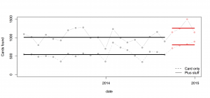
Here’s a comparison using all the data: the pale points are the observations, the heavy lines are means.

allcards

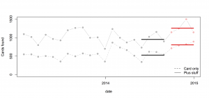
Or, we might worry about trends over time and use just the most recent four months of comparison data:

recentcards

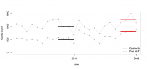
Or, use the same four months of the previous year:

matchedcards


In this case all the comparisons give basically the same conclusion: more cards are being handed in, but the increase is pretty similar for cards alone and for cards with other stuff, which weakens the support for the ‘card clash’ explanation.

Also, in the usual StatsChat spirit of considering absolute risks: there are 3.5 million trips per day, and about 55 cards handed in per day: one card for about 64000 trips. With two trips per day, 320 days per year, that would average once per person per century.

West Island census under threat?

From the Sydney Morning Herald

Asked directly whether the 2016 census would go ahead as planned on August 9, a spokeswoman for the parliamentary secretary to the treasurer Kelly O’Dwyer read from a prepared statement.

It said: “The government and the Bureau of Statistics are consulting with a wide range of stakeholders about the best methods to deliver high quality, accurate and timely information on the social and economic condition of Australian households.”

Asked whether that was an answer to the question: “Will the census go ahead next year?” the spokeswoman replied that it was.

Unlike Canada, it’s suggested they would at least save money in the short term. It’s the longer-term consequences of reduced information quality that are a concern — not just directly for Census questions, but for all surveys that use Census data to compensate for sampling bias. How bad this would be depends on what is used to replace the Census: if it’s a reasonably large mandatory-response survey (as in the USA), it could work well. If it’s primarily administrative data, probably not so much.

In New Zealand, the current view is that we do still need a census.

Key findings are that existing administrative data sources cannot at present act as a replacement for the current census, but that early results have been sufficiently promising that it is worth continuing investigations.


February 18, 2015

Petrol prices

From time to time I like to remind people about the national petrol price monitoring program. For example, when there’s a call for a review of fuel prices.

The Ministry of Business, Innovation & Employment (Economic Development Information) carries out weekly monitoring of “importer margins” for regular petrol and automotive diesel.  The weekly oil prices monitoring report is reissued each week with the previous week’s data.

The importer margin is the amount available to retailers to cover domestic transportation, distribution and retailing costs, and profit margins.

The purpose of this monitoring is to promote transparency in retail petrol and diesel pricing and is a key recommendation from the New Zealand Petrol Review

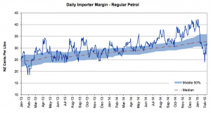
The importer margin for petrol over the past three years looks like this:

petrol-margin

The wiggly blue line is the week-by-week estimated margin; the shaded area is centered around the red trend line and covers 50% of the data. The margin had been going up; the calls for a review came just after it plummeted.

At the same site, but updated only quarterly, is an international comparison of the cost of fuel broken down into tax and everything else.

petrol-international

Super 15 Predictions for Round 2

Team Ratings for Round 2

The basic method is described on my Department home page.

Here are the team ratings prior to this week’s games, along with the ratings at the start of the season.

Current Rating Rating at Season Start Difference
Crusaders 8.60 10.42 -1.80
Waratahs 8.35 10.00 -1.60
Brumbies 3.95 2.20 1.70
Hurricanes 3.65 2.89 0.80
Sharks 2.79 3.91 -1.10
Chiefs 2.77 2.23 0.50
Stormers 2.69 1.68 1.00
Bulls 1.87 2.88 -1.00
Blues 0.90 1.44 -0.50
Highlanders -2.54 -2.54 -0.00
Force -3.02 -4.67 1.70
Lions -4.14 -3.39 -0.80
Cheetahs -4.42 -5.55 1.10
Reds -6.73 -4.98 -1.70
Rebels -7.71 -9.53 1.80


Performance So Far

So far there have been 7 matches played, 2 of which were correctly predicted, a success rate of 28.6%.

Here are the predictions for last week’s games.

Game Date Score Prediction Correct
1 Crusaders vs. Rebels Feb 13 10 – 20 24.40 FALSE
2 Brumbies vs. Reds Feb 13 47 – 3 11.20 TRUE
3 Lions vs. Hurricanes Feb 13 8 – 22 -1.80 TRUE
4 Blues vs. Chiefs Feb 14 18 – 23 3.20 FALSE
5 Sharks vs. Cheetahs Feb 14 29 – 35 13.50 FALSE
6 Bulls vs. Stormers Feb 14 17 – 29 5.20 FALSE
7 Waratahs vs. Force Feb 15 13 – 25 18.70 FALSE


Predictions for Round 2

Here are the predictions for Round 2. The prediction is my estimated expected points difference with a positive margin being a win to the home team, and a negative margin a win to the away team.

Game Date Winner Prediction
1 Chiefs vs. Brumbies Feb 20 Chiefs 3.30
2 Rebels vs. Waratahs Feb 20 Waratahs -12.10
3 Bulls vs. Hurricanes Feb 20 Bulls 2.70
4 Highlanders vs. Crusaders Feb 21 Crusaders -7.10
5 Reds vs. Force Feb 21 Reds 0.30
6 Stormers vs. Blues Feb 21 Stormers 6.30
7 Sharks vs. Lions Feb 21 Sharks 10.90


February 16, 2015

Briefly

Pot and psychosis

The Herald has a headline “Quarter of psychosis cases linked to ‘skunk’ cannabis”, saying

People who smoke super-strength cannabis are three times more likely to develop psychosis than people who have never tried the drug – and five times more likely if they smoke it every day.

The relative risks are surprisingly large, but could be true; the “quarter” attributable fraction needs to be qualified substantially. As the abstract of the research paper (PDF) says, in the convenient ‘Interpretation’ section

Interpretation The ready availability of high potency cannabis in south London might have resulted in a greater proportion of first onset psychosis cases being attributed to cannabis use than in previous studies

Let’s unpack that a little.  The basic theory is that some modern cannabis is very high in THC and low in cannabidiol, and that this is more dangerous than more traditional pot. That is, the ‘skunk’ cannabis has a less extreme version of the same problem as the synthetic imitations now banned in NZ. 

The study compared people admitted as inpatients in a particular area of London (analogous to our DHBs) to people recruited by internet and train advertisements, and leaflets (which, of course, didn’t mention that the study was about cannabis). The control people weren’t all that well matched to the psychosis cases, but it wasn’t too bad.  The psychosis cases were somewhat more likely to smoke cannabis, and much more likely to smoke the high-THC type. In fact, smoking of other cannabis wasn’t much different between cases and controls.

That’s where the relative risks of 3 and 5 come from.  It’s still possible that these are due at least in part to some other factor; you can’t tell from just this sort of data. The atttributable fraction (a quarter of cases) comes from combining the relative risk with the proportion of the population who are exposed.

Suppose ‘skunk-type’ cannabis triples your risk, and 20% of people in the population use it, as was seen for controls in the sample. General UK data (eg) suggest the rate in non-users might be 5 cases per 10,000 people per year. So, in 100,000 people, 80,000 would be non-users and you’d expect 40 cases per year. The other 20,000 would be users, and you’d expect a background rate of 10 cases plus 20 extra cases caused by the cannabis. So, in the 100,000 people, you’d get 70 cases per year, 50 of which would have happened anyway and 20 due to cannabis. That’s not exactly the calculation the researchers did — they used a trick where they don’t need the background rate as long as it’s low, and I rounded more — but it’s basically the same. I get 28%; they got 24%.

The figures illustrate two things. First, the absolute risk increase is roughly 20 cases per 100,000 20,000 people per year. Second, the ‘quarter’ estimate is very sensitive to the proportion exposed. If 5% of people used ‘skunk-type’ cannabis, you can run the numbers again and you get 5 cases due to cannabis out of 55 in 100,000 people: only 9% of cases due to exposure.

Now we’re at the ‘interpretation’ quote from the research paper.  In this South London area, 20% of people have used mostly the high-potency cannabis and 44% mostly have used other types, with 37% non-users. That’s a lot of pot.  Even if the relative risks are correct, the population attributable proportion will be much lower for the UK as a whole (or for NZ as a whole).

Still, the research does tend to support the idea of regulated legalisation, the sort of thing that Mark Kleiman advocates, where limits on THC and/or higher taxes for higher concentrations can be used to push cannabis supply to lower-risk varieties.

 

February 15, 2015

Caricatures and credits


A lot of surprisingly popular accounts on Twitter just tweet pictures, without giving any sources,and often with captions that misleading or just wrong.  One from yesterday had a picture of a picnic on a highway in the Netherlands in 1973 and described it as being from the US.

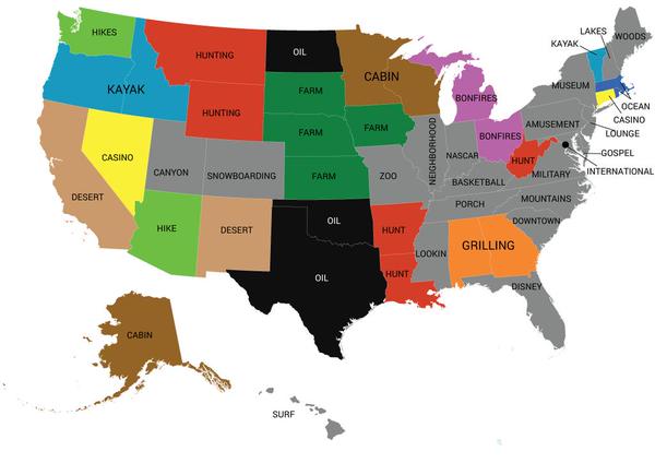
Here’s one that came from @AmazingMaps, today, captioned “Most popular word used in online dating profiles by state”

B916Zi9IIAAXAJb


Could it really be true that ‘NASCAR’ is the most popular word in Indiana dating profiles? Or that ‘oil’ is the most popular word in Texas? Have the standard personal-ad clichés become completely outdated? Aren’t Americans easy-going any more? Doesn’t anyone care about romance or honesty or humour?

We’ve seen this sort of analysis before on StatsChat. It’s designed to produce a caricature, though not necessarily in a bad way. This one comes from Mashable, based on analysis by Match.com. The original post says

Essentially, they broke down which words are used with relative frequency in certain states, as compared to relative infrequency in the rest of the country.

That is, the map has ‘oil’ for Texas and ‘NASCAR’ for Indiana not because these words were used very often in those states, but because they were used much less often in other states. Most Indiana dating profiles probably don’t mention NASCAR, but a much higher proportion do than in, say, New York or Oregon. Most Texas dating profiles don’t talk about oil, but it’s more common in Texas than in Maine or Tennessee. It’s not that everyone in Oregon or Idaho kayaks, but a lot more do than in Iowa or Kansas.


When this map first came out, in November, there were lots of stories about it, typically getting things wrong (eg an NBC motor sports site had the headline “NASCAR” is most frequently used word among Indiana online dating profiles”). That’s still bad, but most of these sites had links or at least mentioned the source of the map, so that people who care could find out what the facts are. @AmazingMaps seems confident none of its followers care.

February 14, 2015

Run and find out, but guess first

Vox.com has a post on calendar patterns.  Yuri Victor noticed that, this year, February is a nice rectangular shape on a calendar (as happens whenever it starts on Sunday in  a non-leap year), and wondered how often this happened.  This is the sort of question where you can easily find out the answer, so he did:

I decided to see if this occurs often so I wrote some code and found out it happens more than I thought.In the past 100 years, there have been 11 Februaries that make a rectangle.

He also noticed that February 13th would be Friday when this happened and wondered how often we got a Friday 13th:

Friday the 13ths also happen more than I thought. In the past 100 years there have been 171 Friday the 13ths, which means there is one to two a year.

This is a Good Thing. We want journalists wondering about patterns and looking up data to check them. We don’t want them being required to call an expert in calendars to give a quote. It’s also a Good Thing that he tells us his expectations were wrong

It would be even better, though, if he’d tried to work out a quantitative guess and tell us. The simplest guess would be that, in the long run, February 1 is a Sunday as often as any other day, and that the 13th of a month is a Friday as often as any other day.  These are natural guesses because there’s no special reason the year or a particular month should start on a particular day of the week. 

In  100 years there are 1200 months, and 1200/7 is 171.4, so it looks as though Friday 13th happens in almost exactly 1/7 of months.  In the past 100 years there are 75 Februaries with 28 days, and 75/7 is 10.7, so 28-day Februaries begin on Sunday almost exactly 1/7 of the time.

You wouldn’t always expect the simplest possible explanation to hold. For example, the date of Passover is set based on the solar and lunar calendars, in a 19-year cycle. Since 7 doesn’t divide 19, you’d expect either that the days of the week didn’t divide up equally or that they took a long time (requiring lots of leap years) to do so.


February 13, 2015

Super 15 Predictions for Round 1

Team Ratings for Round 1

Sorry about the delay in posting these predictions. I have never been really happy with my selection of parameters, so decided to do a massive grid search yesterday which ended up taking about 16 hours. That means this year I have shiny new parameter values for my predictions. As ever, remember the adage, “past performance is not necessarily indicative of future behaviour”.

The basic method is described on my Department home page.

Here are the team ratings prior to this week’s games, along with the ratings at the start of the season.

Current Rating Rating at Season Start Difference
Crusaders 10.42 10.42 0.00
Waratahs 10.00 10.00 0.00
Sharks 3.91 3.91 -0.00
Hurricanes 2.89 2.89 -0.00
Bulls 2.88 2.88 0.00
Chiefs 2.23 2.23 0.00
Brumbies 2.20 2.20 -0.00
Stormers 1.68 1.68 -0.00
Blues 1.44 1.44 0.00
Highlanders -2.54 -2.54 -0.00
Lions -3.39 -3.39 -0.00
Force -4.67 -4.67 0.00
Reds -4.98 -4.98 0.00
Cheetahs -5.55 -5.55 -0.00
Rebels -9.53 -9.53 -0.00


Predictions for Round 1

Here are the predictions for Round 1. The prediction is my estimated expected points difference with a positive margin being a win to the home team, and a negative margin a win to the away team.

Game Date Winner Prediction
1 Crusaders vs. Rebels Feb 13 Crusaders 24.40
2 Brumbies vs. Reds Feb 13 Brumbies 11.20
3 Lions vs. Hurricanes Feb 13 Hurricanes -1.80
4 Blues vs. Chiefs Feb 14 Blues 3.20
5 Sharks vs. Cheetahs Feb 14 Sharks 13.50
6 Bulls vs. Stormers Feb 14 Bulls 5.20
7 Waratahs vs. Force Feb 15 Waratahs 18.70