January 6, 2015
Getting to work
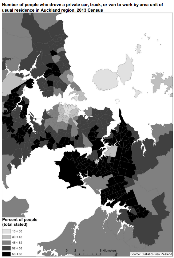
From a new StatsNZ report on commuting in Auckland, based on the last Census. Qualitatively, people drive to work from where you’d expect. Quantitatively, there’s been a bit of increase in public transport use.
Commuting patterns is an example of where an interactive map would be helpful for visualisation.
(via @polemic and @DarrenDavis10 on Twitter)
Thomas Lumley (@tslumley) is Professor of Biostatistics at the University of Auckland. His research interests include semiparametric models, survey sampling, statistical computing, foundations of statistics, and whatever methodological problems his medical collaborators come up with. He also blogs at Biased and Inefficient See all posts by Thomas Lumley »
