Posts from January 2015 (38)

January 31, 2015

Big buts for factoid about lying

At StatsChat, we like big buts, and an easy way to find them is unsourced round numbers in news stories. From the Herald (reprinted from the Telegraph, last November)

But it’s surprising to see the stark figure that we lie, on average, 10 times a week.

It seems that this number comes from an online panel survey in the UK last year (Telegraph, Mail) — it wasn’t based on any sort of diary or other record-keeping, people were just asked to come up with a number. Nearly 10% of them said they had never lied in their entire lives; this wasn’t checked with their mothers.  A similar poll in 2009 came up with much higher numbers: 6/day for men, 3/day for women.

Another study, in the US, came up with an estimate of 11 lies per week: people were randomised to trying not to lie for ten weeks, and the 11/week figure was from the control group.  In this case people really were trying to keep track of how often they lied, but they were a quite non-representative group. The randomised comparison will be fair, but the actual frequency of lying won’t be generalisable.

The averages are almost certainly misleading, because there’s a lot of variation between people. So when the Telegraph says

The average Briton tells more than 10 lies a week,

or the Mail says

the average Briton tells more than ten lies every week,

they probably mean the average number of self-reported lies was more than 10/week, with the median being much lower. The typical person lies much less often than the average.

These figures are all based on self-reported remembered lies, and all broadly agree, but another study, also from the US, shows that things are more complicated

Participants were unaware that the session was being videotaped through a hidden camera. At the end of the session, participants were told they had been videotaped and consent was obtained to use the video-recordings for research.

The students were then asked to watch the video of themselves and identify any inaccuracies in what they had said during the conversation. They were encouraged to identify all lies, no matter how big or small.

The study… found that 60 percent of people lied at least once during a 10-minute conversation and told an average of two to three lies.



January 30, 2015

Probably not

The Herald (from the Daily Mail) asks “Has an 8-year-old found a cancer cure?

According to the story,

Michael Lisanti asked his eight-year-old daughter how she would cure cancer, and it seems she may have got it right.

Camilla Lisanti suggested using antibiotics, “like when I have a sore throat”.

Her parents, a husband-wife cancer research team were sceptical at first but tested out her theory in their Manchester University lab. And to their surprise, several cheap and widely-used antibiotics killed the most dangerous cancer cells.

That’s not what they say in their research paper, where the idea is presented as coming from a large-scale objective search

These observations are also consistent with the idea that cancer is essentially a disease of “stemness” gone awry

Based on this rather simple premise, using unbiased quantitative proteomic profiling, we have focused on identifying a global phenotypic property of cancer stem cells (CSCs) that could be targeted across multiple tumor types. We have identified this property as a strict dependence on mitochondrial biogenesis, for the anchorage-independent clonal expansion and survival of the CSC population.

Here, we show that 4-to-5 different classes of FDA-approved antibiotics, which inhibit mitochondrial biogenesis as an “off-target” effect, can be used to eradicate cancer stem cells, in 12 different cancer cell lines, across 8 different tumor types 

Either way, are these antibiotics (which aren’t the ones recommended for ‘when I have a sore throat’)  a new idea that’s going to cure cancer?

Well, doxycycline, the apparent favourite, has been proposed before, based on at least two other theories about why it should work. A simple Google search would tell you that. A slightly more sophisticated search would tell you that this mechanism has been proposed before (in 1984)

Tetracyclines have even been tested before. A review article in 2011 says

Here we review the efforts to determine the efficacy of tetracyclines as chemotherapeutics in human cancer trials. While the majority of clinical trials have yielded disappointing results, tetracyclines have been shown to be generally well tolerated and have significant anti-proliferative effects in certain cancer types.

On the other hand, those trials were done in tumours chosen based on a different theory, and mostly used different tetracyclines. It would be wonderful if doxycycline did better in new trials, but I wouldn’t say that’s the way to bet.

A bit more complicated than that

On Twitter, I got a link to a Telegraph story “One glass of wine increases stroke risk by third”, with the request “Debunk please.”

Not all depressing health news is necessarily wrong. However, even if it’s describing a real risk you can be pretty confident that it will have been exaggerated a bit, and that’s the case here.  It’s probably true that alcohol consumption at not-particularly-high levels increases stroke risk, but it does pay to look more closely at what the research is claiming.

The first thing to notice is that the story shifts from

Middle aged drinkers who down just one large glass of wine a day increase their risk of stroke by a third, warns a new study.

to

The results showed drinkers in their fifties and sixties who had at least two alcoholic drinks a day…

That is, the research lumped together everyone who averaged two or more standard drinks per day (actually, 2.4 standard drinks/day in NZ units). This group, collectively, had a 34% higher stroke risk than the 0.5 drink/day group, but the group who had 1-2 standard drinks per day were not at any increased risk.  Unless there’s a magic threshold at 2.4 drinks/day of alcohol, the excess risk must be less than 1/3 for people just into the 2.4+ drinks range, and more for people far into the range.

The next step is to try to look at the actual alcohol consumption in each group, to see how far above 2.4/day the highest group was. That’s not given, but some interesting things are. First, only 3% of the people who had strokes drank more than 2.4 drinks/day, so this wasn’t a very good sample for looking at heavy drinking.  The researchers pointed this out themselves: “A potential limitation of our study could be a low proportion of heavy drinkers as alcohol consumption in Sweden is one of the lowest in Europe

What’s more surprising is that 3% of the people who didn’t have strokes also drank more than 2.4 drinks/day.  In fact, the mean and median alcohol consumption were slightly lower in the people who had strokes than in the people who didn’t.  How can this be?

Part of the explanation is given the Telegraph story

The findings show that blood pressure and diabetes appeared to take over as one of the main influences on having a stroke at around the age of 75.

That is, the alcohol effect was mostly in middle-aged people, where the actual stroke risk is lower. This was the main finding of the research, in fact. It still wouldn’t entirely explain the lack of difference in alcohol consumption, but there’s also probably a contribution from the statistical model they used and the way it handles people who die of something other than a stroke, and from lower risk in light drinkers than in non-drinkers.

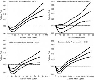
The other question to ask, always,  is what other research there is. Here’s a graph from a meta-analysis combining 27 alcohol and stroke studies published last year (click to embiggen). It also shows an increase, but not as dramatic as the new study.
1-s2.0-S0167527314009073-gr5

Since the new study wasn’t particularly well suited to looking at the effect of heavier drinking (it would have been better for looking at non-drinkers vs light drinkers), there isn’t much case for preferring the single new study estimate over the combined estimate.  According to this estimate, at 2 drinks/day there isn’t convincing evidence of increased risk. Above 3 drinks/day there is, and it goes up rapidly after that. Another meta-analysis in 2010 found broadly similar results, as did one in 2003 in the prestigious journal JAMA.

So, not really debunked, but not quite as bad as it sounds.

Meet Statistics summer scholar Ying Zhang

Ying Zhang Photo

Every year, the Department of Statistics offers summer scholarships to a number of students so they can work with staff on real-world projects. Ying, right, is working on a project called Service overview, client profile and outcome evaluation for Lifeline Aotearoa Face-to-Face Counselling Services  with the Department of Statistics’ Associate Professor David Scott and Christine Dong, research and clinical engagement manager, Lifeline and also an Honorary Research Fellow in the Department of Psychological Medicine at the University of Auckland. Ying explains:

“Lifeline New Zealand is a leading provider of dedicated community helpline services, face-to-face counselling and suicide prevention education. The project aims to investigate the client profile, the clinical effectiveness of the service and client experiences of, and satisfaction with, the face-to-face counselling service.

“In this project, my work includes three aspects: Data entry of client profiles and counselling outcomes; qualitative analysis of open-ended questions and descriptive analysis; and modelling for the quantitative variables using SAS.

“Very few research studies have been done in New Zealand to explore client profiles or find out clients’ experiences of, and satisfaction with, community face-to-face counselling services. Therefore, the study will add evidence in terms of both clinical effectiveness and client satisfaction. This study will also provide a systematic summary of the demographics and clinical characteristics of people accessing such services. It will help provide direction for strategies to improve the quality and efficiency of the service.

“I have just graduated from the University of Auckland with a Postgraduate Diploma in Statistics.  I got my bachelor and master degrees majoring in information management and information systems at Zhejiang University in China.

“My first contact with statistics was around 10 years ago when I was at university in China. It was an interesting but complex subject for me. After that, I did some internship work relating to data analysis. It helped me accumulate more experience about using data analysis to help inform business decisions.

“This summer, apart from participating in the project, I will spend some time expanding my knowledge of SAS – it’s a very useful tool and I want to know it better. I’m also hoping to find a full-time job in data analysis.”


January 29, 2015

30 years is longer than one week

From Stuff, on the housing affordability index

“The university said a key driver was the median house price, which rose more than $30,000 over the year, eclipsing the $19.35 increase in average weekly wages.

Interest rates also rose from 5.51 per cent to 5.97 per cent on average.”

Comparing the median house price increase to the median (I think) individual weekly wage and salary income increase is a particularly opaque way of presenting the data. Obviously $30,000 is a lot more than $19.35, but one is paid over thirty years an the other is received over one week.

For example, it should be easy to say what increase in average weekly earnings would be necessary to not be ‘eclipsed’ by the $30,000 house price increase? If the report doesn’t say, the journalist should ask. The reader shouldn’t have to do that calculation. It turns out that if median weekly wages had risen $34.50 instead of $19.35, they wouldn’t have been eclipsed and the affordability index would have stayed constant. This isn’t the impression that you’d get from the story.

The argument for an affordability index is that it makes affordability changes easier to understand by reducing them to a single number.  That’s only true either if you understand how the number is calculated (which takes quite a lot of research) or you don’t really care exactly what it means.

Absolute risk/benefit calculators

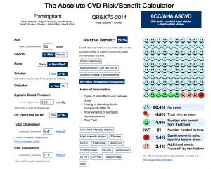
An interesting interactive calculator for heart disease/stroke risk, from the University of Nottingham. It lets you put in basic, unchangeable factors (age,race,sex), modifiable factors (smoking, diabetes, blood pressure, cholesterol), and then one of a set of interventions

Here’s the risk for an imaginary unhealthy 50-year old taking blood pressure medications

bp

The faces at the right indicate 10-year risk: without the unhealthy risk factors, if you had 100 people like this, one would have a heart attack, stroke, or heart disease death over ten years, with the risk factors and treatment four  would have an event (the pink and red faces).  The treatment would prevent five events in 100 people, represented by the five green faces.

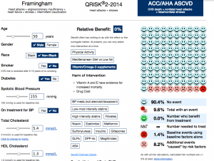
There’s a long list of possible treatments in the middle of the page, with the distinctive feature that most of them don’t appear to reduce risk, from the best evidence available. For example, you might ask what this guy’s risk would be if he took vitamin and fish oil supplements. Based on the best available evidence, it would look like this:

vitamin


The main limitation of the app is that it can’t handle more than one treatment at a time: you can’t look at blood pressure meds and vitamins, just at one or the other.

(via @vincristine)

Briefly

  • “When 2000 people take aspirin for one year, one heart attack is prevented.” A story on absolute risk and number-needed-to-treat, at the NY Times Upshot blog.  They introduce this as related to personalised medicine, but it’s really not.

Meet Statistics summer scholar Oliver Stevenson

Oliver StevensonEvery year, the Department of Statistics offers summer scholarships to a number of students so they can work with staff on real-world projects. Oliver, right, is working on a project called Maps and graphics for animal populations with Associate Professor Rachel Fewster. Oliver explains:

“This project involves dealing with data from various conservation projects around the country. The data primarily consists of catch rates of various animal species at different locations of a project. My job is to come up with new ideas for maps, graphics and charts that conservation volunteers will find engaging, and that will illustrate the positive impact their work is having on New Zealand’s environment.

“The project is aimed at motivating the general public who are involved in local conservation schemes. When they return from a day’s work, they will get to see the rewards of their labours presented on a map, as well as personalised charts showing their own contribution to the project. Ideally, this keeps them motivated and coming back for more!

I recently completed my Bachelor of Science majoring in Statistics and minoring in Psychology at the University of Otago. I am originally from Auckland, and have returned to pursue a Bachelor of Science (Honours) in Statistics in 2015.

I enjoy statistics as I believe it can be applied to almost any aspect of life. Data exists in so many subjects and occupations: commerce, medicine, law, sports, the environment – anything you can think of!

“Where there is data, we can use statistics to gain a deeper understanding of the underlying processes taking place and better understand the world around us. Because statistics covers such a wide range of topics, I’m always working with something different, which keeps the subject interesting.

This summer, hopefully I will find some time to get away and do some camping and get the chance to play a few games of cricket in the sun.”


January 28, 2015

Tracking medical results to their source

From the Herald

A study from the Garvan Institute in Australia demonstrates that a diet rich in coconut oil protects against ‘insulin resistance’ (an impaired ability of cells to respond to insulin) in muscle and fat and avoids the accumulation of body fat caused by other high fat diets.


Suppose we wanted to find this study and see what it really demonstrates. There’s not a  lot to go on, but the Google knows all and sees all. When you have more information — researcher names, journal names, words from the title of the paper — Google Scholar is the best bet (as Jeff Leek explains here).  With just “Garvan Institute coconut oil”, Google Scholar isn’t very helpful.

However, since this study is popular among coconut lobbyists, an ordinary Google search does quite well. For me, the top hit is a press release from the Garvan Institute. The press release begins

A new study in animals demonstrates that a diet rich in coconut oil protects against ‘insulin resistance’ (an impaired ability of cells to respond to insulin) in muscle and fat. The diet also avoids the accumulation of body fat caused by other high fat diets of similar calorie content. Together these findings are important because obesity and insulin resistance are major factors leading to the development of Type 2 diabetes.

I’ve highlighted two key phrases: this was an animal study, and the coconut oil diet did well compared to another high fat, high calorie diet.

What’s more, the Garvan press release links to the research paper. The abstract is open-access; here are two quotes from it

Mice fed the MCFA diet displayed reduced adiposity and better glucose tolerance than LCFA-fed animals.

In rats, isocaloric feeding of MCFA or LCFA HF diets induced hepatic insulin resistance to a similar degree, however insulin action was preserved at the level of LF controls in muscle and adipose from MCFA-fed animals.

That is, in mice, coconut oil was better than the same amount of lard (though not as good as a low-fat diet); in rats coconut oil was as bad as lard on one measure of insulin resistance, but was comparable to the low-fat diet on another measure.

If the results translated to humans, this would show a diet high in coconut oil was better for insulin resistance than one high in animal fat, but worse than a low-fat diet.

Meet Statistics summer scholar Kai Huang

Kai Huang croppedEvery year, the Department of Statistics offers summer scholarships to a number of students so they can work with staff on real-world projects. Kai, right, is working on a project called Constrained Additive Ordination with Dr Thomas Yee. Kai explains:

“In the early 2000s, Dr Thomas Yee proposed a new technique in the field of ecology called Constrained Additive Ordination (CAO) that solves the problems about the shape of species’ response curves and how they are distributed along unknown underlying gradients, and meanwhile the CAO-oriented Vector Generalised Linear and Additive Models (VGAM) package for R has been developed. This summer, I am compiling code for improving performance for the VGAM package by facilitating the integration of R and C++ under the R environment.

“This project brings me the chance to work with a package in worldwide use and stimulates me to learn more about writing R extensions and C++ compilation. I don’t have any background in ecology, but I acquired a lot before I started this project.

“I just have done the one-year Graduate Diploma in Science in Statistics at the University of Auckland after graduating from Massey University at Palmerston North with a Bachelor of Business Studies in Finance and Economics. In 2015, I’ll be doing an honours degree in Statistics. Statistics is used in every field, which is awesome to me.

“This summer, I’ll be spending my days rationally, working with numbers and codes, and at night, romantically, spending my spare time with stars. Seeing the movie Interstellar [a 2014 science-fiction epic that features a crew of astronauts who travel through a wormhole in search of a new home for humanity] reignited my curiosity about the universe, and I have been reading astronomy and physics books in my spare time this summer. I even bought an annual pass to Stardome, the planetarium at Auckland, and have spent several evenings there.”