Posts from December 2014 (46)

December 2, 2014

Known and unknown unkowns

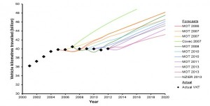
This graph is from the Ministry of Transport Strategic Policy Programme, looking at forecasts of demand for transport infrastructure.

ResizedImage600304-FutureDemand-Diagram1

The coloured lines show forecasts of driving (billion vehicle-km) made in the past; the black diamonds show actual driving. It’s clear that actual driving flattened out about ten years ago and the forecasts didn’t. What’s not clear is the implication. It could be that the old models need to be thrown out and that increases in driving are a twentieth-century phase we’ve grown out of. Or, it could be that growth in driving will restart soon. Or something else entirely.

The MoT report very sensibly accepts that we don’t really know what’s going on, and emphasises the importance of flexibility: if you aren’t confident about the future, you should be willing to accept extra costs to avoid premature lock-in, and you should also be prepared to pay for research to get better information.

 

December 1, 2014

Drug graphs

The Economist has a story on the changes in heroin abuse in the US (via @nzdrug).  It’s interesting to read, but I want to comment on the graphs.  The first one, and the one in the tweet, was this:

20141122_USC323

The source (if you use the clues in the story to search at JAMA Psychiatry) is here; the format of the graph is the same in the research paper.  I really don’t like this style with two lines for one proportion. At first glance it looks as though there’s information in the way one line mirrors the other, with the total staying approximately constant over time. Then you see that the total is exactly constant over time. It’s 100%.

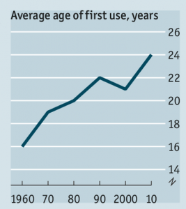
The other interesting graph is different in the research paper and the story. The data are the same, but the visual impression is different.

drug-nozero drug-zero

The graph on the left, from The Economist, has no zero. The graph on the right has a zero, making the change in mean age look a lot smaller.  In this case I think I’m with The Economist when it comes to the design, though I’d argue for a slightly wider and flatter graph. Barcharts must start at zero (defined appropriately for the data), but lines don’t have to, and an increase in mean age of first use from 16.5 to 22.9 is a pretty big change.

Where I’m not with The Economist is the numbers. The research paper, as I said, gives the numbers as 16.5 in the 1960s and 22.9 in the 2010s. The graph from the story is definitely too high at the maximum and probably too low at the minimum.


Ghosts and zombies

A month late for the season, but still interesting:

  • The Iraq military reportedly has about 50,000 ‘ghost’ soldiers, existing only for payroll fraud.
  • Jordan Weissman at Slate tries to track down a zombie figure of $400 billion/year for illegal sports betting in the US. It has been cited in an academic paper and a Supreme Court brief, without any primary source being given.

National income map

From the Herald’s data blog again, an interactive map of household incomes across the country, by Chris McDowall.

This is a dot map, with one dot for each household. The locations aren’t exact, since that sort of information isn’t publicly available; they are placed randomly within the Census meshblock (which presumably explains the household in the middle of the old Mangere Bridge in the example below).

income-map

Dot maps handle varying population density much better than shaded maps: if you zoom out, you can see that typical household income is not even a thing in most of the geographical area of NZ, but if you zoom in on a city, like Auckland, or a small town, like Raetihi or Ohakune, you can see the patterns of income.

You can’t do everything with dots, though.  Firstly, they only work where there really is a location for each number. If you wanted to map air pollution or land value, the reality is spread out, not localised.

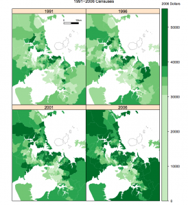
More interesting, though, is the comparison with this map from StatsNZ over household income over time in Auckland

census-income

A single household income is localised at a single point, but a change between two censuses isn’t.  If you used different dot locations for the four census times, some of the visual change would just be noise from the dot locations, but if you used the same dot locations you’d be implying that those specific households had those specific income changes.


Stat of the Week Competition: November 29 – December 5 2014

Each week, we would like to invite readers of Stats Chat to submit nominations for our Stat of the Week competition and be in with the chance to win an iTunes voucher.

Here’s how it works:

  • Anyone may add a comment on this post to nominate their Stat of the Week candidate before midday Friday December 5 2014.
  • Statistics can be bad, exemplary or fascinating.
  • The statistic must be in the NZ media during the period of November 29 – December 5 2014 inclusive.
  • Quote the statistic, when and where it was published and tell us why it should be our Stat of the Week.

Next Monday at midday we’ll announce the winner of this week’s Stat of the Week competition, and start a new one.

(more…)

Stat of the Week Competition Discussion: November 29 – December 5 2014

If you’d like to comment on or debate any of this week’s Stat of the Week nominations, please do so below!