Drug graphs
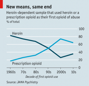
The Economist has a story on the changes in heroin abuse in the US (via @nzdrug). It’s interesting to read, but I want to comment on the graphs. The first one, and the one in the tweet, was this:
The source (if you use the clues in the story to search at JAMA Psychiatry) is here; the format of the graph is the same in the research paper. I really don’t like this style with two lines for one proportion. At first glance it looks as though there’s information in the way one line mirrors the other, with the total staying approximately constant over time. Then you see that the total is exactly constant over time. It’s 100%.
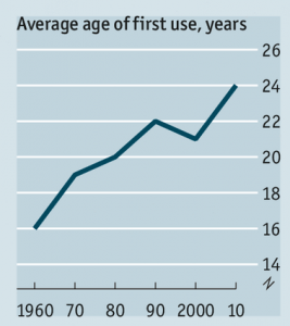
The other interesting graph is different in the research paper and the story. The data are the same, but the visual impression is different.
The graph on the left, from The Economist, has no zero. The graph on the right has a zero, making the change in mean age look a lot smaller. In this case I think I’m with The Economist when it comes to the design, though I’d argue for a slightly wider and flatter graph. Barcharts must start at zero (defined appropriately for the data), but lines don’t have to, and an increase in mean age of first use from 16.5 to 22.9 is a pretty big change.
Where I’m not with The Economist is the numbers. The research paper, as I said, gives the numbers as 16.5 in the 1960s and 22.9 in the 2010s. The graph from the story is definitely too high at the maximum and probably too low at the minimum.
Thomas Lumley (@tslumley) is Professor of Biostatistics at the University of Auckland. His research interests include semiparametric models, survey sampling, statistical computing, foundations of statistics, and whatever methodological problems his medical collaborators come up with. He also blogs at Biased and Inefficient See all posts by Thomas Lumley »


Sometimes the real zero isn’t zero. You’d hope there weren’t too many people under 10 first using heroin.
10 years ago
The true zero may be pretty close to conception i.e. -0.75 years.
10 years ago