Motion and context in graphics
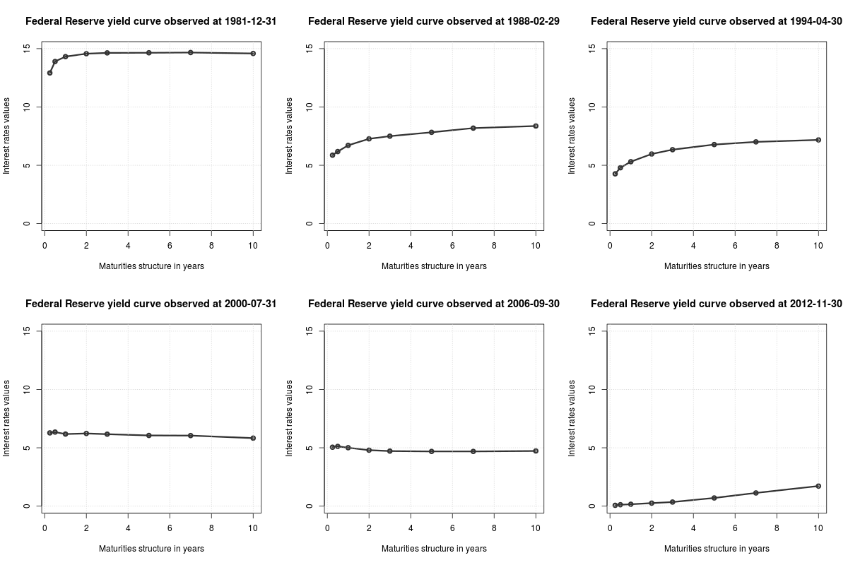
Via Michael Toth I found this animated GIF from isomorphismes, showing the ‘yield curve‘ for Federal Reserve bonds
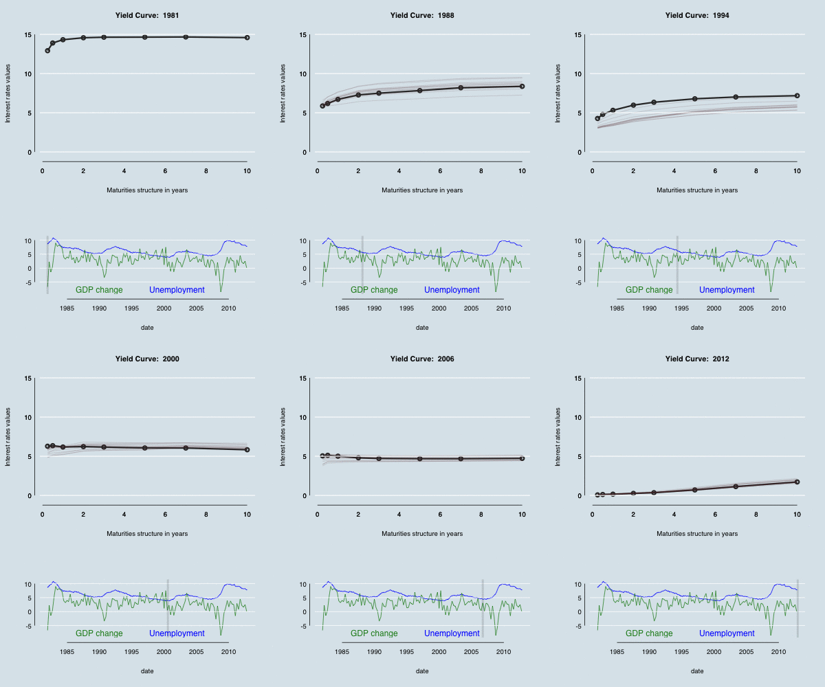
Michael modified the curve to make it prettier — alternatively, more similar to the style of The Economist. In both cases, though, I felt the time context was missing. Using animation rather than multiple plots lets you get a lot more on a page, but you can’t see what’s happening as clearly.
One possibility is to make a separate graphic that shows where you are in time; another is to keep some history by letting the graph leave shadows. In the graph below (based on both the linked examples), there are 12 months worth of shadow lines trailing the solid line, and a grey indicator bar showing where we are in history, with GDP growth and unemployment as context.
Even better (though not embeddable in WordPress) would be to make the time axis able to both autoplay and be controllable by the user, as in this example from the R animint package.
(update: the code)
Thomas Lumley (@tslumley) is Professor of Biostatistics at the University of Auckland. His research interests include semiparametric models, survey sampling, statistical computing, foundations of statistics, and whatever methodological problems his medical collaborators come up with. He also blogs at Biased and Inefficient See all posts by Thomas Lumley »

