Posts from July 2014 (54)

July 2, 2014

What’s the actual margin of error?

The official maximum margin of error for an election poll with a simple random sample of 1000 people is 3.099%. Real life is more complicated.

In reality, not everyone is willing to talk to the nice researchers, so they either have to keep going until they get a representative-looking number of people in each group they are interested in, or take what they can get and reweight the data — if young people are under-represented, give each one more weight. Also, they can only get a simple random sample of telephones, so there are more complications in handling varying household sizes. And even once they have 1000 people, some of them will say “Dunno” or “The Conservatives? That’s the one with that nice Mr Key, isn’t it?”

After all this has shaken out it’s amazing the polls do as well as they do, and it would be unrealistic to hope that the pure mathematical elegance of the maximum margin of error held up exactly.  Survey statisticians use the term “design effect” to describe how inefficient a sampling method is compared to ideal simple random sampling. If you have a design effect of 2, your sample of 1000 people is as good as an ideal simple random sample of 500 people.

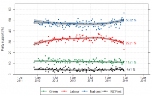
We’d like to know the design effect for individual election polls, but it’s hard. There isn’t any mathematical formula for design effects under quota sampling, and while there is a mathematical estimate for design effects after reweighting it isn’t actually all that accurate.  What we can do, thanks to Peter Green’s averaging code, is estimate the average design effect across multiple polls, by seeing how much the poll results really vary around the smooth trend. [Update: this is Wikipedia’s graph, but I used Peter’s code]

NZ_opinion_polls_2011-2014-majorparties

I did this for National because it’s easiest, and because their margin of error should be close to the maximum margin of error (since their vote is fairly close to 50%). The standard deviation of the residuals from the smooth trend curve is 2.1%, compared to 1.6% for a simple random sample of 1000 people. That would be a design effect of (2.1/1.6)2, or 1.8.  Based on the Fairfax/Ipsos numbers, about half of that could be due to dropping the undecided voters.

In principle, I could have overestimated the design effect this way because sharp changes in party preference would look like unusually large random errors. That’s not a big issue here: if you re-estimate using a standard deviation estimator that’s resistant to big errors (the median absolute deviation) you get a slightly larger design effect estimate.  There may be sharp changes, but there aren’t all that many of them, so they don’t have a big impact.

If the perfect mathematical maximum-margin-of-error is about 3.1%, the added real-world variability turns that into about 4.2%, which isn’t that bad. This doesn’t take bias into account — if something strange is happening with undecided voters, the impact could be a lot bigger than sampling error.
 

July 1, 2014

Does it make sense?

From the Herald (via @BKDrinkwater on Twitter)

Wages have only gone up $34.53 annually against house prices, which are up by $38,000.

These are the findings of the Home Affordability Report quarterly survey released by Massey University this morning.

At face value, that first sentence doesn’t make any sense, and also looks untrue. Wages have gone up quite a lot more than $34.53 annually. It is, however, almost a quote from the report, which the Herald embeds in their online story

 There was no real surprise in this result because the average annual wage increase of $34.53 was not enough to offset a $38,000 increase in the national median house price and an increase in the average mortgage interest rate from 5.57% to 5.64%. 

If you look for income information online, the first thing you find is the NZ Income Survey, which reported a $38 increase in median weekly salary and wage income for those receiving any. That’s a year old and not the right measure, but it suggests the $34.53 is probably an increase in some measure of average weekly income. Directly comparing that to the increase in the cost of house would be silly.

Fortunately, the Massey report doesn’t do that. If you look at the report, on the last page it says

Housing affordability for housing in New Zealand can be assessed by comparing the average weekly earnings with the median dwelling price and the mortgage interest rate

That is, they do some calculation with weekly earnings and expected mortgage payments. It’s remarkably hard to find exactly what calculation, but if you go to their website, and go back to 2006 when the report was sponsored by AMP, there is a more specific description.

If I’ve understood it correctly, the index is annual interest payment for an 80% mortgage  on the median house price at the average interest rate, divided by the average weekly wage.  That is, it’s the number of person-weeks of average wage income it would take to pay the mortgage interest for a year.  An index of 30 in Auckland means that the mortgage interest for the first year on 80% mortgage on the median house would take 30 weeks of average wage income to pay. A household with two people earning the average Auckland wage would spend 15/52 or nearly 30% of their income on mortgage interest to buy the median Auckland house.

Two final notes: first the “There was no real surprise” claim in the report is pretty meaningless. Once you know the inputs there should never be any real surprise in a simple ratio. Second, the Herald’s second paragraph

These are the findings of the Home Affordability Report quarterly survey released by Massey University this morning.

is just not true. Those are the inputs to the report, from, respectively, Stats New Zealand and REINZ. The findings are the changes in the affordability indices.

Graph of the week

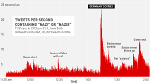
From Deadspin. No further comment needed.

785528210252283206

Facebook recap

The discussion over the Facebook experiment seems to involve a lot of people being honestly surprised that other people feel differently.

One interesting correlation based on my Twitter feed is that scientists involved in human subjects research were disturbed by the research and those not involved in human subjects research were not. This suggests our indoctrination in research ethics has some impact, but doesn’t answer the question of who is right.

Some links that cover most of the issues