Posts from July 2014 (54)

July 28, 2014

NZ Data Futures Forum: Discussion paper out

The New Zealand Data Futures Forum, which was established by the Ministers of Finance and Statistics to explore the future of data-sharing between the public and private sector, has released a discussion paper here.

This is the press release that was issued this morning:

Paddock to plate, and smart roads possible – NZ Data Futures Forum

New Zealand’s international brand and exports could grow significantly with the creation of a data sharing ‘eco-system’ according to a paper released by the NZ Data Futures Forum today.

Food traceability or ‘paddock to plate’ tracking is one of a number of kick start projects recommended in the paper that would see New Zealand become a world leader in the trusted use of data.

“New Zealand has got a real opportunity here. If we can create an ‘eco-system’ for data, we can unlock huge value, but to do this we need to treat data as a national asset,” says Forum Chair John Whitehead.

The paper suggests a range of initiatives including the establishment of an independent data council and an open data champion to drive innovation through data sharing.  The data council would act as an independent ‘guardian’ to ensure trust, privacy and security are maintained.

“Getting the rules of the game right is a vital part of encouraging collaboration, creativity and innovation.  New Zealand is uniquely placed to do this extremely well.”

The development of ‘smart roads’ that pull data from a range of sources, such as cats eye data capturing traffic flow, is another example the Forum uses to highlight the value that can  be created through collaborative data sharing.

“Transport is a critical issue for Auckland. Smart roads can keep traffic moving more freely and prevent a future of bottlenecks and delays literally putting a brake on productivity

“If our recommendations are followed we will see New Zealand lead the world in this space. The potential gains are limitless, including the ability to tackle immediate and real social problems.”
 

Stat of the Week Competition: July 26 – August 1 2014

Each week, we would like to invite readers of Stats Chat to submit nominations for our Stat of the Week competition and be in with the chance to win an iTunes voucher.

Here’s how it works:

  • Anyone may add a comment on this post to nominate their Stat of the Week candidate before midday Friday August 1 2014.
  • Statistics can be bad, exemplary or fascinating.
  • The statistic must be in the NZ media during the period of July 26 – August 1 2014 inclusive.
  • Quote the statistic, when and where it was published and tell us why it should be our Stat of the Week.

Next Monday at midday we’ll announce the winner of this week’s Stat of the Week competition, and start a new one.

(more…)

Stat of the Week Competition Discussion: July 26 – August 1 2014

If you’d like to comment on or debate any of this week’s Stat of the Week nominations, please do so below!

July 27, 2014

More rugby stats

From Offsetting Behaviour (specifically, Seamus Hogan): How unfair is the Super 15 schedule?

The was prompted by one of the posts on the (apparently new) blog Sport Loves Data, by Kirdan Lees.

Air flight crash risk

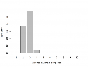
David Spiegelhalter, Professor of the Public Understanding of Risk at Cambridge University, has looked at the chance of getting three fatal plane crashes in the same 8-day period, based on the average rate of fatal crashes over the past ten years.  He finds that if you look at all 8-day periods in ten years, three crashes is actually the most likely way for the worst week to turn out.

He does this with maths. It’s easier to do it by computer simulation: arrange the 91 crashes randomly among the 3650 days and count up the worst week. When I do this 10,000 times (which takes seconds). I get

crashes


The recent crashes were separate tragedies with independent causes — two different types of accident and one deliberate shooting — they aren’t related like, say, the fires in the first Boeing Dreamliners were. There’s no reason for the recent events should make you more worried about flying.

July 25, 2014

Storytelling with data: genre and shared language

A talk from this year’s Tapestry conference, taking the idea of storytelling with data seriously by looking at genre

Genres create a shared language, but they can also become formulaic. 

Here’s one example to get you going: what do love stories have to do with taxi maps?

Watch the video

(via Alberto Cairo)


Briefly

Graphics edition

July 24, 2014

Weak evidence but a good story

An example from Stuff, this time

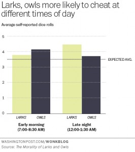
Sah and her colleagues found that this internal clock also affects our ability to behave ethically at different times of day. To make a long research paper short, when we’re tired we tend to fudge things and cut corners.

Sah measured this by finding out the chronotypes of 140 people via a standard self-assessment questionnaire, and then asking them to complete a task in which they rolled dice to win raffle tickets – higher rolls, more tickets.

Participants were randomly assigned to either early morning or late evening sessions. Crucially, the participants self-reported their dice rolls.

You’d expect the dice rolls to average out to around 3.5. So the extent to which a group’s average exceeds this number is a measure of their collective result-fudging.

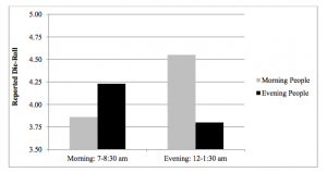
“Morning people tended to report higher die-roll numbers in the evening than the morning, but evening people tended to report higher numbers in the morning than the evening,” Sah and her co-authors wrote.

The research paper is here.  The Washington Post, where the story was taken from, has a graph of the results, and they match the story. Note that this is one of the very few cases where starting a bar chart at zero is a bad idea. It’s hard to roll zero on a standard die.

larks-owls-wapost


The research paper also has a graph of the results, which makes the effect look bigger, but in this case is defensible as 3.5 really is “zero” for the purposes of the effect they are studying

lark-owl


Unfortunately,neither graph has any indication of uncertainty. The evidence of an effect is not negligible, but it is fairly weak (p-value of 0.04 from 142 people). It’s easy to imagine someone might do an experiment like this and not publish it if they didn’t see the effect they expected, and it’s pretty certain that you wouldn’t be reading about the results if they didn’t see the effect they expected, so it makes sense to be a bit skeptical.

The story goes on to say

These findings have pretty big implications for the workplace. For one, they suggest that the one-size-fits-all 9-to-5 schedule is practically an invitation to ethical lapses.

Even assuming that the effect is real and that lying about a die roll in a psychological experiment translates into unethical behaviour in real life, the findings don’t say much about the ‘9-to-5’ schedule. For a start, none of the testing was conducted between 9am and 5pm.


Infographic of the month

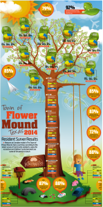
Alberto Cairo and wtfviz.net pointed me to the infographic on the left, a summary of a residents’ survey from the town of Flower Mound, Texas (near Dallas/Fort Worth airport). The highlight of the infographic is the 3-D piecharts nesting in the tree, ready to hatch out into full-fledged misinformation.

At least, they look like 3-D pie charts at first glance.  When you look more closely, the data are three-year trends in approval ratings for a variety of topics, so pie charts would be even more inappropriate than usual as a display method.  When you look even more closely, you see that that’s ok, because the 3-D ellipses are all just divided into three equal wedges — the data aren’t involved at all.

flower_mound 2014 Citizen Survey Infographic_201407151504422733

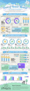
The infographic on the right comes from the town government.  It’s much better, especially by the standards of infographics.

If you follow the link, you can read the full survey results, and see that the web page giving survey highlights actually describes how the survey was done — and it was done well.  They sent questionnaires to a random sample of households, got a 35% response rate (not bad, for this sort of thing) and reweighted it based on age, gender, and housing tenure (ie rent, own, etc) to make it more representative.  That’s a better description (and a better survey) than a lot of the ones reported in the NZ media.


[update: probably original, higher resolution version, via Dave Bremer.]

July 23, 2014

Human statisticians not obsolete

There’s a website, OnlyBoth.com, that, as it says

Discovers New Insights from Data.
Writes Them Up in Perfect English.
All Automated.

You can test this by asking it for ‘insights’ in some example areas. One area is baseball, so naturally I selected the Seattle Mariners, and 2009, when I still lived in Seattle. OnlyBoth returns several names where it found insights, and I chose ‘Matt Tuiasosopo’ — the most obvious thing about him is that he comes from a famous local football family, but I was interested in what new insight the data revealed.

Matt Tuiasosopo in 2009 was the 2nd-youngest (23 yrs) of the 25 hitters who were born in Washington and played for the Seattle Mariners.

outdone by Matt Tuiasosopo in 2008 (22 yrs).

I don’t think our students need to be too worried yet.