Posts from May 2014 (77)

May 6, 2014

Privacy vs. sharing data for the public good – have your say

The New Zealand Data Futures Forum was established by the Ministers of Finance and Statistics to have a balanced conversation with New Zealand about the opportunities, risks and benefits of sharing data.

It is particularly keen that people have a say about the potential sharing of big data (information captured through instruments, sensors, internet transactions, email, video, click streams, and other digital activity) held by public and private-sector organisations. How do individuals control their own information and identity while at the same time creating an environment where data can be harnessed for public and economic good?

The Forum will be active until the end of June this year. To post a comment go to https://www.nzdatafutures.org.nz/have-your-say
 

Personalised medicine: all the screenings

This piece from the Vancouver Sun exaggerates the current level of usefulness of genetic tests, but is spot on about the problems of scale

“As a diagnostic tool, personal genomics is invaluable for selecting therapies, but this whole screening issue opens up another can of worms,” said Lynd. “With the new economies of scale … it is just as easy to look for everything as it is to look for the one thing you need to know.”

Every cancer patient sent for a full genome analysis to determine which variant of breast cancer she has, could potentially become a patient for any or all of the other diseases indicated on their genome and the subject of a whole series of expensive tests to disprove the presence of an illness.

A picture that changed the world

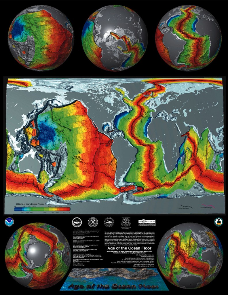
One of the standard science facts that comes in in polls about general scientific ignorance is that the continents move. More than 80% of people in the US know this, but within living memory it went from loony to controversial to accepted to boring enough for school curriculum.

People noticed the similarity of the African and American coastlines as soon as there were maps of both continents, but the idea of millions of square kilometers of land cruising around the earth seemed rather less plausible than a massive coincidence. This, from NOAA is a modern version of one of the most compelling pieces of evidence. The ocean floor is younger along the mid-Atlantic ridge (and similar lines), and gets older, symmetrically, as you move away from the ridge

crustageposter


[the sea turtle migration/continental drift story, though? That’s a myth]

Stories with data

From Harvard Business Review, 10 kinds of stories to tell with data

For almost a decade I have heard that good quantitative analysts can “tell a story with data.” Narrative is—along with visual analytics—an important way to communicate analytical results to non-analytical people. Very few people would question the value of such stories, but just knowing that they work is not much help to anyone trying to master the art of analytical storytelling. What’s needed is a framework for understanding the different kinds of stories that data and analytics can tell. If you don’t know what kind of story you want to tell, you probably won’t tell a good one.


May 5, 2014

Verging on a borderline trend

From Matthew Hankins, via a Cochrane Collaboration blog post, the first few items on an alphabetical list of ways to describe failure to meet a statistical significance threshold

a barely detectable statistically significant difference (p=0.073)
a borderline significant trend (p=0.09)
a certain trend toward significance (p=0.08)
a clear tendency to significance (p=0.052)
a clear trend (p<0.09)
a clear, strong trend (p=0.09)
a considerable trend toward significance (p=0.069)
a decreasing trend (p=0.09)
a definite trend (p=0.08)
a distinct trend toward significance (p=0.07)
a favorable trend (p=0.09)
a favourable statistical trend (p=0.09)
a little significant (p<0.1)
a margin at the edge of significance (p=0.0608)
a marginal trend (p=0.09)
a marginal trend toward significance (p=0.052)
a marked trend (p=0.07)
a mild trend (p<0.09)

Often there’s no need to have a threshold and people would be better off giving an interval estimate including the statistical uncertainty.

The defining characteristic of the (relatively rare) situations where a threshold is needed is that you either pass the threshold or you don’t. A marked trend towards a suggestion of positive evidence is not meeting the threshold.

Weight gain lie factor

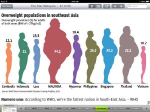
From  Malaysian newspaper The Star, via Twitter, an infographic that gets the wrong details right

BmxTXxXCcAA5D3O


The designer went to substantial effort to make the area of each figure proportional to the number displayed (it says something about modern statistical computing that the my quickest way to check this was read the image file in R, use cluster analysis to find the figures, then tabulate).

However, it’s not remotely true that typical Malaysians weigh nearly four times as much as typical Cambodians. The number is the proportion above a certain BMI threshold, and that changes quite fast as mean weight increases.  Using 1971 US figures for the variability of BMI, you’d get this sort of range of proportion overweight with a 23% range in mean weight between the highest and lowest countries.

Stat of the Week Competition: May 3 – 9 2014

Each week, we would like to invite readers of Stats Chat to submit nominations for our Stat of the Week competition and be in with the chance to win an iTunes voucher.

Here’s how it works:

  • Anyone may add a comment on this post to nominate their Stat of the Week candidate before midday Friday May 9 2014.
  • Statistics can be bad, exemplary or fascinating.
  • The statistic must be in the NZ media during the period of May 3 – 9 2014 inclusive.
  • Quote the statistic, when and where it was published and tell us why it should be our Stat of the Week.

Next Monday at midday we’ll announce the winner of this week’s Stat of the Week competition, and start a new one.

(more…)

Stat of the Week Competition Discussion: May 3 – 9 2014

If you’d like to comment on or debate any of this week’s Stat of the Week nominations, please do so below!

May 4, 2014

False, but not misleading

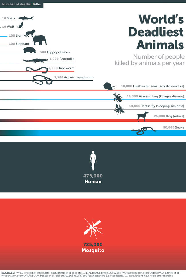
An infographic tweeted by Bill Gates recently on the world’s deadliest animals
00


He’s trying to make the point that malaria is a really big deal, killing more people than human violence, which is true, and which is the impression from the infographic, so it’s not misleading in that sense.

However, mosquitos don’t rend people limb from limb. The mosquito deaths are due to mosquitos infecting people with malaria parasites. The human deaths, however, are just directly due to violence. If  he’d included deaths due to human-human transmission of infection (influenza, tuberculosis, HIV, …), humans would easily be at the top of the list again.

May 3, 2014

Optimising the for the wrong goal

From Cathy O’Neill, at mathbabe.org

By contrast, let’s think about how most big data models work. They take historical information about successes and failures and automate them – rather than challenging their past definition of success, and making it deliberately fair, they are if anything codifying their discriminatory practices in code.

That is, data mining approaches to making decisions are blind to the prejudices attached to characteristics such as gender, ethnicity, age, so they will readily look at historical data, note that women (gays, immigrants, Maori, older people) haven’t been successful in positions like this in the past, and fail to wonder why.