Visualising income inequality
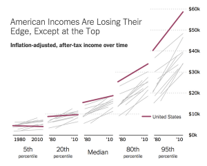
From the New York Times, a set of slope graphs comparing countries over a 30-year period at five points in the distribution.
The headline is a bit exaggerated — the US seems to be retaining its lead at the 80th percentile — but the graph is good.
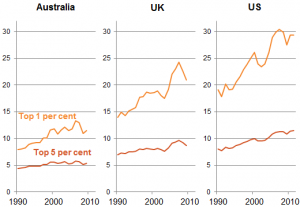
From Jim Savage (on Twitter), income of top 1% or top 5% as multiple of income for bottom 90%
Looking into the top few percent is tricky because the definition of ‘income’ becomes flexible. As Matt Nolan pointed out a few years ago, there was a big increase in the 1%’s share of US income in 1986, which is due at least in part to the Tax Reform Act making tax evasion less advantageous and so increasing reported taxable income.
Thomas Lumley (@tslumley) is Professor of Biostatistics at the University of Auckland. His research interests include semiparametric models, survey sampling, statistical computing, foundations of statistics, and whatever methodological problems his medical collaborators come up with. He also blogs at Biased and Inefficient See all posts by Thomas Lumley »


The Aussie graph just shows that the US story is not the story everywhere.
11 years ago
Your point about tax changes affecting what data gets collected applies to NZ. I remember a couple of years ago reading an article by Susan St James about the rise in NZ Gini coefficient over time, particularly after 1984. She pointed out it is based on income data reported to the IRD. Thus a change in the top rate from about 60% to 45% is going to change what people are going to declare.
A general point is when comparing data over time to be aware that the data collection process is more likely to change with administrative data than with an on-going survey.
11 years ago