Busable Wellington
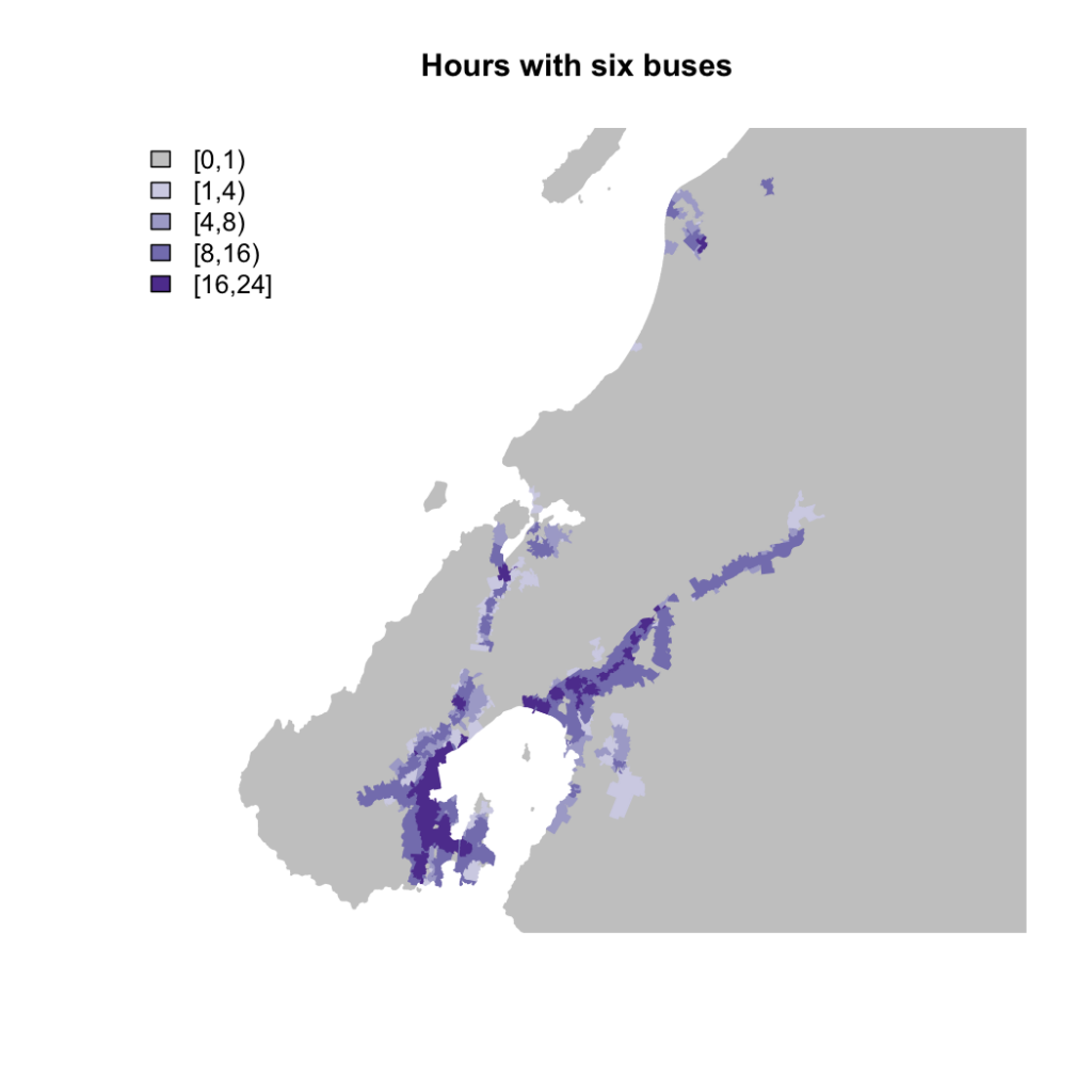
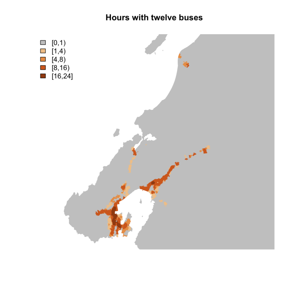
In response to a reader request, here are the same bus service maps as for Auckland. Again, click for big PDF files so you can zoom in. I think these include non-bus transit, but I’m not completely sure.
Hours per day with at least six transit trips within 500m
Hours per day with at least 12 transit trips within 500m
In the Wellington region it seems that people who have any bus service have a useful amount.
The region as a whole has a smaller proportion of people with good public transport than Auckland region (7% in the top category, 60% in the bottom), but if we restrict to Wellington City there are 17% in the top category, 26% in the next, and only 30% in the lowest.
[Update: Here’s a version with a 1km distance instead of 500m]
Thomas Lumley (@tslumley) is Professor of Biostatistics at the University of Auckland. His research interests include semiparametric models, survey sampling, statistical computing, foundations of statistics, and whatever methodological problems his medical collaborators come up with. He also blogs at Biased and Inefficient See all posts by Thomas Lumley »


Thanks! I really appreciate you doing Wellington.
11 years ago
it seems to only be buses, though it’s hard to tell.
Question: if it’s a count of transit services within 500m, and your spatial unit is the meshblock, how do you determine distance? From the centre of the meshblock? Any edge? A spatial intersection? I always make that clear when doing these types of analyses, given that a meshblock can be more than 500m.
Research also shows people are willing to walk further than 500m to reliable, high capacity and frequent transit, such as trains. All the park and rides at Wellington region train stations are at capacity, too. Wellington has a higher transit mode share than Auckland
11 years ago
It’s the ‘label point’ of the first polygon in the shapefile for the meshblock. I did say in the Auckland post. This seems to be reasonably close to the centroid in the few examples I looked at.
In principle, extending from 500m to 1000m could reveal completely new well-served areas, but I’d expect it mostly would just expand the fringes. Another problem in both cities is with straight-line distances: in Wellington, a lot of the 500m around the bus stops at VUW is far enough away vertically to be a problem, and in Auckland it isn’t sensible to walk over Mt Eden if it happens to be between you and a bus.
11 years ago
Pardon, I did read the Auckland post after writing my comment, promptly felt a little silly, but could not find a way to edit it. I wonder how different a raster heat map of transit stop-visits with a distance decay would be. Of course you couldn’t match it up with the census data and you still have the problem with Euclidean planar distance, but I feel the modifiable area unit problem bears even larger here.
A distance decay function could also take into account the number of seats for each mode. I doubt one train with 8 wagons is equivalent to one small bus in peoples’ minds. Nice work though.
11 years ago
I’ll have a look if I get time. I’m not sure how to handle multiple stops on the same trip in that context — it looks as though more computing would be needed (or proper GIS).
11 years ago
Something I made just quickly, as an idea. I don’t think it’s very useful, but I like trying new cartographic techniques. https://lh4.googleusercontent.com/-ryJivU-nNcs/U0XyYmk2myI/AAAAAAAABIo/57_XtDsj3Cg/w1293-h693-no/stopcounts.png (Hopefully the link works.)
11 years ago
Or this: https://plus.google.com/u/0/photos/110613670431997443027/albums/6000468584679664241/6000468583026957090?authkey=CILV9vSTx8ivNw&pid=6000468583026957090&oid=110613670431997443027
11 years ago
I tried a hexbin plot conditioned on hour, which I think has possibilities but wasn’t quite right.
11 years ago
Some roads aren’t going to get a useful amount because they just aren’t made for buses
2009
http://www.stuff.co.nz/national/3122294/Bus-stuck-train-derailed-in-Wellington
2012
http://wellington.scoop.co.nz/?p=51070
.
11 years ago