April 9, 2014
Briefly
Pie chart edition
- Stats NZ has a new dynamic spinning interactive pie chart to show changes in components of CPI
- #onelesspie initiative to clean up Wikipedia by upgrading pie charts to something more useful
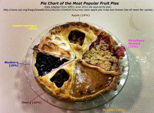
- A chart pie by Melissa Wakefield, using pie data from NPR
Thomas Lumley (@tslumley) is Professor of Biostatistics at the University of Auckland. His research interests include semiparametric models, survey sampling, statistical computing, foundations of statistics, and whatever methodological problems his medical collaborators come up with. He also blogs at Biased and Inefficient See all posts by Thomas Lumley »
