Posts from March 2014 (59)

March 4, 2014

What you don’t know

The previous post was about the failure of the ‘deficiency model’ of communication, which can be caricatured as the idea that people who believe incorrect things just need knowledge pills.

Sometimes, though, information does help. A popular example is that providing information to university students about the actual frequency of binge drinking, drug use, etc, can reduce their perception that ‘everyone is doing it’ and reduce actual risky  behaviour.

So, it’s interesting to see these results from a US survey about same-sex marriage

Regular churchgoers (those who attend at least once or twice a month), particularly those who belong to religious groups that are supportive of same-sex marriage, are likely to over- estimate opposition for same-sex marriage in their churches by 20 percentage points or more.

  • „„About 6-in-10 (59%) white mainline Protestants believe their fellow congregants are mostly opposed to same-sex marriage. However, among white mainline Protestants who attend church regularly, only 36% oppose allowing gay and lesbian people to legally marry while a majority (57%) actually favor this policy.
  • Roughly three-quarters (73%) of Catholics believe that most of their fellow congregants are opposed to same-sex marriage. However, Catholics who regularly attend church are in fact divided on the issue (50% favor, 45% oppose).

For survey nerds, the sampling methodology and complete questionnaire are also linked from that web page.
What you do know that ain’t so

From a randomised trial of four different sets of information about vaccine benefits (via Brendan Nyhan)

Parents were randomly assigned to receive 1 of 4 interventions: (1) information explaining the lack of evidence that MMR causes autism from the Centers for Disease Control and Prevention; (2) textual information about the dangers of the diseases prevented by MMR from the Vaccine Information Statement; (3) images of children who have diseases prevented by the MMR vaccine; (4) a dramatic narrative about an infant who almost died of measles from a Centers for Disease Control and Prevention fact sheet; or to a control group.

In particular, intervention 4 is a popular and sensible idea, and it has occurred to people from Benjamin Franklin to Kiwi parents and the Herald. However:

RESULTS: None of the interventions increased parental intent to vaccinate a future child. Refuting claims of an MMR/autism link successfully reduced misperceptions that vaccines cause autism but nonetheless decreased intent to vaccinate among parents who had the least favorable vaccine attitudes. In addition, images of sick children increased expressed belief in a vaccine/autism link and a dramatic narrative about an infant in danger increased self-reported belief in serious vaccine side effects.

This research is depressing from the point of view of science communication. The problem is that the message goes in two apparently opposite ways.  One conclusion is that increasing trust in science and medicine is the only solution, which would require more public contact and communication, and openness about uncertainty.  The other conclusion is that a public health advertising campaign is a treatment, and like any other treatment it should be evaluated for safety and effectiveness before it’s applied to the population, an approach that seems to imply a reduction in open and unfiltered communication.

I don’t think the contradiction is unavoidable; I think more communication about research process — who are we and what do we actually do — will help, but also that advertising, whether government-funded or pushed by PR departments, is actually dangerous.  If we overstate claims about the biochemical effects of compounds in chocolate, or the number of deaths prevented by lowering the blood alcohol limit, why should we be trusted on important issues?


March 3, 2014

Stat of the Summer Winner!

Hope you all had a wonderful summer! Thank you to everyone who nominated stats in the media during the summer break period. We’ve chosen Tommy Honey’s nomination to win the prize:

Statistic: Food in Guinea, Gambia, Chad and Iran costs people 2 times more than other consumer goods, making those the most expensive countries for citizens to buy food

Source: NZ Herald
Date: 20 January 2014

In this morning’s Herald we are told by Brendan Manning and Patrice Dougan
that “NZ ranks 23rd equal with Israel when it comes to healthy eating.” They provide a link to a report produced by Oxfam: goodenoughtoeatmediabrieffinalversionenglish.pdf

I don’t know where to start….

In spite of the report stating “[the report] is the first of its kind”, the article insists on implying several times that New Zealand’s position has changed (“The cost of food and unhealthy eating habits pushed New Zealand down the list… New Zealand has fallen well behind Australia and most of Europe in a new report ranking the healthiest places to eat in the world…. New Zealand also fell behind the United Kingdom (13), Japan (21) and the United States (21).”).

The article also says of New Zealand, “Ranked on obesity, only 13 countries out of 125 scored worse” yet provides no evidence of this and the report it links to does not have the full (or indeed, any) rankings.

It also says, “Food in Guinea, Gambia, Chad and Iran costs people 2 times more than other consumer goods, making those the most expensive countries for citizens to buy food.” What food? What consumer goods? Yesterday I bought a pie ($4.50) and a battery ($1.50). Therefore, in New Zealand, food costs 3 times more than other consumer goods. The only reference to this in the report is the statement, “the only countries where food is more expensive are Guinea (100 points) and The Gambia (97 points)” and Iran doesn’t get a mention at all.

To be fair to the journalists (although, why should we?) they are simply repeating mistakes from the Oxfam website (http://www.oxfam.org.nz/news/new-zealand-beaten-australia-oxfam-s-new-global-food-table) where it states, “Food in Guinea, The Gambia, Chad and Iran costs people two-and-a-half times more than other consumer goods, making those the most expensive countries for citizens to buy food.”

The only data provided by Oxfam is the report linked to by the Herald, which contains no rankings. The Oxfam statement does claim that “New Zealand also fell behind the United Kingdom (13), Japan (21) and the United States (21)”, and it is perhaps here where the Herald got its information. A pity it repeated it unquestioningly…

Stat of the Week Competition: March 1 – 7 2014

Each week, we would like to invite readers of Stats Chat to submit nominations for our Stat of the Week competition and be in with the chance to win an iTunes voucher.

Here’s how it works:

  • Anyone may add a comment on this post to nominate their Stat of the Week candidate before midday Friday March 7 2014.
  • Statistics can be bad, exemplary or fascinating.
  • The statistic must be in the NZ media during the period of March 1 – 7 2014 inclusive.
  • Quote the statistic, when and where it was published and tell us why it should be our Stat of the Week.

Next Monday at midday we’ll announce the winner of this week’s Stat of the Week competition, and start a new one.

(more…)

Stat of the Week Competition Discussion: March 1 – 7 2014

If you’d like to comment on or debate any of this week’s Stat of the Week nominations, please do so below!

March 2, 2014

Super 15 Predictions for Round 4

Team Ratings for Round 4

The basic method is described on my Department home page. I have made some changes to the methodology this year, including shrinking the ratings between seasons.

My predictions are early this week and may not appear next week unless I can get some internet access while travelling.

Here are the team ratings prior to this week’s games, along with the ratings at the start of the season.

Current Rating Rating at Season Start Difference
Crusaders 6.77 8.80 -2.00
Sharks 5.76 4.57 1.20
Chiefs 4.67 4.38 0.30
Waratahs 3.82 1.67 2.20
Brumbies 3.56 4.12 -0.60
Bulls 3.44 4.87 -1.40
Stormers 2.08 4.38 -2.30
Reds 0.18 0.58 -0.40
Blues -1.32 -1.92 0.60
Cheetahs -1.38 0.12 -1.50
Hurricanes -1.43 -1.44 0.00
Highlanders -3.34 -4.48 1.10
Lions -4.26 -6.93 2.70
Rebels -5.00 -6.36 1.40
Force -6.56 -5.37 -1.20


Performance So Far

So far there have been 16 matches played, 8 of which were correctly predicted, a success rate of 50%.

Here are the predictions for last week’s games.

Game Date Score Prediction Correct
1 Blues vs. Crusaders Feb 28 35 – 24 -7.80 FALSE
2 Rebels vs. Cheetahs Feb 28 35 – 14 -2.30 FALSE
3 Stormers vs. Hurricanes Feb 28 19 – 18 8.50 TRUE
4 Chiefs vs. Highlanders Mar 01 21 – 19 11.70 TRUE
5 Waratahs vs. Reds Mar 01 32 – 5 3.40 TRUE
6 Force vs. Brumbies Mar 01 14 – 27 -6.80 TRUE
7 Bulls vs. Lions Mar 01 25 – 17 10.60 TRUE


Predictions for Round 4

Here are the predictions for Round 4. The prediction is my estimated expected points difference with a positive margin being a win to the home team, and a negative margin a win to the away team.

Game Date Winner Prediction
1 Hurricanes vs. Brumbies Mar 07 Brumbies -1.00
2 Reds vs. Cheetahs Mar 07 Reds 5.60
3 Crusaders vs. Stormers Mar 08 Crusaders 8.70
4 Force vs. Rebels Mar 08 Force 0.90
5 Bulls vs. Blues Mar 08 Bulls 8.80
6 Sharks vs. Lions Mar 08 Sharks 14.00


March 1, 2014

It’s cold out there, in some places

Next week I’m visiting Iowa State University, one of the places where the discipline of statistics was invented. It’s going to be cold — the overnight minimum on Sunday is forecast at -25C — because another of the big winter storms is passing through.

The storms this year have been worse than usual. Minneapolis (where they know from cold) is already up to its sixth-highest number of days with the maximum below 0F (-18C, the temperature in your freezer). The Great Lakes have 88% ice cover, more than they have had for twenty years.

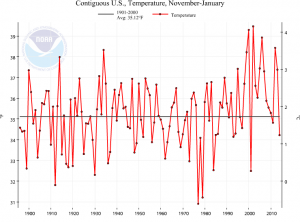
Looking at data from NOAA, this winter has been cold overall in the US, very slightly below the average for the past century or so.

us

However, that’s just the US. For the northern hemisphere as a whole, it’s been an unusually warm winter, well above historical temperatures

hemisphere


This has been your periodic reminder that weather news, for good reasons, gives you a very selective view of global temperature.


Briefly

  • From Tim Harford, Toronto effectively had a randomised trial for countdown walk signals — what do they do for accidents?
  • From Mathbabe It would be idiotic for someone with the intention of being discriminatory to do so outright. It’s much easier to embed such a thing in an opaque model where it will seem unintentional and will probably never be discovered at all.

    But how is an investigative journalist going to even approach that?

  • From Matthew Ericson of the New York Times: “When maps shouldn’t be maps”
  • From Max Fisher at the Washington Post, a look at the problems of interpreting changes in rankings

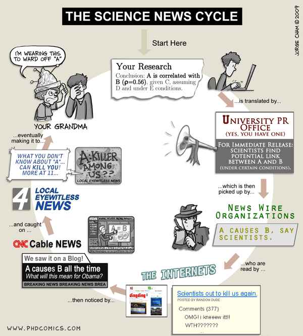
Science news cycle

From Piled Higher and Deeper.  Substitute as necessary if your grandma is a scientist.

sciencegap


The only thing wrong with this is it gives too much credit to university PR departments.