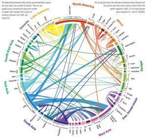
Where do people come from?
An analysis of global migration flows, published in Science, via Quartz
The first thing that Kiwis will note is the graph says no-one migrates to New Zealand. That’s even though the proportion of foreign-born residents in New Zealand is almost twice that in the USA and more than twice that in the UK.
As usual, the issue is denominators: the graphic shows the largest migration flows, and in New Zealand the flow of migrants to Australia is about equal to all the inflows put together. None of the other flows of migrants are large enough to show up.
Thomas Lumley (@tslumley) is Professor of Biostatistics at the University of Auckland. His research interests include semiparametric models, survey sampling, statistical computing, foundations of statistics, and whatever methodological problems his medical collaborators come up with. He also blogs at Biased and Inefficient See all posts by Thomas Lumley »