Graphic lie factor: sports edition
via Alberto Cairo, this gem from Malaprensa, a Spanish mediawatch site, originally from Marca.
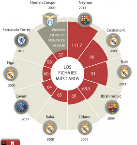
This isn’t actually a pie chart, it’s a bar chart that has been horribly warped around a circle. It shows top transfer fees in football (ie, soccer). One Neymar da Silva Santos Júnior has allegedly ended up with a transfer fee estimated at 111 million euros, through complicated arrangements. This would be a record; the originally announced figure was a mere 57 million euros, which would put Neymar in tenth place alongside Hernan Crespo
Malaprensa points out that the figures aren’t inflation-adjusted, and that they aren’t including comparable sets of payments for all the players. They don’t point out how bad the display is: compare the heights for 57 and 111 million euro, and then think about what the area comparison would be.
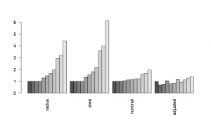
I’ve redrawn the bars in a sensible coordinate system, showing the apparent differences based on the height, area, nominal euro amount, and euro amount adjusted for inflation (the last is from Malaprensa), with Crespo’s transfer fee scaled to 1 in each case

It’s much less impressive when it’s shown accurately.
Thomas Lumley (@tslumley) is Professor of Biostatistics at the University of Auckland. His research interests include semiparametric models, survey sampling, statistical computing, foundations of statistics, and whatever methodological problems his medical collaborators come up with. He also blogs at Biased and Inefficient See all posts by Thomas Lumley »
