Manipulating official statistics
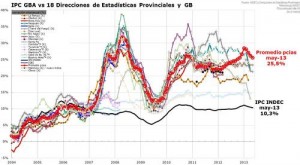
This is what it looks like when a country does manipulate its official statistics (from Ezequiel Tortorolli, via Tom Pepinsky and Xavier Marquez).
The black line is Argentina’s official federal inflation rate. The red line is the average of the rates for the 18 provinces, which are the fainter wiggly lines.
[Update: Argentina has just announced a new inflation index that’s supposed to be non-bogus. It will take a while to convince people.]
Thomas Lumley (@tslumley) is Professor of Biostatistics at the University of Auckland. His research interests include semiparametric models, survey sampling, statistical computing, foundations of statistics, and whatever methodological problems his medical collaborators come up with. He also blogs at Biased and Inefficient See all posts by Thomas Lumley »

It was also dangerous to point out that the “official” statistics were wrong. See http://magazine.amstat.org/blog/2012/12/01/argentinastatistics/
11 years ago