Posts from January 2014 (43)

January 10, 2014

Why data isn’t enough

By a data enthusiast, Felix Salmon, writing at Wired

After disruption, though, there comes at least some version of stage three: over­shoot. The most common problem is that all these new systems—metrics, algo­rithms, automated decisionmaking processes—result in humans gaming the system in rational but often unpredictable ways. Sociologist Donald T. Campbell noted this dynamic back in the ’70s, when he articulated what’s come to be known as Campbell’s law: “The more any quantitative social indicator is used for social decision-making,” he wrote, “the more subject it will be to corruption pressures and the more apt it will be to distort and corrupt the social processes it is intended to monitor.”

Meet Mengdan Yu, Statistics summer scholar

Every year, the Department of Statistics offers summer scholarships to a number of students so they can work with our staff on real-world projects. We’ll be profiling them on Stats Chat.

Mengdan (below) is working with Jessica McLay on a project titled The simario R package. She explains:

Mengdan Yu

“The simario R package is a collection of R functions for performing dynamic microsimulation developed by  COMPASS (the Centre of Methods and Policy Application in the Social Sciences at the University of Auckland). Dynamic microsimulation is used to test ‘what if?’ situations.  The starting point of the simulation is a set of attributes for each unit (usually individual) and the attributes (variables) are simulated or updated in annual steps.  User-specified modifications can be made on the variables at the start or any point during simulation in order to see the effects on output attributes of interest.

“A simple demonstration microsimulation model (demo model) using the simario R functions was created two years ago, but the focus since then has been on developing a complicated microsimulation model called Modelling the Early Life Course (MELC).  Compared to the demo model, the MELC model uses newer versions of the simario functions and has had a lot of additional functionality built in.

“What I’m doing for my summer project is ensuring that the newer versions of the simario functions  work properly with the demo model and extend the demo microsimulation model.  The extension includes adding more variables to the system, showcasing the different ways variables can be simulated over time and including more of the functionality that is currently in MELC but not in the demo model.  I will also be checking the documentation for all the functions in the simario package to make it ready to publish as an official R package.

“This is useful research as dynamic microsimulation is increasingly used, especially in government, to help in making policy decisions.  There are a number of programming languages used to create microsimulation models, including those based on C++, C#, SAS, and Java.  However, given the prominence of the R language, a package for microsimulation in R could prove useful and helpful to analysts attempting microsimulation.  The demo model in conjunction with an article (to be written later by COMPASS) will show how to put the functions together to create a working microsimulation model.

“This is my third year of a Bachelor of Science majoring in Statistics and Computer Science.  Initially, I chose statistics because I’m into calculating probabilities, and have been since I was a child. As I learned more about stats, especially analysing data by using software, I appreciated even more how useful the subject is in many areas. Studying statistics has improved my logic thinking and my ability to solve real-life problems with stats techniques.

“For the rest of the summer, I’d like to do something relaxing: hang out with my friends, sleep at home and watch dramas so I can be positive and energetic for next semester.”




January 9, 2014

Infographic of the week

Via @keith_ng, this masterpiece showing that more searches for help lead to more language. Or something.

badlang

It’s not, sadly, unusual to see numbers being used just for ordering, but in this case the numbers don’t even agree with the vertical ordering.  And several of them aren’t, actually, languages. And the headline is just bogus.

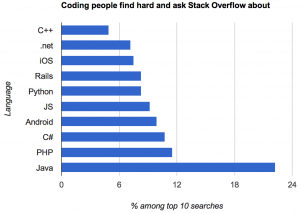
This version, by Kevin Marks (@kevinmarks), at least is accurate and readable.

oklang

but it’s hard to tell how much of Java’s dominance is due to it being popular versus being confusing.

Adam Bard has data on the most popular languages on the huge open-source software repository GitHub. This isn’t quite the right denominator, since Stack Overflow users aren’t quite the same population as GitHub users, but it’s something.  Assigning iOS, Android, and Rails, to Objective-C, Java, and Ruby respectively, and scaling by GitHub popularity, we find that C# has the most StackOverflow queries per GitHub commit; Objective-C and Java have about two-thirds as many.  In the end, though, this data isn’t going to tell you much about either high-demand programming skills or the relative friendliness of different programming languages.


Heat wave in Greenland

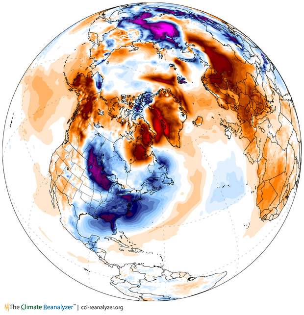
Following up on Monday’s post, here is the estimated surface air temperature anomaly yesterday over North American and the Arctic, from the site Climate Reanalyzer

T2_anom_satellite1


“Anomaly” means this is the temperature relative to the 1980-2000 average for the time of year. The US midwest and east cost are cold, as is Siberia, but Greenland, northern Europe, and most of Russia are hot.  The northern hemisphere as a whole is half a degree above average, and the Arctic is 1.7 degrees above.

This picture still requires weather models to combine weather-station and satellite measurements and extrapolate them across the globe. That’s done by NOAA’s Global Forecast System, which is a fairly uncontroversial piece of modeling.

January 7, 2014

NZ electoral visualisations

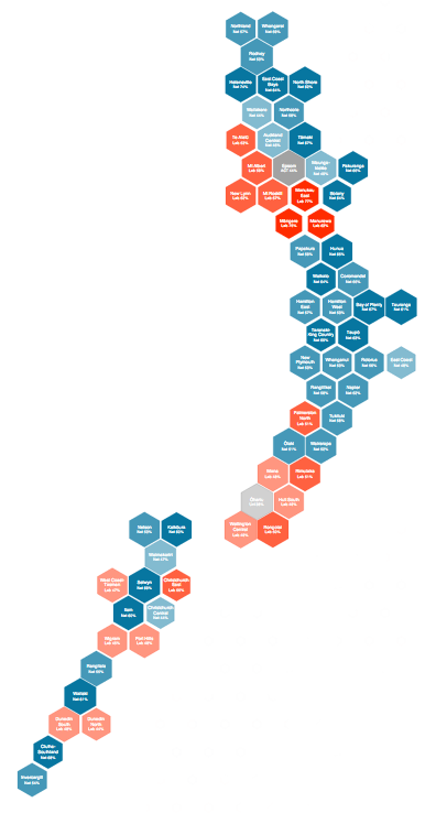
The first post at the new Hindsight blog is on Chris McDowall’s hexagonal maps of NZ political geography.

hexmap


He also has some slides describing the construction of another visualisation, relating party vote to deprivation index.

How dangerous is the rest of the world?

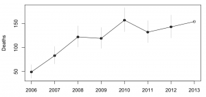
Both Stuff and the Herald have stories today based on MFAT statistics on consular assistance provided for deaths and accidents overseas.  The basic message is that deaths overseas are increasing.

Both sites have interactive graphics: Stuff has a clicky map, and the Herald has barplots where you can select a country. A very nice feature of the Herald story is that they have more data, and a link to let you download it. They got the data under the Official Information Act, which is an impressive-sounding way of saying they asked MFAT for it (as Graeme Edgeler has pointed out, even ringing up some departmental office and asking what time they’re open is an Official Information Act request.)deaths

From the extended data it’s clear that consular assistance for deaths is up a lot over time. That’s a much bigger increase than the number of trips overseas, and the increase looks pretty similar if you exclude Australia, which is unrepresentative because so many Kiwis actually live there. I don’t have any real idea why this is happening, and apparently neither do the journalists.

It’s interesting to look at how dangerous foreign travel is based on these data.  For Thailand, the story in Stuff quotes 115000 trips and 18 deaths in the 9 months to September 2013. That gives a mortality rate of 0.16 per 1000 trips. The annual mortality rate for New Zealand as a whole is 6.8 per 1000 people per year, but travellers tend to be younger and healthier than average. For twentysomethings, the annual mortality rate is about 0.6 per 1000 per year, so the average trip uses up at most 3 months worth of mortality risk — travelling to Thailand is dangerous, but not very dangerous.   Even then, we can’t be sure that it’s Thailand that is dangerous: other contributing explanations could be that people do riskier things while they are there, or that the sort of people who travel to Thailand are prone to taking more risks.  The figure for all countries is about half that for Thailand, though it’s less reliable because of the difficulty in knowing how to handle Australia.

The figures for deaths while travelling should be fairly reliable — I’d expect most deaths of travellers to require some consular assistance — but the figures for accidents are obviously less complete. That didn’t stop Stuff saying

But according to the figures, deaths far outnumber accidents and injuries for New Zealanders across the globe.

The phrase “according to the figures” is doing a lot of work in that sentence, if you want to be able to say it with a straight face.


Update: Luis Apiolaza tracked down data(XLS) on deaths of visitors to NZ. Mortality is about 0.05-0.07 per 1000 trips. Visitors are safer here than we are abroad.

January 6, 2014

In the deep midwinter

It’s cold in the United States at the moment. Very cold. Temperatures in places where lots of people live are down below -20C (before worrying about the wind chill).This isn’t just hypothermia weather, this is ‘exposed skin freezes in minutes’ weather, and hasn’t been seen on such a large scale for decades. So why isn’t this evidence against global warming?

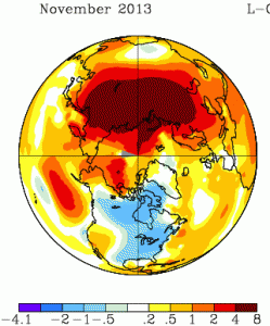
It will be a month or two before we have the global data, but the severe cold snaps in recent years have been due to cold air being in unusual places, rather than to the world being colder that week. For example, November 2013 was also cold in the North America, but it was warm in northern Russia; the cold had just moved (map from NASA).

nmaps


The cold spells in Europe in recent years have been matched by warm spells in Greenland and northeast Canada. You don’t hear about these as much, because hardly anyone lives there.  The ‘polar vortex‘ being described on the US news is an example of the same thing: cold air that usually stays near the pole has moved down to places where people live. That suggests the global temperature anomaly maps for December/January will show warmer-than-usual conditions in other parts of the far northern hemisphere.

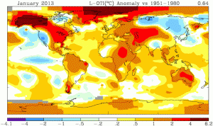
For contrast, look at the heat wave in Australia last January, when the Bureau of Meteorology had to find a new colour to depict really, really, really hot. This map is from the same NASA source (just a different projection)

nmaps-oz


Not only was all of Australia hot, the ocean south of Australia was warmer than typical. This wasn’t a case of cold air from the Southern Ocean failing to reach Australia, which causes heat waves in Melbourne several times a year. It doesn’t look like a case of just moving heat around.

No single weather event can provide any meaningful evidence for or against global warming. What’s important for honest scientific lobbying is whether this sort of event is likely to become more common as a result. The Australian heat waves definitely are. The situation is less clear for the US winter cold: the baseline temperatures will go up, which will mitigate future cold snaps, but there is some initial theoretical support for the idea that warming of the Arctic Ocean increases the likelihood that polar vortices will wander off into inhabited areas.


[note: you can also see in the Jan 2013 picture that the warm winter in the US was partly balanced by cold in Siberia that you didn’t hear so much about]

January 5, 2014

But does it work?

The Public Accounts Committee of the British House of Commons has just released a report on access to clinical trial information, especially in the context of stockpiling the influenza anti-viral, Tamiflu, for use in future pandemics. Their summary says

The Department of Health (the Department) spent £424 million on stockpiling Tamiflu, an antiviral medicine used in the treatment of influenza, for use in a pandemic, but had to write off £74 million of its Tamiflu stockpile as a result of poor record-keeping by the NHS.

There is a lack of consensus over how well Tamiflu works, in particular whether it reduces complications and mortality. Discussions over this issue among professionals have been hampered because important information about clinical trials is routinely and legally withheld from doctors and researchers by manufacturers. This longstanding regulatory and cultural failure impacts on all of medicine, and undermines the ability of clinicians, researchers and patients to make informed decisions about which treatment is best. There are also concerns about the information made available to the National Institute for Health and Care Excellence (NICE) which assesses a medicine’s clinical and cost–effectiveness for use in the NHS.

The information from the clinical trials is, finally, being released: the director of the Cochrane Library says (at AllTrials)

The Cochrane Collaboration – who gained full access to all documents held by European regulators – discovered that many large trials on Tamiflu have not reported results and that for many more trials only partial information was available. Cochrane is now receiving full clinical study reports from Roche. This new information is being assessed by the twelve international researchers who make up the Cochrane Collaboration neuraminidase team, funded by the National Institute of Health Research. They are close to submitting the updated evidence for peer review. The findings will for the first time provide what the PAC calls for, ‘independent scrutiny of a medicine’s effectiveness.’ 

Tamiflu is one of the charismatic megafauna of the publication bias problem: it’s not that research into influenza is especially bad, it’s that this is one issue where it’s possible to make governments take notice.

January 4, 2014

Briefly

The basic statistical question is “Compared to what?”

  • Compared to what? Mark Kleiman If you ignore the benefits of [cannabis] legalization, it looks like a pretty bad idea. If you ignore the costs, it looks like a pretty good idea.
  • Compared to what? What’s wrong with this comparisonmars
  • We criticize the Herald and the Fairfax papers a lot, but it could be much worse

This year, the Mail reported that disabled people are exempt from the bedroom tax; that asylum-seekers had “targeted” Scotland; that disabled babies were being euthanised under the Liverpool Care Pathway; that a Kenyan asylum-seeker had committed murders in his home country; that 878,000 recipients of Employment Support Allowance had stopped claiming “rather than face a fresh medical”; that a Portsmouth primary school had denied pupils water on the hottest day of the year because it was Ramadan; that wolves would soon return to Britain; that nearly half the electricity produced by windfarms was discarded. All these reports were false.

and that doesn’t include any of their science/health stories that ended up on StatsChat via the local media.

Blowing in the wind

From Cameron Beccario, an interactive visualisation of wind speeds around the world, with your choice of projection, and winds at levels from ground up to the stratosphere.

earth