Posts from January 2014 (43)

January 20, 2014

What’s wrong with this picture?

There’s a popular image on Twitter at the moment, labelled as “Economy Class on Pan Am 747 in the late 60’s”

BeXEgN-IYAAeS_d

Air travel, especially in the United States, was much more luxurious then, but there are some problems with this picture.

The easy ones: the picture as posted by @HistoryInPics has no attribution. It’s also mislabelled, and has been converted to black and white to make it look more period. The original (via @hypatiadotca) is a Boeing promotional photo of a mock-up of the 747 cabin.

SetWidth1200-K14142

Presumably the mock-up was done with Pan Am and their customers in mind, since Pan Am were the big customer, but that’s not the same thing at all. And the 747 wasn’t used in the 1960s — that’s what I noticed, since I know the first test-flight of the 747 was the year I was born.

Now we’ve got that out of the way, the StatsChat-relevant aspect of the picture is the dramatic fall in the price of flying over the years. In the 1960s Pan Am used to charge about US$500 for a round-trip from New York to London.  Adjusted for inflation, that’s nearly US$4000 now, which would get you a much nicer business-class ticket. In terms of median income the fall in price is even greater, and much greater in terms of the income of the sort of people who used to fly in the 1960s.

My parents moved from the UK to Australia in the mid-1960s. It was ten years before they next saw their families.  That’s what has really changed about flying.


[Update: 2014-5-30  @HistoryinPics has excelled themselves (screenshot)]

Meet Tim Evans, Statistics summer scholar

Every year, the Department of Statistics at the University of Auckland offers summer scholarships to a number of students so they can work with our staff on real-world projects.  Tim (below) is working with Associate Professor Rachel Fewster on a project called Acoustics as a method of wildlife monitoring. Tim explains:

“My research project involves taking noisy audio recordings taken in the bush and trying to extract key features and parameters from these recordings. These features can then be used to train a statistical model that will be able to recognise patterns in bird song and calls of a specific species. The project will focus on recordings of an endangered native species, the kōkako.

Tim Evans

“This research will be of significant use to the conservation efforts for the kōkako. Currently, population estimates rely on being able to find kōkako nests during fledging season and banding new chicks when they fledge. This is extremely difficult, as it relies on extensive hours from volunteers working in dense bush. The vast majority of chicks fledge without being banded.

“With the kōkako detection model, we will be able to use triangulation to pinpoint the position of the birds when they call or sing. This will enable us to monitor their behaviour and narrow down kōkako nests and territories. This will make far easier the process of finding nests and banding and monitor new chicks, and will give rangers and volunteers information about birds’ whereabouts.

“I hold a Bachelor of Engineering (Hons) in Electrical and Electronics Engineering. I am now studying a Graduate Diploma in Science majoring in Mathematics. Statistics appeals to me as it is provides a scientist with a formal language of the real world.”

“In my spare time this summer, I hope to be getting out for the odd surf. I also hope to get out on our yacht with my dad and my brother.”


January 19, 2014

How to beat Lotto

That is, how to gamble in a way that over a course of a year, gives you a higher chance at a larger payout than playing NZ Lotto each week and hoping for Division 1. We all know you can’t “beat Lotto” in the usual sense of improving your odds of winning.

In the ordinary Saturday Lotto, you pick 6 numbers out of 40, and if all 6 are correct (which they aren’t) you win $1 million. The chance of winning is 1 in 3838380 per ‘line’. Suppose you play the minimum of 4 lines, for $6, each week for a year. The chance of winning in a year is one in 18453.75. That is, on average you’d expect to win once in every 18453 years and 9 months.

Alternatively, suppose you save up the $6 per week, and then at the end of the year go to a casino and play roulette.  Put it all on a single number.  If you win, put it all on a single number again, and then if you win,  put it all on a ‘double street’ of six numbers.  Your chance of winning (in double-zero roulette) is 1 in 9145.33, and if you win you will make $2426112.

So, you get twice the chance of winning as you would have for Lotto division 1, and more than twice the payout. The expected return is 85%, much better than the 56% that NZ Lotteries returns (averaged over all its games, annual report).  Does that mean it’s a good idea? No. Not even slightly.  You have a 37 in 38 chance of turning up with $300 and losing it in a few minutes. If you don’t, you have a 37 in 38 chance of losing $7500 in the next few minutes, and if you don’t, you have about an 85% chance of losing more than quarter of a million dollars.   This strategy makes your losses obvious, which makes gambling no fun. And you still only win once every 91 centuries.

Enjoyable gambling, including Lotto, is based on making your losses less obvious by masking them with small wins and stretching them out over time. Of course, that’s also what makes gambling, including Lotto, potentially addictive.

January 18, 2014

Briefly

Prostate cancer controversy

The Ministry of Health has put out two brochures about prostate cancer screening, and there has been a heated reaction from some doctors. Prostate cancer screening in men without any symptoms is controversial, because it makes a lot of sense that it would have benefits, but the estimates from clinical trials are surprisingly small, and it definitely causes harm.  There are plausible reasons to hope the benefits are larger than estimated in the trials, but not clear evidence.

The US Preventive Services Taskforce says that basically no-one should be screened, because there’s moderately good evidence that screening does not prolong life, and gives only small reductions in prostate cancer death. A statement from a group of prostate cancer researchers (somewhat misleadingly called a ‘consensus statement’, given the clear lack of consensus) says basically everyone should be screened because there’s good evidence that it reduces death specifically from prostate cancer. This isn’t just a situation where some people would decide one way and some would decide the other way because of different preferences and values; this is genuine disagreement.

You’re obviously not going to get a resolution of this question from me. But according to the ChCh Press

The Prostate Cancer Foundation says the pamphlets are perfectly balanced and branded the critics as “pathetic”.

Here I do have to disagree.  One of the pamphlets says literally not one word about risk or harm or any possible disadvantage of screening. I don’t see how that can possibly be `perfectly balanced’.

The other one is substantially better; it says

A prostate check aims to reduce your chances of being harmed or dying from prostate cancer. While the PSA blood test and the DRE may be uncomfortable, there is no risk from having them. They do not harm you in any way.

Depending on your PSA and DRE results, you may need to make decisions about more tests and possibly treatments. The tests and treatments have benefits and risks (can cause harm). You need to understand what the benefits and risks are so you can make the right decisions for you and your family and whānau.

The second paragraph there is the important one. Personally, I don’t think it’s sufficiently clear how much the second paragraph takes back the claims of the first, but it is there, as is a description of the treatment options. The pamphlet also does emphasize that screening should be an individual choice, but there isn’t  any suggestion that there is any uncertainty or controversy over the best approach.

In any case, if you’re male, older than, say, Russell Coutts, and the sort of person who reads StatsChat, it’s probably worth reading both the US PTF anti-screening recommendations and the Melbourne Consensus pro-screening recommendations. They are both produced by intelligent, knowledgeable people using the same set of facts and trying their best to help.

It’s a real pity the NZ Guidelines Group is no more. They wouldn’t be able to solve the problem, either, but they might at least be able to referee the argument and perhaps reduce the name-calling.

Desolation of Smog

From the air pollution monitor at the US Embassy in Beijing

01-16-2014 04:00; PM2.5; 671.0; 613; 
  Beyond Index (at 24-hour exposure at this level)

“Beyond Index” means “when we made up the categories, we didn’t bother to go this high because it obviously wouldn’t be needed.”  671 μg/m3 of PM2.5 is roughly the same as the peak particulate air pollution in the Great London Smog of 1952 — only a rough comparison is possible because air pollution was measured differently back then.  The pollution isn’t quite as bad as the London Smog because the Beijing air improves around midday and again in the evening. The 24 hour average was ‘only’ 448μg/m3, and the following day’s average was down to 154, a bit more than four times the US standard for the 98th percentile of days.

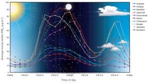
For comparison, here’s a New Zealand graph from GNS. The y-axis is PM10, which includes larger particles that aren’t measured in the Beijing figure; PM2.5 would be very roughly half as high.

air-quality-graph

Last month there was a story at Quartz about China’s air pollution, mentioning how sharing face-mask pictures had become a thing. Here are some examples, from the South China Morning Post

masks

They make good photos. They don’t protect you from PM2.5, which goes straight through ordinary paper or cloth masks.

Vaccine-preventable disease outbreaks

The Council on Foreign Relations has built an interactive map showing outbreaks of the major vaccine-preventable diseases since mid-2008, based on news stories. Here’s the local map

vaccine-oznz


The red circles are measles; the green are pertussis; blue are rubella.

There are two big limitations to the use of news stories as the source. The first is obvious from the map. That outbreak of 3500 pertussis cases in Western Australia wasn’t actually among the Ngaanyatjarra people of the Western Desert, where the circle is. It was mostly in Perth, but the story didn’t say that, just “Western Australia”.

The second limitation is that not everything gets reported. Here’s a map of more of the world

vaccine-world


The small orange circles are  polio, and probably include every polio case diagnosed in the world. The larger, yellow circles include cholera and typhoid, and are just big outbreaks. The brown circles are mumps, which only seems to make the news in Europe and the Middle East. And there’s basically no pertussis reported in Africa or South Asia, because it’s underdiagnosed and not really news.

January 17, 2014

Meet Lily Trinh, Statistics summer scholar

Every year, the Department of Statistics at the University of Auckland offers summer scholarships to a number of students so they can work with our staff on real-world projects.  Lily (below) is working with Dr. Steffen Klaere (Statistics) and Prof Miriam Meyerhoff (Linguistics) on a project called Structure detection in spoken language features. Lily explains:

“I ain’t going nowhere. Me no care.” These are a couple of examples that illustrate my rather interesting project research topic, looking at the use of the non-standard spoken English form also known as Bequia Creole (Bequia is  part of Saint Vincent and the Grenadines). Linguists have hypotheses about Creole speakers using certain language patterns in their speech, and as statisticians we are especially interested in potential groupings among features of Creole and identifying those patterns. Over the summer, we will be analysing data obtained from conversations with speakers from three villages.

Lily Trinh

“One example is the Creole form of negation (ain’t instead of am not in standard English) possibly clustered with negative concord or double negation (I ain’t … nowhere instead of I am not … anywhere in standard English). Some other features of Creole we are also interested in include the zero copular verb (the verb “be” in English), the non-standard subject form, tense-aspect markers and the like. In particular, we would like to use statistical tools to visualise and quantify any clustering relationships.

“Being bilingual myself – I also speak Vietnamese – I hope the research will give some kind of insight into linguistic understanding of spoken languages.

“I have just completed two-and-a-half years of a conjoint BA/BCom degree. Aside from my Statistics major, I am also completing a second major in Economics for the BA component of my degree.

“I really enjoy the problem-solving aspect of science and I admire the magic of numbers to tell stories. In particular, I am amazed by the usefulness of statistics for giving undeniable evidence either for or against a logical- sounding statement. I am still considering whether to go on to Honours in statistics after I’ve finished my time as an undergraduate, but I know for sure a background in statistics will be help me to become a more competent econometrician and generally speaking, help me to make more sense of the world around me.

“Over the summer, I’m looking forward to doing lots of relaxing and pursuing my favourite pastimes: reading, cooking, origami, guitar playing, and spending lots of time at the beach with family and friends.”


Hard-to-survey populations

As we saw a few weeks ago with the unexpectedly high frequency of virgin births, it can be hard to measure rare things accurately in surveys, because rare errors will crowd out the true reports. It’s worse with teenagers, as a new paper from the Add Health study has reported. The paper is not open-access, but there’s a story in MedicalXpress.

So imagine the surprise and confusion when subsequent revisits to the same research subjects found more than 70 percent of the self-reported adolescent nonheterosexuals had somehow gone “straight” as older teens and young adults.

“We should have known something was amiss,” says Savin-Williams. “One clue was that most of the kids who first claimed to have artificial limbs (in the physical-health assessment) miraculously regrew arms and legs when researchers came back to interview them.”

This wasn’t just data-entry error, and it probably wasn’t a real change; after some careful analysis they conclude it was a mixture of genuine misunderstanding of the question (“romantic” vs “sexual” attraction), and, well, teenagers. Since not many teens are gay (a few percent), it doesn’t take many incorrect answers to swamp the real data.

It doesn’t matter so much that the number of gay and bisexual teenagers was overestimated. The real impact is on the analysis of health and social development in this population.  In Add Health and at least one other youth survey, according to the researchers, this sort of error has probably led to overestimating the mental and physical health problems of non-heterosexual teenagers.

January 16, 2014

Meet Hongbin Guo, Statistics summer scholar

Every year, the Department of Statistics at the University of Auckland offers summer scholarships to a number of students so they can work with our staff on real-world projects.  Hongbin Guo (below) is working with Dr. Stephane Guindon on a project called Incorporating spatial information into the coalescent. Hongbin explains:

“We all share a common ancestor. The age of that ancestor strongly depends on the size of the population under scrutiny. For instance, two individuals randomly chosen in New Zealand (a large population) will generally have Hongbin Guoan older common ancestor compared to two randomly-chosen individuals from the same family (a small population). Kingman’s coalescent translates this idea into a simple yet powerful statistical tool that has been used to infer the size of populations given the genealogies of groups of individuals.

“However, this approach does not account for spatial information – the location of individuals is simply ignored. Since closely-related individuals also tend to live next to each other, incorporating spatial information into the coalescent appear like a relevant extension of this model. This project aims at making a first step in this direction.

“I am an international student from China, and this is my fourth year at the University of Auckland. I have a BCom\BSc in Economics, Statistics and Mathematics; this year I am doing Honours.

“Statistics appeals to me because our society is built on information, and statistics is the study of finding logic and useful information in messy piles of data. It is the study of bringing beauty out of chaos. Statistics is extremely useful in all fields of science.

“This summer, when I am not working on my project, I want to take a trip to the South Island and see beautiful New Zealand. In the past four years, thanks to my workload, I haven’t got out of Auckland. I am really grateful for this scholarship – hard work pays off, indeed!”