November 5, 2013
Briefly
- Open Data availability comparisons between countries. NZ does reasonably well.
- Accuracy of weather forecasts in Auckland: actual weather and 24-hour and 48-hour forecasts
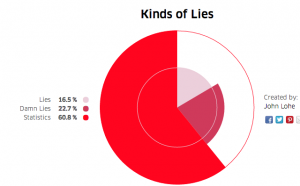
- Pie charts purely as art from a competition run by a design conference in London. They are pure angle charts, using varying radius of slices in a way that has nothing to do with the data (or ‘data’). An example

- The New Zealand Statistical Association has a new website, featuring a detail from the painting ‘Random Numbers’ by NZ mathematician and artist Peter James Smith. Some of his other works is being exhibited in Auckland this month
Thomas Lumley (@tslumley) is Professor of Biostatistics at the University of Auckland. His research interests include semiparametric models, survey sampling, statistical computing, foundations of statistics, and whatever methodological problems his medical collaborators come up with. He also blogs at Biased and Inefficient See all posts by Thomas Lumley »