Posts from October 2013 (67)

October 13, 2013

Think of a number and multiply by 80000

Bernard Hickey in the Herald

Imagine the public outrage if it were discovered that more than 80,000 New Zealanders were receiving wages, salaries and investment incomes of more than $6 billion a year, but were also receiving a benefit from the Government.

and

Income figures this week from Statistics NZ show more than 80,000 New Zealanders over the age of 65 receive wages, salaries and investment returns of more than $6.5 billion a year while claiming NZ Super.

It certainly helps to summon the outrage if you uses totals rather than averages. I  think there could be a reasonable case for means-testing NZ Super, but these numbers are not a contribution to informed public debate.

I’m not even sure where he got the data: he says “income figures this week from Statistics NZ”, and the only plausible source on the Stats NZ release calendar seems to be the NZ Income Survey, released on October 4. But in the NZ Income Survey data, table 8 says there are only 53,900 people aged 65+ with income above $1150/wk, which works out to just under $60000/year (including their NZ Super, of course).  His figures could still be right — perhaps the very wealthy people at the top drag the total up —  but they can only be right in the same sense as Bill English‘s “people earning under $110000 collectively pay no net income tax”.

Imagine the public outrage if it were discovered that nearly 54000 retired New Zealanders were earning over $45000/yr  from investments and salaries and still collecting NZ Super as well. Go on, imagine it.

October 11, 2013

An visitor’s view of our school stats curriculum

Neville Davies, from the Royal Statistical Society Centre for Statistical Education, Plymouth University, UK, is visiting the Department of Statistics at The University of Auckland, the home of statschat.  I asked him to share his first impressions … 

Does New Zealand have one of the most innovative school statistics curriculums in the world? Yes! But how does it compare with the UK?

Well, in the UK for the last 50 years the school statistics curriculum has been hijacked by policymakers and maths teachers who believe the subject is a subset of maths and should be taught as such. And there is research evidence to support this.

This attitude has stifled curriculum development for statistics and helped to make the subject disliked by many school-aged learners. And many schoolteachers dislike teaching it too – it’s a bit of a nuisance that gets in the way of the maths.

But things are much better in New Zealand: here the school curriculum is data-driven throughout and is taught, learned and assessed accordingly. And that’s how it should be.

Everyone should have noticed that we are awash with data: bombarded with the stuff. As more and more people try to make sense of these mountains of data, very often information gleaned from them are at best untrustworthy and often misleading and wrong. It is a matter of common sense that young people should be taught to be confident with what to do about data they see in everyday life, as well as being sceptical about what others claim about them.

The best way to teach the skills necessary is precisely what the New Zealand school curriculum specifies.

By talking to the developers of the curriculum in New Zealand, visiting schools, talking to teachers, attending classes and chatting to students I am discovering how the statistics part of the mathematics and statistics curriculum is being implemented in refreshing and innovative ways. To coin a phrase used in New Zealand school statistics resources,  I am being a ‘data and information detective’  and I will take back to the UK lessons we can learn to try to change what is going in that distant land. It’s a case of grandmother needing to learn new ways to suck statistical eggs!

Watch this space for updates.


Pokies trust hijacks student coursework

Good work by journalist Steve Deane in today’s New Zealand Herald:

A study published by the Lion Foundation which extols the benefits of funding community projects with gambling money is course work produced by a group of Massey commerce students.

… I wonder if the students knew that their coursework, which for various reasons explained in the story can’t be used to draw such conclusions, knew their work was going to be hijacked? Either the Lion Foundation doesn’t know much about statistical rigour, or is grasping at straws and hoping no-one will ask questions.

October 10, 2013

Innovation and indexes

The 2013 Global Innovation Index is out, with writeups in Scientific American and the NZ internets, but not this year in the NZ press. Stuff, instead, tells us “Low worker engagement holds NZ back”, quoting Gallup’s ’employee engagement’ figure of 23% for NZ, without much attempt to compare to other countries.

The two international rankings are very different: of the 16 countries above us in the Global Innovation Index, 13 have significantly lower employee engagement ratings, one (Denmark) is about the same, and one (USA) is higher (one, Hong Kong, is missing because Gallup lumps it in with the rest of the PRC).  It’s also important to consider what is behind these ratings. If you search on  “Gallup employee engagement”, you get results mostly focused on Gallup’s consulting services — getting you to worry about employee engagement is one of the ways they make money.  The Global Innovation Index, on the other hand, came from a business school and was initially sponsored by the Confederation of Indian Industry  and has now expanded with wider sponsorship and academic involvement: it’s not biased in any way that’s obviously relevant to New Zealand.

With any complicated scoring system, different countries will do well on different components of the score.  If you believe, with the authors of Why Nations Fail,  that quality of institutions is the most important factor, you might focus on the “Institutions” component of the innovation index, where New Zealand is in third place. If you’re AMP econonomist Bevan Graham you might think the ‘business sophistication’ component is more important and note that NZ falls to 28th.

If you want NZ innovation to improve, the reverse approach might be more helpful: look at where NZ ranks poorly, and see if these are things we want to change (innovation isn’t everything) and how we might change them.


October 9, 2013

Bell curves, bunnies, and dragons

Keith Ng points me to something that’s a bit more technical than we usually cover here on StatsChat, but it was in the New York Times, and it does have  redeeming levels of cutesiness: an animation of the central limit theorem using bunnies and dragons

The point made by the video is that the Normal distribution, or ‘bell curve’, is a good approximation to the distribution of averages even when it is a very poor approximation to the distribution of individual measurements.  Averaging knocks all the corners off a distribution, until what is left can be described just by its mean and spread.  (more…)

Evils of axis

From the US shutdown, via @juhasaarinen: Senator Reid posted this chart showing how the Democrats have been willing to compromise

The axes are a problem, but not in the way you might initially think.  As a standard bar chart, this is missing the bottom 80% of the graph, but the point is to use the budget proposals from President Obama and Representative (and unsuccessful vice-presidential candidate) Paul Ryan as endpoints and illustrate how subsequent proposals have moved.  That is, the problem with the chart is that the Ryan budget should be all the way at the bottom.

Something that might display the message better (at least if redrawn by someone with a modest level of graphic design competence) is

compromise


explicitly using the two proposals as endpoints and showing the movement of the Democrats’ proposal.

ITM Cup Predictions for Round 9

Team Ratings for Round 9

Here are the team ratings prior to Round 9, along with the ratings at the start of the season. I have created a brief description of the method I use for predicting rugby games. Go to my Department home page to see this.

Here are the team ratings prior to this week’s games, along with the ratings at the start of the season.

Current Rating Rating at Season Start Difference
Canterbury 20.60 23.14 -2.50
Wellington 13.18 6.93 6.20
Auckland 9.54 9.02 0.50
Counties Manukau 4.60 4.36 0.20
Tasman 3.02 -6.29 9.30
Waikato -0.35 5.25 -5.60
Hawke’s Bay -1.41 -6.72 5.30
Taranaki -3.50 3.92 -7.40
Otago -3.73 -4.44 0.70
Bay of Plenty -5.43 -1.96 -3.50
Southland -8.31 -11.86 3.50
Northland -9.92 -8.26 -1.70
Manawatu -10.76 -8.97 -1.80
North Harbour -10.82 -7.43 -3.40


Performance So Far

There is a problem with the code I have been using for assessing performance, due to the unusual schedule in the ITM Cup, where some teams play more than one game in a week. I haven’t had time to alter the code so am omitting this section for the time being. Look at last week’s post to see how the predictions went. For the record, there were 7 games correct, out of 8 games played last week

Predictions for Round 9

Here are the predictions for Round 9. The prediction is my estimated expected points difference with a positive margin being a win to the home team, and a negative margin a win to the away team.

Game Date Winner Prediction
1 Northland vs. Otago Oct 09 Otago -1.70
2 Hawke’s Bay vs. Wellington Oct 10 Wellington -10.10
3 Counties Manukau vs. Southland Oct 11 Counties Manukau 17.40
4 North Harbour vs. Canterbury Oct 12 Canterbury -26.90
5 Northland vs. Bay of Plenty Oct 12 Northland 0.00
6 Waikato vs. Taranaki Oct 12 Waikato 7.70
7 Otago vs. Auckland Oct 13 Auckland -8.80
8 Tasman vs. Manawatu Oct 13 Tasman 18.30


Currie Cup Predictions for Round 10

The Currie Cup continues to be a nightmare for prediction. In past seasons there appeared to be a large home ground advantage, but not this year. There have been some very high scores and games won away from home starting with Griquas beating the Sharks in Durban in the first week. Griquas have subsequently lost all their games, but have 5 points from loss bonuses, and 1 four try bonus. They then have had 52 points against them in each of the last two games. (Do they still have any supporters after that sequence of games?) One reason for the difficulty of prediction is possibly that the Lions, Cheetahs and Bulls are all fairly evenly matched, so that any one might beat any other on a given day, no matter whether home or away.

Team Ratings for Round 10

Here are the team ratings prior to Round 10, along with the ratings at the start of the season. I have created a brief description of the method I use for predicting rugby games. Go to my Department home page to see this.
Here are the team ratings prior to this week’s games, along with the ratings at the start of the season.

Current Rating Rating at Season Start Difference
Sharks 5.20 3.24 2.00
Western Province 3.74 4.47 -0.70
Lions 0.73 -1.22 1.90
Blue Bulls 0.38 0.59 -0.20
Cheetahs -0.22 -2.74 2.50
Griquas -11.98 -6.48 -5.50


Performance So Far

So far there have been 27 matches played, 13 of which were correctly predicted, a success rate of 48.1%.

Here are the predictions for last week’s games.

Game Date Score Prediction Correct
1 Western Province vs. Lions Oct 05 36 – 23 10.00 TRUE
2 Blue Bulls vs. Sharks Oct 04 16 – 18 3.70 FALSE
3 Griquas vs. Cheetahs Oct 05 21 – 52 1.60 FALSE


Predictions for Round 10

Here are the predictions for Round 10. The prediction is my estimated expected points difference with a positive margin being a win to the home team, and a negative margin a win to the away team.

Game Date Winner Prediction
1 Lions vs. Griquas Oct 12 Lions 20.20
2 Cheetahs vs. Blue Bulls Oct 12 Cheetahs 6.90
3 Sharks vs. Western Province Oct 12 Sharks 9.00


Prediction is hard

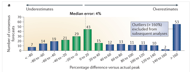
How good are sales predictions for newly approved drugs?

Not very (via Derek Lowe at  In the Pipeline)

Forecasts

There’s a wide spread around the true value. There’s less than a 50:50 chance of being within 40%, and a substantial chance of being insanely overoptimistic. Derek Lowe continues

Now, those numbers are all derived from forecasts in the year before the drugs launched. But surely things get better once the products got out into the market? Well, there was a trend for lower errors, certainly, but the forecasts were still (for example) off by 40% five years after the launch. The authors also say that forecasts for later drugs in a particular class were no more accurate than the ones for the first-in-class compounds. All of this really, really makes a person want to ask if all that time and effort that goes into this process is doing anyone any good at all.


Briefly

imp-pie


  • Rachel Kumar is a data scientist who tests fitness trackers:  she still says “it’s unclear how you use this data. I know if I’ve been active or not, and the histograms don’t tell me anything else.” 
  • Algorithms: “They have biases like the rest of us. And they make mistakes. But they’re opaque, hiding their secrets behind layers of complexity. How can we deal with the power that algorithms may exert on us? How can we better understand where they might be wronging us?” by Nicholas Diakopoulos.
  • An example: according to a new rating of Faculty Media Impact, MIT’s top department is Sociology. MIT doesn’t actually have a sociology department.