Evils of axis
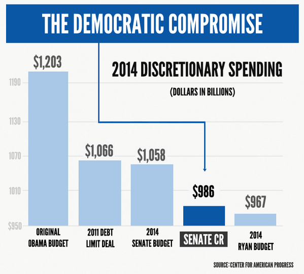
From the US shutdown, via @juhasaarinen: Senator Reid posted this chart showing how the Democrats have been willing to compromise

The axes are a problem, but not in the way you might initially think. As a standard bar chart, this is missing the bottom 80% of the graph, but the point is to use the budget proposals from President Obama and Representative (and unsuccessful vice-presidential candidate) Paul Ryan as endpoints and illustrate how subsequent proposals have moved. That is, the problem with the chart is that the Ryan budget should be all the way at the bottom.
Something that might display the message better (at least if redrawn by someone with a modest level of graphic design competence) is
explicitly using the two proposals as endpoints and showing the movement of the Democrats’ proposal.
Thomas Lumley (@tslumley) is Professor of Biostatistics at the University of Auckland. His research interests include semiparametric models, survey sampling, statistical computing, foundations of statistics, and whatever methodological problems his medical collaborators come up with. He also blogs at Biased and Inefficient See all posts by Thomas Lumley »
