October 9, 2013
Briefly
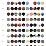
- From Wired, 13 of the best infographics from 2013. Not entirely convinced, though I quite like the pie charts showing colour changes by Impressionist artists over time.
- Rachel Kumar is a data scientist who tests fitness trackers: she still says “it’s unclear how you use this data. I know if I’ve been active or not, and the histograms don’t tell me anything else.”
- Algorithms: “They have biases like the rest of us. And they make mistakes. But they’re opaque, hiding their secrets behind layers of complexity. How can we deal with the power that algorithms may exert on us? How can we better understand where they might be wronging us?” by Nicholas Diakopoulos.
- An example: according to a new rating of Faculty Media Impact, MIT’s top department is Sociology. MIT doesn’t actually have a sociology department.
Thomas Lumley (@tslumley) is Professor of Biostatistics at the University of Auckland. His research interests include semiparametric models, survey sampling, statistical computing, foundations of statistics, and whatever methodological problems his medical collaborators come up with. He also blogs at Biased and Inefficient See all posts by Thomas Lumley »
