September 22, 2013
Briefly
- Careers: The number of people getting statistics degrees in the US has doubled in the past five years (and they’re still able to get jobs)
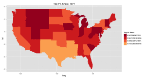
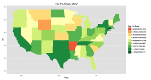
- Increasing inequality in the US from 1977 to 2012 (it happens in other places too): top 1% share of income. The colour choice is a bit unfortunate (red: more equal, green:less equal). There are animated pictures and more inequality measures in the original
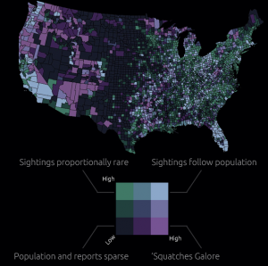
- Map of sasquatch sightings in the US. The original has all the sightings as well as this map cross-referenced with population density. Remember, just because you can measure it doesn’t mean it exists
- Software for drawing data-based maps: CartoDB. Has both free and paid versions. Worth a look if you do maps.
Thomas Lumley (@tslumley) is Professor of Biostatistics at the University of Auckland. His research interests include semiparametric models, survey sampling, statistical computing, foundations of statistics, and whatever methodological problems his medical collaborators come up with. He also blogs at Biased and Inefficient See all posts by Thomas Lumley »


