Cumulative totals tend to increase
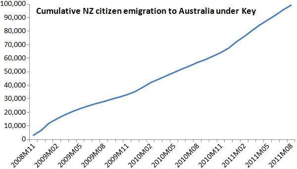
One of our early Stat-of-the-Week awards was for this graph from The Standard

Among the problems is that the graph is cumulative, so it unavoidably goes up. It’s a good choice if you want the impression of a relentless increase regardless of the data; not so good if you’re trying to inform.
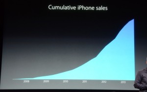
Tim Cook, of Apple, did something similar with iPhone sales at the product release yesterday
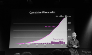
David Yanofsky, at Quartz, overlays the quarterly sales reports
It’s clear that quarterly sales have been declining recently, although it’s also clear that each new iPhone leads to a sales surge. The quarterly reports actually tell you something about the sales pattern; the cumulative reports really don’t.
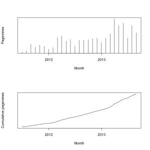
In the same way, although these two graphs of StatsChat page views contain the same information, the first one lets you see patterns over time, such as the start of the rugby-prediction season, and the times I’m away. Cumulative charts are usually less useful and often misleading, whether deliberately or not.
Thomas Lumley (@tslumley) is Professor of Biostatistics at the University of Auckland. His research interests include semiparametric models, survey sampling, statistical computing, foundations of statistics, and whatever methodological problems his medical collaborators come up with. He also blogs at Biased and Inefficient See all posts by Thomas Lumley »


