August 9, 2013
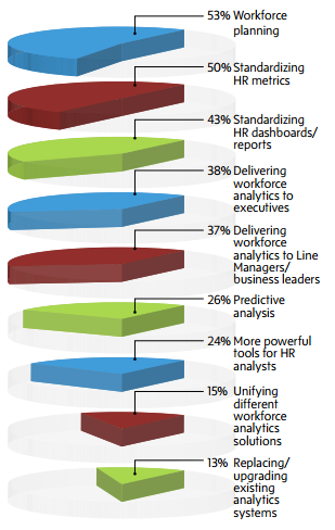
Graphical innovation in delivering workforce analytics
Via Nathan Yau (from a source that evades Google’s reverse image search), another innovation in data visualisation

If you’re the first person to use a data visualisation idea, it’s just possible that it’s because it isn’t a very good idea.
Thomas Lumley (@tslumley) is Professor of Biostatistics at the University of Auckland. His research interests include semiparametric models, survey sampling, statistical computing, foundations of statistics, and whatever methodological problems his medical collaborators come up with. He also blogs at Biased and Inefficient See all posts by Thomas Lumley »
It is from visier.com (specifically, http://info.visier.com/Portals/134573/docs/Visier_Workforce_Analytics_5_Critical_Indicators_White_Paper.pdf ). Not many companies claim to be “an innovation leader in delivering… analytics”. I wonder why.
12 years ago
I simply love that final sentence. There is quite of a bit of demand from clients to represent their data in unique ways – honestly it can be a challenge doing this while keeping the representations accurate and meaningful.
I fully expect that something I’ve done will end up being critiqued here one day. Always slightly freaked out about that when I’m producing graphics – I think that’s a good thing though!
12 years ago