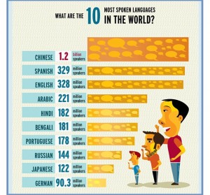
Nathan Yau, at Flowing Data, shows this barchart-like object

The most obvious problem is that the bar for Chinese is about 3 times the area of the bar for English, and should be either about a third bigger, or, if you really believe there are 1 trillion Chinese speakers, 1300 times bigger. The bars for English and Spanish are obviously out of proportion as well.
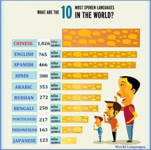
I tried to find the original source of this graph, which Nathan doesn’t give, perhaps because he couldn’t find it either. However, Google image search did show a related graph that explains some of the problems. I found it at a range of sites, but the one at 10-most.com is where it looks most original.

This version is still ugly, but the bars match the labels.
Comparing the numbers to Wikipedia, it looks as though someone edited the labels from ‘top ten by number of native speakers’ to ‘top ten by total number of speakers’ either as a deliberate change or because they didn’t understand the original graph (and they also inflated the Chinese count by a factor of 1000). Sadly, the editor didn’t appreciate that the bars are more than just decoration; they are supposed to convey numeric information.
PS: Yes, we could also get picky about ‘Chinese’ as a single language, but they clearly mean Mandarin Chinese, the group of dialects that includes the official language of both the PRC and the ROC.
