Sometimes a list should just be a list
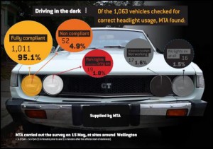
From the Motor Trade Association (via Scoop), an infographic that really would be better as a table or list rather than what appears to be a set of four pie charts.
Adding to the problems, the survey of 1063 vehicles was for a single half-hour period on one day, and 50% of the half-hour period was before the start of official darkness (though they say visibility was low enough to make headlights necessary).
Thomas Lumley (@tslumley) is Professor of Biostatistics at the University of Auckland. His research interests include semiparametric models, survey sampling, statistical computing, foundations of statistics, and whatever methodological problems his medical collaborators come up with. He also blogs at Biased and Inefficient See all posts by Thomas Lumley »
