Posts from April 2013 (67)

April 8, 2013

Briefly

  • Interesting post on how extreme income inequality is. The distribution is compared to a specific probability model, a ‘power law’, with the distribution of earthquake sizes given as another example. Unfortunately, although the ‘long tail’ point is valid, the ‘power law’ explanation is more dubious.   Earthquake sizes and wealth are two of the large number of empirical examples studied by Aaron Clauset, Cosma Shalizi, and Mark Newman, who find the power law completely fails to fit the distribution of wealth, and is not all that persuasive for earthquake sizes. As Cosma writes

If you use sensible, heavy-tailed alternative distributions, like the log-normal or the Weibull (stretched exponential), you will find that it is often very, very hard to rule them out. In the two dozen data sets we looked at, all chosen because people had claimed they followed power laws, the log-normal’s fit was almost always competitive with the power law, usually insignificantly better and sometimes substantially better. (To repeat a joke: Gauss is not mocked.)


All clinical trial results should be published

If you’re one of the 40,000 or so people who has signed the Alltrials petition you will have received an email from Ben Goldacre asking for more help.

The  Declaration of Helsinki, the major document on research ethics in medicine, already states

30. Authors, editors and publishers all have ethical obligations with regard to the publication of the results of research. Authors have a duty to make publicly available the results of their research on human subjects and are accountable for the completeness and accuracy of their reports. They should adhere to accepted guidelines for ethical reporting. Negative and inconclusive as well as positive results should be published or otherwise made publicly available. Sources of funding, institutional affiliations and conflicts of interest should be declared in the publication. Reports of research not in accordance with the principles of this Declaration should not be accepted for publication.

The petition is trying to get these principles enforced. Publication bias isn’t just a waste of the voluntary participation of (mostly sick) people in research. Publication bias means we don’t know which treatments really work.

In my first job (as a lowly minion) in medical statistics, my boss was Dr John Simes, an oncologist. Back in the 1980s he had shown that publication bias in cancer trials gave the false impression that a more toxic chemotherapy regimen for ovarian cancer had substantial survival benefits to weigh against the side-effects.  Looking at all registered (published and unpublished) trials showed the survival benefit was small and quite possibly non-existent.  The specific treatment regimens he studied have long been outmoded, but his message is still vitally important.

These examples illustrate an approach to reviewing the clinical trial literature, which is free from publication bias, and demonstrate the value and importance of an international registry of all clinical trials.

Nearly thirty years later, we are still missing information about the benefits and risks of drugs.

For example, influenza researchers have used detailed simulation models to assess control strategies for pandemic flu. These simulation models need data about the effectiveness of drugs and vaccines.  When the next flu pandemic hits, we really need these models to be accurate, so it’s especially disturbing that Tamiflu is one of the drugs with substantial unpublished clinical trial data.

Stat of the Week Competition: April 6 – 12 2013

Each week, we would like to invite readers of Stats Chat to submit nominations for our Stat of the Week competition and be in with the chance to win an iTunes voucher.

Here’s how it works:

  • Anyone may add a comment on this post to nominate their Stat of the Week candidate before midday Friday April 12 2013.
  • Statistics can be bad, exemplary or fascinating.
  • The statistic must be in the NZ media during the period of April 6 – 12 2013 inclusive.
  • Quote the statistic, when and where it was published and tell us why it should be our Stat of the Week.

Next Monday at midday we’ll announce the winner of this week’s Stat of the Week competition, and start a new one.

(more…)

Stat of the Week Competition Discussion: April 6 – 12 2013

If you’d like to comment on or debate any of this week’s Stat of the Week nominations, please do so below!

Kiwi students hold their own census

What are Kiwi kids’ most common food allergies? What time do they go to sleep at night? How long can they stand on their left leg with their eyes closed?

Many thousands of students aged between 10 and 18 (Year 5 to Year 13) are due to start answering these questions – and a host of others about their lives – on Monday May 6, the first day of the new term and the day CensusAtSchool 2013 begins.

So far, 461 schools have registered to take part. The 32-question survey, available in English and Māori, aims to raise students’ interest in statistics and provide a fascinating picture of what they are thinking, feeling and doing. Teachers will administer the census in class between May 6 and June 14.

“A good way to engage students in mathematics and statistics is to start from a place that’s familiar to them – their own lives and the lives of their friends,” says co-director Rachel Cunliffe, a University of Auckland-trained statistician.“Students love taking part in the activities and then, in class with their teachers, becoming “data detectives” to see what stories are in the results – and not just in their own classroom, but across the country.”

This year, students are being asked for the first time about food allergies to reflect the lack of data on the issue, says Cunliffe. “Students will be able to explore the dataset to compare the prevalence of self-reported allergies for different ages, ethnicities and sexes.”

Westlake Girls High School maths teacher Dru Rose is planning for about 800 Year 9 and 10 students to take part. She’s keen to see the data that will emerge from two other new questions about how many hours of homework students did the night before, and how many hours sleep they had. “It’s real-life stuff,” she says. “We’ll be able to examine the data and see if there are any links.”

Andrew Tideswell, manager of the Statistics New Zealand Education Team, says our  statistics curriculum is world-leading, and CensusAtSchool helps teachers and students get the most out of it.

“By engaging in CensusAtSchool, students have an experience that mirrors the structure of the national census, and it encourages them to think about the need for information and ways we might use it to solve problems,” he says. “Students develop the statistical literacy they need if New Zealand is to be an effective democracy where citizens can use statistics to make informed decisions.”

CensusAtSchool, now in its sixth edition, is a biennial collaborative project involving teachers, the University of Auckland’s Department of Statistics, Statistics New Zealand and the Ministry of Education. It is part of an international effort to boost statistical capability among young people, and is carried out in Australia, the United Kingdom, Canada, the US, Japan and South Africa.
 

April 6, 2013

Gun deaths visualisation

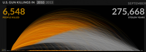
Periscopic, a “socially conscious data visualization firm” has produced an interactive display of the years of life lost due to gun violence in the US, based on national life expectancy data. Each victim appears as a dot moving along the arc of their life, and then dropping at the age of death. More and more accumulate as you watch.

guns


Of course, it’s important to remember that this display gets a lot of its power from two facts: the USA is very big, and we know the names and ages of death of gun victims.  You couldn’t do the same thing as dramatically for smoking deaths, and it would look much less impressive in a small country.


Also, Alberto Cairo has a nice post using this as an example to talk about the display of uncertainty.

(via @hildabast)


April 5, 2013

Frontpage news

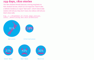
James Wendelbourn, a graphic designer, has summarized the content of the NZ Herald front page every day for a year.

He’s made a series of infographics about it, at sellingthenewz.tumblr.com, for example

frontpage


I don’t really like the graphics from the point of view of presentation of quantitative information, but the actual content is interesting.

As always with this sort of thing, you might disagree with the classifications, but they are generally reasonable: I like the division of ‘consumer’ news into “outrage”, “shopping”, and “other”.

April 4, 2013

Infographic meh.

The Herald has produced this Stat of the Week nomination

BuyOnlineApr13


The obvious problem is that the percentages add up to about 170%, not 100%. That’s why the bar labelled “41.8%” is only about 1/4 of the circle.These are not mutually exclusive categories, and in fact someone who is in one of these categories is actually more likely to be in others.

The most interesting results from the underlying data would be about which purchases go together. Is there an more-or-less consistent ordering of things so that someone who buys food and beverages online will also buy reading materials and electronics online, or is it more complicated?  That’s probably the sort of information that Roy Morgan Research would like to sell you, with the overall proportions as a teaser — selling detailed survey reports is their business.

On the other hand, while the ribbon adding up to a full circle is irrelevant because there isn’t a meaningful total, it’s hard to get very worked up about it.  A table, or a ‘forest plot’ of points and margin of error would be a bit more informative — it’s not clear what the margin of error in the smaller categories is like.

I’m slightly more worried about the fact that reading isn’t counted as leisure, somewhat more worried that it’s news that more people use the internet now than ten years ago, and much more worried that the graph says it refers to 4977 people but the text of the story says 12000 people.

Describing risk

From “Decision Science News”, a post on communicating risks to the general public (eg, in newspapers)

infogrid


They give a list of approaches to use less often (relative risks, single-event probabilities as fractions, conditional probabilities) and approaches to use more often (frequencies with an explicit reference group).

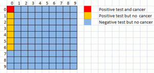
They don’t mention David Spiegelhalters ‘micromorts‘, or the useful `number needed to treat’ for describing screening or treatment probabilities, though the latter is implicit in their examples.  The picture above shows a hypothetical situation where you would need to screen 81 100 people, and have six false positive diagnoses, in order to have one true positive diagnosis. In terms of the traditional conditional probabilities  that’s a test with 100% accuracy in detecting cases  and better than 90% accuracy in detecting non-cases, which sounds much more useful than the situation revealed by the picture.

April 3, 2013

Infographic of the day.

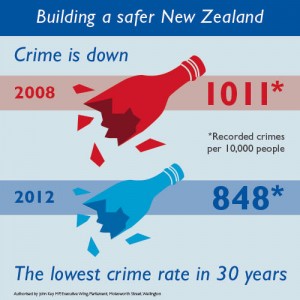
Our only Prime Minister has tweeted an infographic of the new crime figures

key


In his defense, I will first concede that Mr Key is not regarded as an unbiased source of information, so he doesn’t have the same responsibilities that journalists do.

Still.

One of the basic and classical problems with representing numbers by pictures (apart from the choice of picture) is scaling.  The crime rate was 16% lower in 2012 than in 2008. The blue bottle is 16% smaller in every dimension than the red bottle.  If you just look at the size of the picture, the area of the blue bottle is nearly 30% smaller than the red bottle. If you take the visual metaphor seriously, these bottles have volume, and the volume of the blue bottle would be 40% smaller.

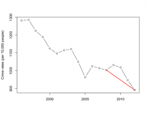
One of the other basic and classical problems discussed in books on misleading statistical graphics is picking two points out of a time series. Using data from Stats New Zealand, we can plot 17 years.

keygraph


Crime has been decreasing for a long time, at roughly the same rate.  Mr Key’s graph corresponds to the red line.