Stephen Few writes a blog called “Visual Business Intelligence”, which if you know that “Business Intelligence” is a euphemism for “Data Analysis”, or “Statistics” is clearly in our field.
He has a recent post complaining about a new release of the “visual business intelligence” tool Tableau, in particular, its apparent enthusiasm for bubble charts and word clouds, and other things that don’t really work. Early marketing, now removed, for this version actually used the heading “Crave more bling?” to describe the features.
As he points out in detail, bubble charts and word clouds are always and everywhere less informative than bar charts. You should go read the whole thing. And perhaps his gallery of bad examples.
I learnt about Few’s post from a column (The Data Trail) in the Vancouver Sun. Under the headline In Defense of Eye Candy, Bling,and Tableau 8, Chad Skelton writes
There’s just one problem: bar charts are kind of boring.
A lot of people who create data visualizations — whether reporters, non-profits or governments — are fighting tooth and nail to get people to pay attention to the data they’re presenting in an online world crowded with endless distractions. And when you’re trying to make someone take notice – especially if the subject is census data or transit figures — a little eye candy goes a long way.
Data visualizations aren’t just a way to present data. They’re often also the flashing billboard you need to get people to pay attention to the data in the first place.
He has a point, but this argument wouldn’t fly in other parts of journalism. An editor would be unlikely to admit: “Yes, the story about numbers on benefit gave the wrong impression about blame, but a clear story explaining it was just the state of the economy would be boring”. When it comes to text or headlines, ‘tabloid journalism’ is an indictment, not a defense.
“Bling”, in particular, is perhaps an unintentionally honest term from the marketers. You wear bling primarily to prove you can afford it; you draw interactive packed bubble charts to prove you know how.
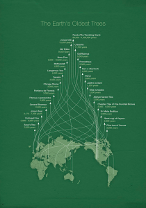
A more positive defense of complex infographics is that they function not as bling, but as art, and more importantly, as puzzles. As art, they are enjoyable to look at, but as puzzles, they are fun to explore. Andrew Gelman gives this example, by Michael Paukner (original here)

He notes
The headache is, I believe, part of the point. First, if the lines were direct you wouldn’t get the pretty Christmas tree pattern. Second, the investment required in following the lines makes you appreciate what you’ve learned. Third, the curvy lines are themselves a puzzle; as you trace them, you gradually learn the meaning of the y-axis.
It’s a familiar idea in education that you absorb information better if you have to do something discover it rather than just being fed it. If that’s why less-informative graphs and infographics are appreciated, perhaps we should be glad of evidence it isn’t only kids and scientists that still think it’s fun to find things out for themselves.
But if that’s the reason, it also warns of the limits of the strategy. These displays are, actually, less efficient and accurate at conveying information. In a situation where information does need to be conveyed efficiently and accurately, bling or eye candy wouldn’t matter so much, but puzzles need to be avoided.
