That’s not worth a thousand words
The Herald has an interesting set of displays of the latest DigiPoll political opinion survey. According to the internets it was even worse earlier in the day, but we can pass over that and only point out that corrections in news stories shouldn’t happen silently (except perhaps for typos).
We can start with the standard complaint: the margin of error for the poll itself is 3.6%, so the margin of error for change since the last poll is 1.4 times higher, or a little over 5%. None of the changes is larger than 5%, and only one comes close.
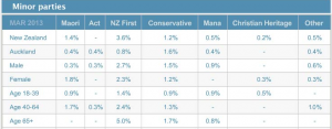
Secondly, there is a big table for the minor parties. I would normally not quote the whole table, but in this case it’s already changed once today.
The total reported for the minor parties is 6.1%, and since there were 750 people sampled, 46 of them indicated support for one of these parties. That’s not really enough to split up over 7 parties. These 46 then get split up further, by age and gender. At this point, some of the sample proportions are zero, displayed as “-” for some reason.
[Updated to add: and why does the one male 40-64 yr old Aucklander who supported ACT not show up in the New Zealand total?]
Approximately 1 in 7 New Zealanders is 65+, so that should be about 6 or 7 minor-party supporters in the sample. That’s really not enough to estimate a split over 7 parties. Actually, the poll appears to have been lucky in recruiting older folks: it looks like 6 NZ First, 2 Conservative, 1 Mana.
That’s all pretty standard overtabulating, but the interesting and creative problems happen at the bottom of the page. There’s an interactive graph, done with the Tableau data exploration software. From what I’ve heard, Tableau is really popular in business statistics: it gives a nice clear interface to selecting groups of cells for comparison, dropping dimensions, and other worthwhile data exploration activities, and helps analysts present this sort of thing to non-technical managers.
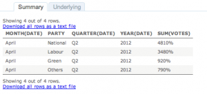
However, the setup that the Herald have used appears to be intended for counts or totals, not for proportions. For example, if you click on April 2012, and select View Data, you get
which is unlikely to improve anyone’s understanding of the poll.
I like interactive graphics. I’ve put a lot of time and effort into making interactive graphics. I’ve linked to a lot of good interactive graphics on this blog. The Herald has the opportunity to show the usefulness of interactive graphics to a much wider community that I’ll ever manage. But not this way.
Thomas Lumley (@tslumley) is Professor of Biostatistics at the University of Auckland. His research interests include semiparametric models, survey sampling, statistical computing, foundations of statistics, and whatever methodological problems his medical collaborators come up with. He also blogs at Biased and Inefficient See all posts by Thomas Lumley »


Worse version.
https://twitter.com/dannews/status/314508762880823296/photo/1
12 years ago
Wow. Wow. Just wow.
12 years ago
Yes, that’s what I was alluding to in the first paragraph. David Farrar has nominated it for Stat of the Week.
12 years ago
I’m puzzled re: how NZ First can earn 3.6% support overall from 2.7% of men and 2.3% of women. Does this suggest strong support for Rt Hon Winston among folk of no specific gender? Or am I reading the data wrong?
12 years ago
That does indeed seem to be a further mystery.
12 years ago
I suspect there is some problem with missing demographic data e.g. people not giving their sex (or age).
(That’s why they should give denominators etc)
By looking at the rounding and from the information that 0.3 is roughly 1 person, the number of males in the male sample is between 328-339 and the females in the female sample is 341-342 or between 669-681 people gave their sex (which might not in itself be accurate).
12 years ago
That’s true, but for it to explain the NZ First anomaly you’d need not reporting their sex to be more common for NZ First voters. I would have guessed the opposite.
12 years ago
I would have guessed the opposite too i.e. older people (relative to younger people) support NZF more and older people are generally more compliant.
It may be something systematic where an operator didn’t key in sex properly when he/she is assigned numbers from a particular area e.g. Tauranga.
12 years ago
> (17+10)/750*100
[1] 3.6
So about 10 people who didn’t give their sex support NZF.
Which works out at that 12%-14% of the people who didn’t volunteer their sex support NZF.
> 10/(750-669)
[1] 0.1234568
> 10/(750-681)
[1] 0.1449275
12 years ago
Which surprises me.
12 years ago
But I think 3.6% is more believable than 2.5% NZF support
12 years ago
Given the context, it’s possible that some of the numbers in the table are not actually correct. Typo?
12 years ago
Automating high quality table production is fairly easy nowdays. It doesn’t take that much programming to get “finished” tables straight from pure data, and it is especially efficient if the basic formatting is going to be the same poll after poll after poll.
I suspect it’s a lack of eyeballing (excess automation) rather than over-handling (excess hand work).
I don’t know when I last transcribed data, it’s all copy & paste when I need to shift it around.
12 years ago
I want to clear up a misunderstanding that is the basis of your criticism of the Tableau visualization. This is not to defend Tableau, but its users at The Herald ;)
When numbers are formatted as percent, Tableau multiplies them by 100, because the assumption is that the range of numbers is 0 to 1. The actual numbers in that dataset are in the 0-100 range though, so they look wrong. The reason they appear correct on the bars is because that label is constructed by taking the raw number and attaching a % sign. If you look at the table and the bars, you can see that the numbers are the same if you multiply the latter by 100.
It would be easy to fix the display in the table (change the default formatting to be Number, rather than Percent), but I guess they didn’t think people would look at the underlying data (since it’s no different than what you see on the bars).
Anyway, interesting posting and blog!
12 years ago