Posts from February 2013 (44)

February 13, 2013

Ordinal graphics

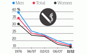
Graphics guru Edward Tufte has the lovely phrase “Pravda School of Ordinal Graphics” for a graphic style which forgets that numbers have a magnitude as well as an order.  Ben Brooks points us to the Herald’s effort


KiwisWhoSmokeFeb13


In the misinformation stakes this is a pretty venial sin, but it’s so unnecessary.  It’s not hard to compute the time lag between 1976 and 1996 or between 2002 and 2006, and to realize they aren’t the same.  The decrease isn’t slowing down as the graph suggests; it’s pretty much a straight line. The truncation of the vertical axis is more of a style thing: if the horizontal axis had been accurate, one could have argued that expanding the vertical scale to show changes in trend was more important. But if that was the rationale, you’d need to get the horizontal scale right.

And if you think of it as an infographic rather than conveying quantitative information there’s another problem: if you have a graphic where two of the colours are pink and blue, and two of the groups are ‘men’ and ‘women’….

Pain and heartbreak

There’s a new paper out in PLoS Medicine that’s starting to show up in overseas news and will probably turn up here soon.  The researchers looked at  painkillers (non-steroidal anti-inflammatory drugs, NSAIDS) that have been shown to increase heart disease risk, and how they are used around the world.

The background here is that NSAIDS block two related enzymes, COX-1 and COX-2.  Blocking COX-2 reduces pain and inflammation; blocking COX-1 decreases blood clotting and leads to gastrointestinal upset and potentially to ulcers.  That’s an obvious reason to look for drugs that just block COX-2, and researchers did this. The best known example is rofecoxib, or as it’s known in marketing, Vioxx.

It turns out that selectively blocking COX-2 is not as good an idea as it seemed, and leads to an increase in heart attacks, strokes, and lawsuits. Vioxx is off the market pretty much everywhere now, but there are some older NSAIDS that were popular because they caused less stomach irritation, and these also turn out to be selective blockers of COX-2. In the light of what was seen for Vioxx and Celebrex, you might expect these drugs also to increase heart attack risk, and the new paper summarises randomised trial data that shows they probably do.  The most important example is diclofenac, which is apparently the world’s most popular painkiller. It’s certainly one of the most popular in New Zealand pharmacies, where it’s called Voltaren.

The research paper estimates that diclofenac increases heart attack risk by about 40% while you’re taking it.  They don’t know how long you need to take it before the risk increases, but if the side-effect is related to blood clotting, it’s plausible that the risk is more or less immediate. The researchers argue that diclofenac should be banned, which seems a bit extreme; the increased heart attack risk is a real issue for some users, but not necessarily for others.  If you’re a 30-year old athlete training every day, your heart attack risk is roughly zero, so increasing it by a factor of 1.4 isn’t a big deal, and the lower risk of stomach irritation might well be worth it.  On the other hand, a lot of people who take NSAIDS regularly for arthritis are at relatively high risk of heart attack and so their risk/benefit tradeoff is very much against diclofenac.

The real problem here is that no-one thought to do any thorough studies of long-term safety for these drugs when they were developed.  Even for the new COX-2 inhibitors such as rofecoxib and celecoxib, the trials that told us about cardiovascular risk were mostly being done not for safety but to look for other potential (but not actual) benefits in Alzheimer’s Disease or in colon cancer prevention.  The world’s regulatory agencies are pretty good at making sure that drugs don’t get approved unless they work, but the regulation of safety is a lot more difficult and is done a lot less well.

[ps: environmentalists may recall that diclofenac is also really bad for vultures]

[Update: now in Stuff, and the Herald]
February 12, 2013

Unclear on the pie-chart concept

Everyone recognises pie. Everyone likes pie. So pie must be a good representation of numbers, right?

One important detail: you want bigger numbers to translate into more pie. This would be especially important if the numbers meant anything, but it’s not a good look even if they don’t.

4XMQKnz

From the Herald-Sun, via Juha Saarinen on Twitter.

[Also: could a cynical reader perhaps think the question was a bit slanted?]

[Update: this looks like exactly the same pie chart they used for 56% vs 44% last month]

Bogus poll ballot-box stuffing

From Ubermotive.com, an Australian blog

Last week, News Corporation ran a story about the shock results of an online poll that indicated over 90% of the 16,000 respondents wanted to see a raise in speed limits, despite the poll being paired with an article asking motorists to slow down in consideration for elderly drivers.

Well, I have some news for you: Over 15,000 of those votes were mine.

Also see the ABC Mediawatch story.

Everyone seems to think News Corporation should be worried, or at least embarrassed, but if you pay any attention to bogus polls you’ve already given up on the idea that public opinion is real and important and measurable.

In related news, the Assocation of Market Research Organisations has just released another draft of their Guidelines on Political Polling.  Their website currently just has the December draft, but I assume the new draft will be there soon.  The guidelines look sensible to me, with my only reservation being the attempt to maintain a “poll” vs “survey” distinction, where “poll” means a real poll and “survey” means a possibly bogus poll.

Conditional probabilities

Usually when someone confuses the probability of A given B and the probability of B given A they don’t really understand that these are different, and you have to point it out and explain it carefully. Richard David Prosser manages to be self-refuting,

And he added: “If you are a young male, aged between say about 19 and about 35, and you’re a Muslim, or you look like a Muslim, or you come from a Muslim country, then you are not welcome to travel on any of the West’s airlines…”

He accepted that most Muslims are not terrorists, but said it’s “equally undeniable” that “most terrorists are Muslims”.

actually pointing out himself that p(terrorist|Muslim) and p(Muslim|terrorist) are not remotely similar.  In the same way, although most members of the Pakistan cricket team are Muslims, most Muslims are not members of the Pakistan cricket team.

That doesn’t handle the further pointless complication of ‘people who look like Muslims’, who, as far as I have been able to tell, are not over-represented among terrorists, but this site might be helpful for calibration.

Sneak peek at questions for CensusAtSchool 2013

Registrations have now opened for primary and high school teachers to sign up to have their classes take part in this year’s CensusAtSchool which runs from May 6 – June 15.

Tens of thousands of school children will be taking part once again, and here’s a sneak peek of some of the new questions they’ll be answering:

Which of the following food allergies* do you have? (You may tick more than one.)

  • cow’s milk (dairy)
  • eggs
  • peanuts
  • tree nuts (e.g. cashews, almonds, Brazil nuts)
  • fish or shellfish
  • soy
  • wheat
  • Other. Please state:
  • none

About how long did you spend on your homework last night? (If you did not do any last night, type 0.)

Who is your favorite singer or band? (If you do not have one, type “Don’t have one”)

This year on 5 March, we all filled in a Census of Population and Dwellings form. Have a guess at what New Zealand’s population was on that date:

Preliminary results will be available from May 9.

Learn more about the educational project CensusAtSchool »

* Interestingly, New Zealand has no prevalence data on food allergies.

February 11, 2013

Petrol-price data

Stuff reports on rising petrol prices:

All three retailers said refined fuel costs had been steadily rising since the beginning of the year and those costs were now being passed onto customers.

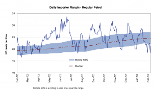
Wouldn’t it be nice if you could get data on this, rather than just believing the petrol companies? Well, you can

The Ministry of Economic Development carries out weekly monitoring of “importer margins” for regular petrol and automotive diesel.  The weekly oil prices monitoring report is reissued every Tuesday with the previous week’s data.

The purpose of this monitoring is to promote transparency in retail petrol and diesel pricing and is a key recommendation from the New Zealand Petrol Review

And if you look at the current graphs, the ‘importer margin’ has been declining since the start of the year, implying increasing pressure on retailers.  On the other hand, the importer margin is about the same as it was this time last year, and as the median from the year before that, so the ‘increasing’ pressure on retailers is partly just business returning to normal.


They also have the underlying data to download.

Real-estate stories: a comparison

Both the Herald and Stuff have stories based on the latest release from Quotable Value. The stories are pretty similar, though the Herald has speculation about the impact on the Reserve Bank rate setting.

Good points:

  • The Herald links to the original media release
  • Stuff points out that prices are still not above the 2007 peak when inflation is taken into account. This isn’t in the media release, but it’s not rocket science and it’s good to see reporters doing it.


February 10, 2013

Two of these things belong together

From an op-ed column in the New York Times, describing three countries

But there is one thing all three have in common: gigantic youth bulges under the age of 30, increasingly connected by technology but very unevenly educated.

If I tell you two of these countries are Egypt and India, can you guess the third?  Anyone? Anyone? Bueller?

It might take a while: in the real world, the third country Friedman includes is better known for instituting draconian (but successful) population-growth controls thirty years ago.

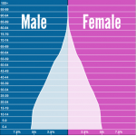
Here are the population age distributions for Egypt, India, and somewhere else, from populationpyramid.net.

egyptindiachina


(via)

Is cherry-picking season finally over?

Ben Goldacre writes in the New York Times about the need for all clinical trials to be published

The Food and Drug Administration Amendments Act of 2007 is the most widely cited fix. It required that new clinical trials conducted in the United States post summaries of their results at clinicaltrials.gov within a year of completion, or face a fine of $10,000 a day. But in 2012, the British Medical Journal published the first open audit of the process, which found that four out of five trials covered by the legislation had ignored the reporting requirements. Amazingly, no fine has yet been levied.

An earlier fake fix dates from 2005, when the International Committee of Medical Journal Editors made an announcement: their members would never again publish any clinical trial unless its existence had been declared on a publicly accessible registry before the trial began. The reasoning was simple: if everyone registered their trials at the beginning, we could easily spot which results were withheld; and since everyone wants to publish in prominent academic journals, these editors had the perfect carrot. Once again, everyone assumed the problem had been fixed.

But four years later we discovered, in a paper from The Journal of the American Medical Association, that the editors had broken their promise: more than half of all trials published in leading journals still weren’t properly registered, and a quarter weren’t registered at all.

There’s a new campaign and petition at Alltrials.net, and if you’re in Auckland, you can hear Ben Goldacre in May at the Auckland Readers and Writers Festival