Compared to what?
The Auckland Transport Blog presents a dramatically bad example of organising and displaying what would otherwise be quite useful information
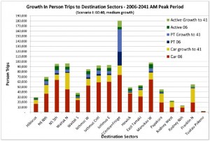
The legend indicates that the graph is trying to show three pairs of now vs future comparisons: car trips, public transport trips, and whatever ‘Active’ means (?walking and cycling, perhaps), and geographical variation.
Unfortunately, the stacking means that the easiest comparison is current car trips (red bars) vs all future trips (total bar length). For example, in the City Centre and Fringe bar, the large projected growth in public transport is mixed up visually with the relatively large current public transport use. The geographical variation would probably be clearer if the bars were sorted by current volume rather than north to south, since then you would be able to see projected differences between currently similar areas.
As a relatively minor problem, the colour scheme also highlights growth in car trips more than it really deserves.
Thomas Lumley (@tslumley) is Professor of Biostatistics at the University of Auckland. His research interests include semiparametric models, survey sampling, statistical computing, foundations of statistics, and whatever methodological problems his medical collaborators come up with. He also blogs at Biased and Inefficient See all posts by Thomas Lumley »
