February 25, 2013
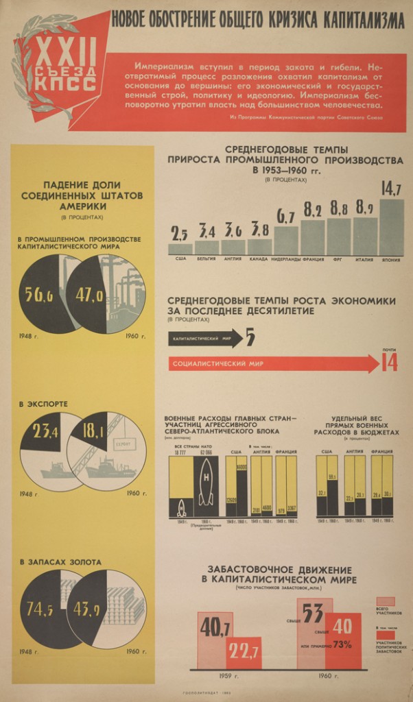
Infographics: so 1980s Soviet
Based on a tweet from Luis Apiolaza (@zentree), I found a bunch of genuine Soviet-era Pravda infographics (the rest of the site is good, too).
These are actually better than a lot of the modern crop. They certainly handle piecharts better than the Herald-Sun.
Probably most of the numbers are made up, but it’s not as if the numbers on modern infographics are all that good.
Thomas Lumley (@tslumley) is Professor of Biostatistics at the University of Auckland. His research interests include semiparametric models, survey sampling, statistical computing, foundations of statistics, and whatever methodological problems his medical collaborators come up with. He also blogs at Biased and Inefficient See all posts by Thomas Lumley »
