Posts from January 2013 (48)

January 13, 2013

Open Data activist dies.

If you know who Aaron Swartz was, you’ve probably already heard that he died yesterday.

Swartz was a computer prodigy and internet activist, who was focused on providing access to information, especially information that was theoretically already public but not readily available.

As a high-school kid, he was one of the developers of the RSS standard for web newsfeeds, which make it easy to integrate updates from many web sites.  He played a major role in the RECAP database, which allows people who pay for (public-domain) US court transcripts to make them available to others.

More recently, he downloaded millions of old academic articles from the JSTOR database, presumably intending to make some of them available in some form, though he never did. The Herald says

In 2011, he was arrested in Boston and charged with stealing millions of scientific journals from a computer archive at the Massachusetts Institute of Technology.

but he was actually charged with the very flexible offences of wire fraud and computer misuse, not with anything to do with theft or copyright violation.

If you want to read more about his life and death, it seems appropriate to suggest searching the Internet. It’s all there.


January 12, 2013

Some kind of bizarre coincidence?

The current H3N2 flu strain is causing serious illness in the US.

From the journalism blog heads-up, two adjacent headlines at Fox News


Dream jobs and reality

The Herald story starts out

If you’re dreading returning to work on Monday, don’t despair – at least you’re not alone.

A new study has found only one in four Kiwis believes they are in their dream job, a percentage lower than in most major countries.

As usual, we can ask: who did the survey, how did they do it, and what are they selling?

The numbers come from LinkedIn, the well-known spam job-search company. They say

As part of its “Dream Jobs” study, LinkedIn surveyed more than 8,000 professionals globally to find out the most common childhood career aspirations and how many professionals currently have their dream job.

So, for a start, it’s not 25% of Kiwis, it’s restricted to ‘professionals’, however they were defined. That might well explain the high satisfaction reported in India and Indonesia, where getting into the ‘professional’ classification is harder and you’d expect more professionals to be happy with their jobs.

Other news sites have different versions of the information. For example, Mashable says that LinkedIn only sampled from their members, and that only 9% world-wide were in their dream jobs, with another 21% in a career that relates to their dream job, Huffington Post concurs, and this matches the LinkedIn press release.

The 8000 respondents were spread across at least 17 countries, and there’s no indication given of how many are from New Zealand.   More importantly, there’s no indication of how they were sampled. I can’t find any evidence that the survey was done in a way that makes the sample size matter.

14-dimensional graphics

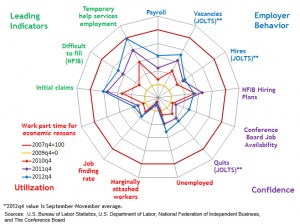
An interesting attempt to graph the recovery from the Great Recession, from the Atlanta Federal Reserve Bank (via)

Atlanta Fed.


The outer circle shows 13 economic indicators at the peak of the boom, and the inner yellow circle shows the bottom of the recession.   You can see that the ‘leading indicators’, that is, things that tend to move ahead of the rest of the economy, are improving quite a lot.  Employer behaviour and confidence indicators are up a bit, but the employment indicators are still stuck at recession levels.   If the leading indicators really are ‘leading’, the rest of the circle should be expanding relatively soon.

This graph will get confusing when there are many time periods or when the patterns are not strong.  You could probably handle a larger number of time periods by having the older ones fade to grey or some such, but it still won’t be clear unless there’s a dramatic pattern.

Also, the 13 economic variables are in a particular order around the circle, and with some graphs like this, the visual effect can be quite sensitive to the order; clearly a bad thing.

January 11, 2013

With friends like these…

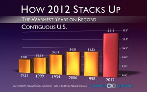
One of the worst graphs of the year, from Climate Central, via Andrew Gelman

Conclusively proving that hotter years are further to the right


More temperature graphics

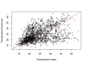
There has been a lot of coverage of Australian weather recently, and people who haven’t been to southeastern Australia in summer may have been struck by how big the reported temperature variations are.  There’s a data set of daily maximum temperatures in Melbourne over ten years that has been used as an example in time series research because of the unusual patterns — a bimodal distribution in day-to-day temperature change.

The graph shows Melbourne maximum temperatures from November through March for ten years.  The basic pattern is that tomorrow’s maximum is either slightly higher than today’s, or is about 21C.  The temperature keeps increasing day to day as long as the wind is from the land, then you get a cold front and people can sleep for a few nights.

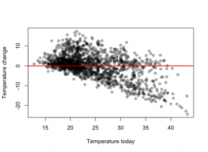
It looks even more dramatic (why?) when the change in temperature is plotted against today’s temperature


January 9, 2013

Ask Nate Silver anything

Nate Silver is doing a Q &A session at reddit.com (they have a running feature I am A …. ask me anything)


Something beginning with ‘D’

The graph shows letter frequencies in English by position in the word — for example, ‘e’ is much less common as the first letter than as the third letter.

wordfrequency


The first systematic study of these was done using a sample of 20 000 words collected by hand and analysed with punched cards and a card-sorting machine.  The author recently wrote to Peter Norvig, at Google, suggesting that an update might be of interest.  The full details, using 0.75 trillion words,  are on Norvig’s web page.

While you’re there, if you have yet to encounter the “Gettysburg Powerpoint”, now is your opportunity.

3-d graphics

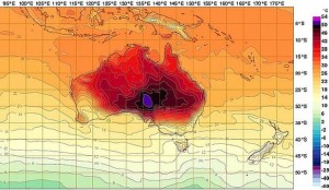
Most ‘3-dimensional’ graphics that you see are using fake perspective and don’t actually provide much additional information. The Australian Bureau of Meteorology maximum temperature forecasts are a genuine 3-d data display, illustrating that you really, really don’t want to be in eastern central Australia this week.  Notice how the coolest parts of Australia are the same temperature as here.

It's too darn hot.


The purple colour at the top of the scale doesn’t fit in well with the rest of the spectrum, and stands out on the map. Normally this would a bad thing, but 50C deserves to stand out.

January 8, 2013

Spying on your genes

Stuff has a story about genetic testing today, which leads off

Those sending their DNA to be analysed cheaply overseas are obliged to share the results with life insurers and risk losing control of their most sensitive information.

If you read further, it turns out that all the information about insurance and law is Australian.

In October, they had a similar story, with information on the relevant US law.

Perhaps next time there will be some NZ context.