January 24, 2013
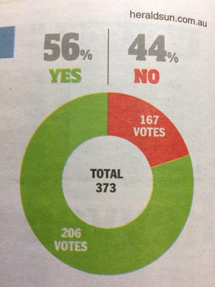
Pie charts rot the brain
Evidence from a well-known West Island newspaper
The chart says about 20%, the numbers say 44% (actually 45% if you can round correctly, but let’s not quibble). (via and)
Thomas Lumley (@tslumley) is Professor of Biostatistics at the University of Auckland. His research interests include semiparametric models, survey sampling, statistical computing, foundations of statistics, and whatever methodological problems his medical collaborators come up with. He also blogs at Biased and Inefficient See all posts by Thomas Lumley »
