January 21, 2013
Minus several million for good thinking
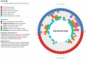
A monstrosity from The Globe & Mail (Canada)
Andrew Gelman demolishes it and suggests better ways to display the data. His conclusion is interesting
But that’s part of the problem—the clearer graph would also be easier to make! To get a distinctive graph, there needs to be some degree of difficulty.
In other words, ten out of ten for style.
Thomas Lumley (@tslumley) is Professor of Biostatistics at the University of Auckland. His research interests include semiparametric models, survey sampling, statistical computing, foundations of statistics, and whatever methodological problems his medical collaborators come up with. He also blogs at Biased and Inefficient See all posts by Thomas Lumley »

I’m afraid I categorised him as a pompous idiot when I read the first line comment about the spelling of ‘colour’.
12 years ago