Posts from January 2013 (48)

January 30, 2013

How stats made Auckland City Hospital’s heart unit more efficient: Radio New Zealand

When Auckland City Hospital was experiencing a cardiac-surgery cancellation rate approaching 30%,  staff decided to ask a statistician for help.  The University of Auckland’s Ilze Ziedins is an expert in queuing theory and probability who often works in areas such as telecommunications and traffic; she jumped at the chance to collaborate on a problem that involved people.

Ilze and two of her graduate students, William Chen and Kim Frew, set out to develop a mathematical model of the Cardiavascular Intensive Care Unit using R, a statistical environment and programming language initially developed at The University of Auckland by Ross Ihaka and Robert Gentleman.

The model used real-life data to investigate different staffing and resourcing scenarios, and as a result was able to confirm what hospital staff had suspected – that the Cardiac Intensive Care Unit was the bottleneck creating problems. The model was also able to suggest an optimal staffing regime that took into account the irregular arrival of people in the unit, either from the operating theatre or as the result of an emergency. As a result, ICU director Andrew Kee and other team members were able to allocate more staff and reduce the cancellation rate to about 10%.

Alison Ballance, of Radio New Zealand show Our Changing World,  went to Auckland City Hospital to meet Ilze Ziedins and Cardiovascular Services Manager Pam Freeman. Listen to the 13-minute interview here.
January 28, 2013

More lottery nonsense

From Stuff, on this week’s Lotto

The winner chose the six lucky numbers they played regularly but, in a clever move, chose to play the same numbers on 10 different lines with each Powerball number. That way they were ensured to win Powerball if their lucky numbers came up.

This strategy doesn’t increase the chance of winning Powerball, because you can’t increase the chance except by cheating or magic.   If they match the six numbers they are certain to win Powerball, rather than having only a 10% chance, but this is exactly compensated by their ten-fold lower chance of having a ticket that matches all six numbers.

The strategy does reduce the chance of winning the first division, by a factor of ten, but increases the fraction of the first-division prize that they snag (in this particular win, from 1/4 to 10/13). Over all, the strategy reduces expected winnings compared to ten random picks. On the other hand, if you cared primarily about average expected return you wouldn’t be playing Lotto.

More misplaced creativity

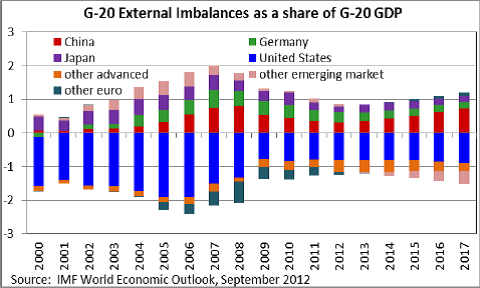
I encountered a new form of awful graph yesterday.  You can think of it as a 3-d bargraph seen from a very bad angle so that the bars get in each other’s way. Or a line graph without the lines.


I think the interpretation is that the height of each coloured segment is the trade imbalance (if it’s the smallest positive or largest negative one), the difference between the trade imbalance and the next lower one (if it’s positive) or the difference between the trade imbalance and the next higher one (if it’s negative).  If two countries/regions have the same trade imbalance, one of them will be nearly invisible.

When the ordering of countries changes, things get even more confusing.  For example, the pink band switches from an almost-invisible slice at the top in 2012 to an almost-invisible slice at the bottom in 2013.  I don’t know what happens to the dark green band after 2012.

The point of the graph appears to be that the light green band is above the red one: Germany’s trade surplus is larger than China’s.  (via)

January 27, 2013

Auckland rent data: too hard basket

Juha Saarinen, on Twitter, asks for data addresses the Auckland rent shock headlines.

Detailed data on new rentals are available from the ‘market rent’ pages at MoBIE, but there doesn’t seem to be any way to download the whole thing, just individual neighbourhoods.  And it’s a long weekend.


N jobs destroyed?

So. 3News reports that the changes to the warrant of fitness rules are going to lead to 2000 jobs being destroyed.  Since this number comes from opponents of the change, it’s almost certainly exaggerated, but how does it compare to the  general rate of job creation and destruction?

According to Stats NZ, in 2009 there were 252 360 jobs lost. Fortunately, there were 223 860 jobs created, even in the depths of the recession.  In 2008, there were 259 920 jobs created and 205 170 jobs destroyed.  So, the WoF change amounts to about 3 days worth of normal background job destruction.  As this shows, jobs always turn over quite rapidly. If we (or, rather, those of you who have cars) stop spending money on WoFs, the money saved will mostly get spent on something else, and will create broadly the same number of jobs there.

Specific job creation or destruction matters a lot in towns that depend on a single employer or industry, but otherwise the headline numbers are rarely as bad as they sound, unless you have one of the jobs.

Clinical trials in India

Stuff has a story from the Sydney Morning Herald on clinical trials in India.  The basic claims are damning if true:

…clinical drug trials are at the centre of a growing controversy in India, as evidence emerges before courts and, in government inquiries, of patients being put onto drug trials without their knowledge or consent…

With a very few exceptions (eg some trials of emergency resuscitation techniques and some minimal-risk cluster-randomised trials of treatment delivery)  it is absolutely fundamental that trial participants give informed consent. Trial protocols are supposed to be reviewed in advance to make sure that participants aren’t asked to consent to unreasonably things, but consent is still primary.  This isn’t just a technical detail, since researchers who were unclear on the importance of consent have often been bad at other aspects of research or patient care.

The Fairfax story mixes in the claimed lack of consent with other claims that are either less serious or not explained clearly. For example

Figures from the drugs controller- general show that in 2011 there were deaths during clinical trials conducted by, or on behalf of, Novartis, Quintiles, Pfizer, Bayer, Bristol Mayer Squibb, and MSD Pharmaceutical.

Of course there were deaths in clinical trials. If you are comparing two treatments for a serious illness, the trial participants will be seriously ill.  When you need to know if a new treatment reduces the risk of death, the only way to tell is to do a study large enough that some people are expected to die.  Even if improved survival isn’t directly what you’re measuring, a large trial will include people who die. In the main Women’s Health Initiative hormone replacement trial, for example, 449 women had died by the time the trial was stopped.  The question isn’t whether there were deaths, it’s whether there were deaths that wouldn’t have occurred if the trials had been done right.

There’s also a claim that families of participants who died were not given adequate compensation as part of the trial.  If there had been consent, this wouldn’t necessarily matter. Lots of trials in developed countries don’t specifically compensate participants or relatives, and there’s actually some suspicion of those that do, because it provides another incentive to participate even if you don’t really want to.

Other sources: Times of India, Chemistry World, a couple of review articles, the Nuremberg Code


January 26, 2013

Selma and Stonewall

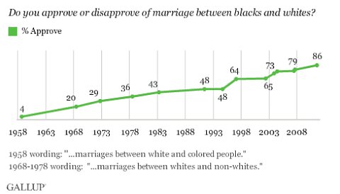
Today’s fascinating survey time series: for fifty-five years Gallup has been asking people in the US if they approve of interracial marriage. (via Paul Krugman, in the NY Times)

Gallup, via New York Times

On the one hand: Yay, progress! On the other hand, one in seven people still not only don’t approve but are prepared to admit this to a random caller on the phone.


Think of a number and multiply by 3120

The Herald has a story about a new app called TalkTo. Rather than you calling a business and waiting around for a possibly unhelpful response, you can text TalkTo and wait for them to call the business, ask your question and pass on the unhelpful response. Or, at least, you can if the business is in the USA or Canada — they currently wouldn’t handle Novapay or Qantas, the two examples in the story. The app obviously wouldn’t help for issues that require a dialogue, which includes essentially all the time I spend on hold.

Anyway, the statistics angle is that we apparently spend 43 days on hold during our lives.  As a basic numeracy challenge: is this more than you expect or less?

The number comes from 20 minutes per week for 60 years, so it doesn’t apply to any actually existing people — 60 years ago, we didn’t have the same level of on-hold, and 60 years in the future there’s at least some hope that a larger fraction of businesses will figure out how to make a useful web page (or whatever the next communication technology but seven turns out to be).

Bogus poll headlines return

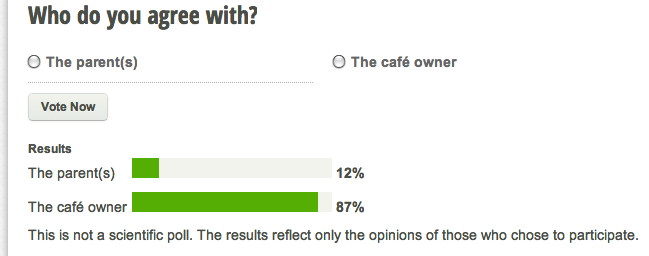
It’s been a long time since we last had a headline based on a bogus poll, but this week the Herald gives us a link on the Life & Style page

Poll: Cafe made right call
A poll shows almost 90 per cent of people think the café did the right thing, asking the mother to remove her crying baby…

and the headline for the story Crying baby debate: Cafe made right call.”

The first question for “almost 90 per cent of people” is “which people?”, and second “how were they sampled?”

The poll (which comes with a bogosity disclaimer) is in the Bay of Plenty Times

Bay of Plenty Times clicky poll


NZ Herald bogus poll

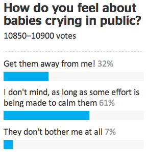
In the Herald, the story is accompanied by another bogus poll, one that gives a quite different impression (and which doesn’t come with a disclaimer)

The difference will partly be the different audiences, partly the different phrasing of the question, and partly a reflection of the fact that bogus polls are completely useless as data-gathering methods.

The lack of agreement is still pretty dramatic.


January 24, 2013

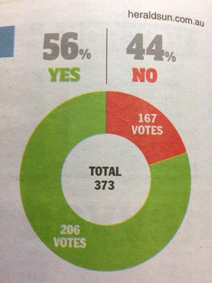
Pie charts rot the brain

Evidence from a well-known West Island newspaper

hun


The chart says about 20%, the numbers say 44% (actually 45% if you can round correctly, but let’s not quibble).  (via and)