Posts from November 2012 (71)

November 17, 2012

infoGRAPHIC

Infographics can be useful — the New York Times ones usually are — but often they are just dubiously-illustrated lists of information.  Or, not even information.

One that is doing the rounds of the Internet at the moment purports to list the best-selling science-fiction novels of all time.  It’s not entirely correct.  For example, its entry for “Twenty Thousand Leauges[sic] Under The Sea”, says

Twenty Thousand Leagues Under The Sea – Jules Verne has sold over 10,000 COPIES and has been translated into 147 languages.

That would be over 68 copies per language. No wonder they kept translating it.

No-one seems to know the original source of this infographic, and my guess is that the true author won’t be eager to change  this situation.

(via)

November 16, 2012

Consider vs actually do

Stuff reports on an Ipsos poll saying that about 1 in 3 people across many countries would consider travelling for medical treatment (and 18% “definitely would consider”).  For the USA, specifically, the figure was 38%.

The story also reports estimates of the actual number of people each year who travel from the USA for health reasons: 60 000 to 750 000. That sounds like a lot, but it’s actually 0.02%-0.25% of the US population, a bit of context that would have be useful in the story.

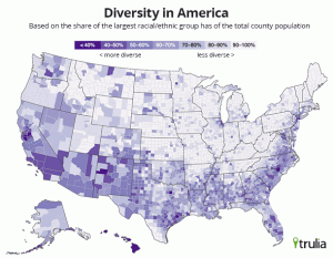
Ethnic diversity here and US

Real-estate data company Trulia has an article on their blog about ethnic diversity in the US, which they measure by the proportion of the population in the largest ethnic group (so low proportions mean more diversity).  Here’s their national map (they also have maps of some cities)

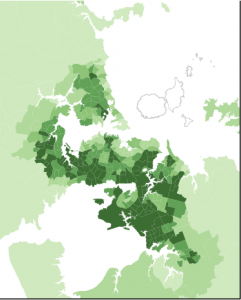
Stats New Zealand have also released maps, though just for Auckland.  Their index of ethnic diversity is 100% minus Trulia’s index, so they are equivalent, though the NZ color scheme is darker in the mid-range than the US one.  The 2006 map of Auckland looks like

It would be interesting to do this for the whole of NZ using the Census meshblock dataset, but I don’t have time right now.  The Auckland map makes the point I made a few weeks ago about modern NZ having more, and more varied, immigration than most people outside the country realise.


Screening anticancer compounds: how it’s really done

I’ve commented a number of times about stories in the papers where researchers have, basically, dripped herbal tea on cancer cells in a Petri dish and found it killed them (the cells, not the researchers).  Screening anticancer compounds this way does work, it’s just that it doesn’t work very often, and when it does work it’s just the first step of years of likely failure.

Derek Lowe, at In The Pipeline, writes today about a research paper looking for things that might kill cancer stem cells.  These are a tiny fraction of cells in a tumour, but are thought to be responsible for a lot of the treatment resistance and relapse.  The researchers couldn’t work with actual cancer stem cells, which aren’t available in large quantities, so they used imitations produced by gene knockout. They screened 300 000 compounds from a large collection maintained by the National Institutes of Health.  About 3000 killed the imitation stem cells.  They then threw out all the compounds known to be highly toxic to normal cells, and those that repeatedly show up in screens for interesting properties.  The problem with the latter group is that either they cheat (ie, they interfere with the assays being used) or they really do so many different things that they probably won’t be practical tools.

Of the remaining 2200 compounds that killed the imitation stem cells, nearly all of them also killed the original cancer cells that didn’t have the gene knockout, so however they might work it’s probably nothing useful for cancer stem cells.  Finally, they rechecked the results with independent samples of the compounds (since if you have a collection of 300 000 compounds, no matter how careful you try to be, they aren’t all going to be what they say on the tin).

After all of this, they ended up with two compounds that appear to be selectively toxic against cancer stem cells.  These aren’t drugs, even potentially, but they should be useful for finding out more about the biological differences in cancer stem cells and that, in turn, may lead to new treatments.

November 15, 2012

Stop it or you’ll go blind

According to the Herald, a West Island eye expert says that ‘up to’  5% of people who watched the solar eclipse will have permanent eye damage in the form of a blind spot or black spot in the center of their vision.  That could easily be hundred thousand people in New Zealand, which seems (a) excessive and (b) rather light on supporting data for such an important public health claim.

Auckland eye doctor Sarah Welsh is quoted as being a bit more realistic

… anyone who watched the event with the naked eye could have damaged their retina.

She had seen at least one patient today who believed they damaged their eyes yesterday….

Yet Welsh said it was “unlikely” five per cent of people suffered such burns.

“I’m not sure where he got that number from,” she said.

A brief session with the internets reveals that after a 1999 eclipse in Britain, there were 14 confirmed cases of permanent eye damage. The same eclipse was also seen in Stockolm, Sweden, where there were 15 cases recorded.  And in 1995, an eclipse in Pakistan led to 36 cases at the Abbottabad Hospital, 26 of whom recovered completely.  There will be some under-reporting in all these examples, but it’s hard to imagine that only one in a hundred or one in a thousand of the people with eye damage reports it.

So where did the 5% number come from? It probably sounded plausible.  That is, he pulled it out of his hat. Or somewhere else round and inappropriate.


Bad news, but good story

The Herald’s story about perinatal mortality in the Counties Manukua DHB area is informative and statistically sensible.  They also have a story about stillbirths, with actual data and expert comments.


November 14, 2012

How good were US election predictions?

Neil Sinhababu has compiled a list of US election predictions by professional pundits, ranked on how well they predicted the overall Electoral College results, the ten marginal states, and the popular vote (as a tie-breaker).

Remember that since people such as Sam Wang, Simon Jackman, and Nate Silver obtain their predictions deterministically from poll data, and publish them in fine detail, people who have any additional sources of information not represented in opinion polls should be able to do better on average, since they can also use the poll summaries as inputs to their own thinking. On the whole, though, the people with additional sources of information mostly did worse.  If we say that Florida was too close to call, we find ten predictions that were otherwise accurate. One was the Intrade betting market, seven were deterministic models, and only two were individuals.

In the future, as happened with baseball after Moneyball, the journalists should start to use the statistical predictions more effectively.  They probably won’t beat the models by much, but they should be able to avoiding doing much worse and sometimes do slightly better.


2013: International Year of Statistics

A call for contributions from The Australian Mathematical Sciences Institute:

2013 is the International Year of Maths of Planet Earth and the International Year of Statistics. This is a once in a decade PR opportunity for the our discipline, AMSI is coordinating the national program for the year.

We are looking for guest bloggers to help us get the word out about the beauty and application of mathematics and statistics in the world around us. We want to show how mathematics and statistics appear in transport networks, bone remodelling, bush fire prediction, economic forecasting, predicting weather patterns, nature, movie animation, gene sequencing or any of the many other areas. Whatever your area of mathematics or statistics we want to hear from you.

This is an opportunity to showcase your research and teaching and help us show the limitless applications of mathematics and statistics to inspire the next generation.

Interested, or want more information? Email Simi.

Up or down

The Herald (from the Daily Mail, sadly) has a headline “Baby girls exposed to stress have great risk of teen anxiety”.  “How great?”, you ask. They don’t say.

We do learn:

Teenage girls are more likely to struggle with anxiety and depression if they’re exposed to stress as babies, a study has found.

If you go to look at either the abstract, or the more comprehensible explanation in Nature News, you find that this isn’t quite right

The study showed that 18-year-old girls who had had high cortisol levels at age 4 have weak connectivity between the amygdala, a deep nub of the brain known for processing fear and emotions, and the ventromedial prefrontal cortex, an outer region involved in curbing the amygdala’s stress response.

But without taking cortisol into account, early stress, in itself, is not significantly correlated with the differences in brain activity seen at age 18…

The study also found that girls who have higher scores on anxiety tests have weaker synchrony between these two regions than do girls with lower scores. Intriguingly, the opposite pattern was found for depressive symptoms: higher depression scores correlate with stronger connectivity.

Or, in the original Greek

For females, adolescent amygdala-vmPFC functional connectivity was inversely correlated with concurrent anxiety symptoms but positively associated with depressive symptoms,

Nothing about the opposite findings for anxiety and depression made it into the story. If you go on to read the full article, you also find that while they measured early life stress and they measured symptoms of adolescent anxiety and depression, they don’t report on the associations between them.  The analysis is about how the other variables related to the brain wave patterns.   At least, for a change, the gender differences in the story are supported by the research.

The research is actually quite interesting and potentially useful, and the correlations between cortisol levels and brain waves are respectably strong.  Much stronger, for example, than the link between the results and the headline and lead in the story.

November 13, 2012

The light at the end of the tunnel

It’s the end of another semester, and we’re about to have a couple of days of presentations by our BSc(Hons) and MSc students, telling us what they’ve been doing all year:

Improving staffing schedules at a Cardiothoracic Intensive Care Unit

Clickers: A study of student opinion on audience response technology

Population modelling interactions between introduced and threatened species for conservation management 

Deal or No Deal

From question to design: Creating a guide for experimental planning and design in the biological sciences 

Balanced Incomplete Block Design in Multivariate Analysis

Use of multivariate omnibus test with mixed model analysis on heterogeneous nested data

Generalised Estimating Equations (GEEs) in the multivariate omnibus test

Web-based interactive graphics

Interactive Graphics for Data Quality Assessment

Creating an R meta-analysis graphics package

Monte Carlo Methods for Adjusting Confidence Intervals for Parameter of Point Process Models

Investigating if follow-up at outpatient clinics helps prevent adverse patient outcomes from Bowel Resection and Hip Replacement 

Methods of analysing hospital length of stay

Data management for combining data sets and macro simulation

Bootstrap methods in linear regression

Comparison of volatility estimates in Black-Scholes option pricing

Financial planning for retirees

A diagnostic for the Gaussian copula

Model Selection under Complex Sampling

BART vs Logistic regression: Propensity score estimation

Modelling and Prediction of Electricity Consumption

Brand attribute importance using choice elimination