Happy little tweeps
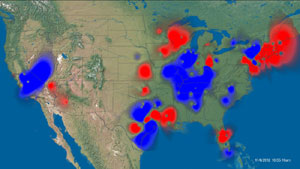
Via Stuff, Twitter heat maps composed by SGI, showing positive and negative sentiment on Twitter on particular topics.
This one is from the US election, and it shows the good and bad aspects of the heatmap. Since the information is in the colour scale, you don’t have the problem we saw earlier this week
On the other hand, you do have the problem that high population density regions are the ones that show up — giving a perhaps-misleading impression in this image that there was overwhelmingly more positive sentiment than negative about the US election results.
[update: wrong map initially]
Thomas Lumley (@tslumley) is Professor of Biostatistics at the University of Auckland. His research interests include semiparametric models, survey sampling, statistical computing, foundations of statistics, and whatever methodological problems his medical collaborators come up with. He also blogs at Biased and Inefficient See all posts by Thomas Lumley »
