Posts from October 2012 (66)

October 2, 2012

Fishy journalism

By comparison with NZ, the UK media are a target-rich environment for statistical and scientific criticism.  The Telegraph ran a headline “Just 100 cod left in North Sea”, and similar stories popped up across the political spectrum from the Sun to the Socialist Worker.

The North Sea, for those of you who haven’t seen it, is quite big. It’s about three times the size of New Zealand.  You’d have a really hard time distinguishing 100 cod in the North Sea from no cod.  An additional sign that something might be wrong comes later on in the Telegraph story, where they say

Scientists have appealed for a reduction in the cod quote from the North Sea down to 25,600 tons next year.

If there are only 100 cod, they must be pretty big to add up to 25,600 tons of catch. They’re not only rarer than whales, they are much bigger.

It turns out (explains the BBC news magazine) that the figure of 100 was for cod over 13 years old. The papers assumed that 13 was some basic adult age, but they should have been thinking in dog years rather than human years.  A 13-year old cod isn’t listening to boy bands, it’s getting free public transport and looking forward to a telegram from the Queen.

The government department responsible for the original figures issued an update, clarifying that the number of adult cod in the North Sea was actually about 21 million.

October 1, 2012

Computer hardware failure statistics

Ed Nightingale, John Douceur, and Vince Orgovan at Microsoft Research have analyzed hardware failure data from a million ordinary consumer PCs, using data from automated crash-reporting systems. (via)

Their main finding is that if something goes wrong with your computer, you should panic immediately, rather than being relieved when it seems to recover. Machines that accumulated at least 5 days full-time use over eight months had a 1/470 chance of a hard disk failure, but those that had one hard disk failure had a 30% chance of a second failure, and those with a second failure had nearly a 60% chance of a third failure.  Do you feel lucky?

It’s obvious that the set of computers that have a failure are basically doomed, but this still leaves open an interesting statistical question.  Does the risk of a second failure increase because the first failure damages the computer, or because the first failure picks out a set of computers that were always a bit dodgy?   I think the researchers missed something here: they tested for whether the times between failures have an exponential distribution (which is the distribution for events that don’t have any memory), and found that it didn’t.  That doesn’t distinguish between the situation where each computer has its own constant risk of failure, and the situation where each machine starts off the same but some of them have risk increasing over time.

For computers, it doesn’t matter very much which of these possibilities is true, but in some other contexts it does.   For example, if young people sent to prison are more likely to reoffend, we want to know whether the prison exposure was partly responsible, or whether these particular people were likely to reoffend anway. Unfortunately, this turns out to be hard.

Let’s-all-panic colour scheme

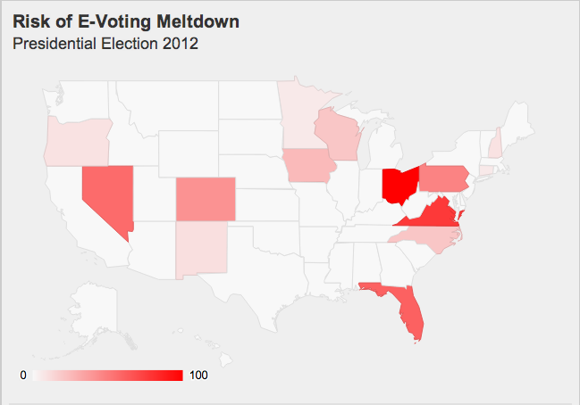
The excellent blog Freedom to Tinker, which focuses on political and social policy concerns related to computing, has an interactive graphic showing where problems with electronic voting are most likely to have a serious impact on the US election. Here’s a snapshot:


The ‘risk’ is scaled so that the top state, Ohio, is at 100. Because of the association of 100 with 100% that probably tends to exaggerate the impact, but the color scheme is worse. There’s almost no visible difference between Ohio at 100 and Virginia at 77, but Pennsylvania (47) is visibly paler than Nevada (57).  For comparison with the colour scale in the map, here’s a colour scale that tries to be uniform (a straight line in CIE Lab space)

Looking at this scale (and using a color picker program for better matching), Virginia seems to be at about 85, and Florida(61) well above 70.  So there really is a distortion of the visual impression.  The distortion probably isn’t deliberate, but comes from using linear interpolation on a scale that doesn’t match visual perception as well.

Worthless degrees

The Herald, overcoming its dislike of education league tables,  says that NZ degrees are the most worthless in the developed world

New Zealand is at the bottom of the global league tables. The net value of a man’s tertiary education is just $63,000 over his working life, compared with $395,000 in the US. For a Kiwi woman, it’s $38,000 over her working life.

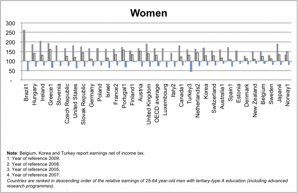
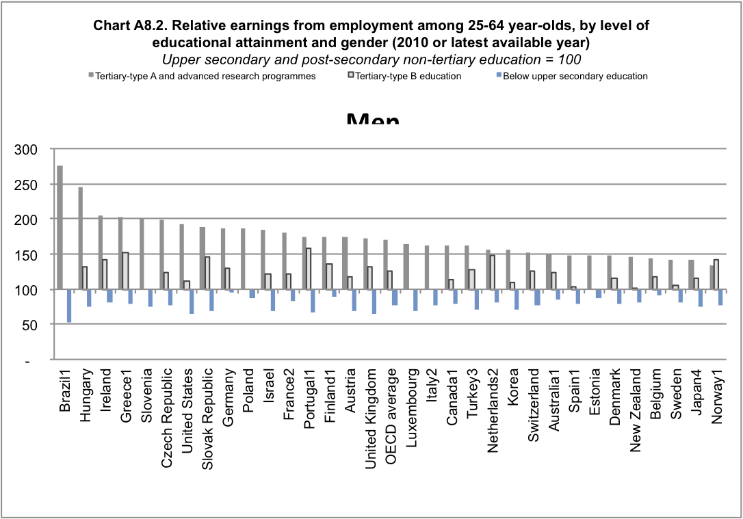
They don’t actually say what OECD report they looked at, but if you go to the OECD Directorate for Education and look at the most recent report, you can get these graphs (click to embiggen)


From the graphs, it’s fairly clear that for ‘Tertiary type-A and advanced research” degrees, NZ is not in fact at the bottom, but people with “Tertiary B-type” degrees do not seem to have any difference in income from those without degrees.  So what are these types: Type A is

Largely theory-based programmes designed to provide sufficient qualifications for entry to advanced research programmes and professions with high skill requirements, such as medicine, dentistry or architecture. Duration at least three years full-time, though usually four or more years

and Type B is

Programmes are typically shorter than those of tertiary-type A and focus on practical, technical or occupational skills for direct entry into the labour market, although some theoretical foundations may be covered in the respective programmes. They have a minimum duration of two years full-time equivalent at the tertiary level.

So, people with traditional university degrees do earn more in NZ, but people with other tertiary qualifications may well not.  It’s also important to remember that these are people in NZ with these degrees: the earnings of Kiwis who migrate overseas are not counted, but the degrees of migrants to NZ are counted even if they aren’t really recognised here.


The other interesting thing about the graph is who else is at the low end: Norway is at the bottom, Sweden and Denmark are both low.  It’s useful to think about the reasons that people with university degree might have higher incomes

  • Specific training: your degree gives you skills and knowledge that are helpful in your specific occupation
  • General training: a degree gives you transferable skills that are helpful in many occupations
  • Signalling: completing a degree shows employers that you can complete a degree
  • Stratification: higher education is a way for the wealthy to perpetuate their advantages through hiring ‘people like us’ for good  jobs

The first two of these are beneficial to the individual and to society as a whole.  The third may be beneficial to the individual, but not to society as a whole, and the fourth is actively harmful.  Among developed countries, those with low social mobility (such as the UK and the USA) have larger differences in income between those with and without degrees than those with higher social mobility (such as the Scandinavian countries).

This context sheds a different light on one of the comments quoted by the Herald

Employers and Manufacturers Association boss Kim Campbell agreed. People at the top in business weren’t paid anything near what counterparts overseas were getting because we didn’t have the big companies that paid top dollar.

A top-level executive in New Zealand would be lucky to get 10 times the entry-level pay rate, he said. In the US, it was not uncommon to get 200 times that level.

You don’t have to be a raving lefty to be dubious about this as an argument in favour of the US system.
Stat of the Week Competition: September 29 – October 5 2012

Each week, we would like to invite readers of Stats Chat to submit nominations for our Stat of the Week competition and be in with the chance to win an iTunes voucher.

Here’s how it works:

  • Anyone may add a comment on this post to nominate their Stat of the Week candidate before midday Friday October 5 2012.
  • Statistics can be bad, exemplary or fascinating.
  • The statistic must be in the NZ media during the period of September 29 – October 5 2012 inclusive.
  • Quote the statistic, when and where it was published and tell us why it should be our Stat of the Week.

Next Monday at midday we’ll announce the winner of this week’s Stat of the Week competition, and start a new one.

(more…)

Stat of the Week Competition Discussion: September 29 – October 5 2012

If you’d like to comment on or debate any of this week’s Stat of the Week nominations, please do so below!