Posts from October 2012 (66)

October 10, 2012

Kids these days

Stuff is using a survey from Weight Watchers as a hook for a story

Four out of five Generation Z youths – those born from 1990 – don’t use any fresh ingredients in their daily evening meals and 39 per cent are unable to correctly identify staple veggies such as leek or zucchini.
 
The new Weight Watchers survey of 1000 people, studying Kiwis’ eating attitudes and food knowledge, has been released today as part of an initiative aimed at tackling obesity.
 
It found New Zealanders were largely sedentary, have lost touch with the importance of savouring mealtimes, and younger generations’ cooking skills were at risk.

As usual, there’s no indication of whether this is a real survey or how it was done, and Weight Watchers itself doesn’t have anything on its website.  It’s not even clear whether this was a survey just of ‘Generation Z’ or of the country as a whole. If the formerlatter, it can’t be very reliable about younger generations, if the latterformer it can’t tell us whether New Zealanders are ‘largely sedentary’.  Of course, if you don’t really care whether the numbers mean anything, it doesn’t matter much.

Also (as the story partially addresses), it’s not clear that there was ever a Golden Age when 18 year olds all cooked nutritious meals from raw ingredients, and while it may be true that fewer Kiwis can identify leeks than in the 1950s, I bet more can identify bok choy. Not that you actually need to be able to identify a leek: when you go to the shop, they’re the things labelled “leeks”, or perhaps “leek’s”.

[Update: Rachel found a presentation of the results. It shows that the 34% of Generation Z who eat vegetables with their evening meal compares to a massive 40% for ‘Silent Generation’, presumably the largest difference between generations they could find.  Not impressed.]

 

October 9, 2012

False positives and copyright

Any binary decision requires us to consider both the probability of getting it right and the consequences of getting it wrong.  Many legal systems have traditionally felt that wrongful convictions are worse than wrongful acquittals, and this forms part of the support for the presumption of innocence.

In other areas of the law, the incentives are different.  In automated detection of unauthorized copying, and resulting ‘takedown’ notices under laws such as the US DMCA, there is effectively no risk to the copyright holder from false positives, so there is not much incentive to avoid them.

An interesting example (via the far-from-unbiased BoingBoing) is this takedown notice, one of the stream routinely posted by Google at ChillingEffects.  The first few pages just show torrent sites that posted unauthorised copies of MS Office and deserve what’s coming to them, but if you scroll down to Copyright Claim #2, it starts to look different: (more…)

Random variation and US polls

Since 3News has had a story saying that Romney is ahead in the US polls (not up yet, but look here later) I figure it’s worth linking to someone who understands these things, Nate Silver.

In short, yes, a poll by a very respectable group did report Romney as ahead, in a very large swing. But other polls showed much smaller swings. So it’s most likely that part of the result is random variation.  It’s true that Romney’s advantage is larger than the margin of error in this poll, but that does happen: one poll in twenty should be outside the margin of error even if there’s nothing more complicated going on.

Nate Silver’s projection including this poll still gives Romney only a 25% chance of winning, about twice what he had before the debate. Intrade‘s betting gives about 35%, up from just over 20%.

[ update: the Princeton Election Consortium meta-analysis of polls has Obama with a 2% lead, down from 6%, but predicted to rise again]

Pie charts with 110% awfulness

Pie charts, as you may have noticed, are not very popular among statisticians, despite the best efforts of the world’s most popular statistics package.  Pie charts with fake 3D are much worse, since the 3-D effects make it harder to see the numbers they can be actively misleading.  But the worst form of pie chart must be the one that gives up on the ‘pie’ metaphor and shows numbers that aren’t even shares of a total.

Stat-of-the-Week nominator Mark points us to this example:

from an otherwise-reasonable post at TechRepublic, on malware-blocking by internet browsers (though it could have done with some consideration of false positives and absolute risk).

The numbers are taken from a report by a professional security lab, but the graphic design is new and original. The report had an inoffensive bar chart, which makes the point much more clearly


October 8, 2012

Real-estate infographics

The Herald has some quite attractive interactive graphics of real-estate prices, but I’m not entirely convinced of their informativeness.  You can see any one of the numbers by pointing at it, but you can’t see two numbers simultaneously, just the binary up/down indicator.

Having a separate category for ‘basically the same’ would help, for example, Christchurch has one red and one green for both median house price and index level, but the increase in median house price is only 0.6% over a year, and the fall since last month is a relatively dramatic 5.7%.  Perhaps the intermediate colour could designate ‘increased less than inflation’, to offset the general resistance to using inflation-adjusted housing prices.

The red and green colours they chose have sufficiently different luminance than they are likely to be distinguishable even if you’re red:green color blind, which is to be commended, but I don’t really like the implication that cheaper housing is bad and more expensive housing is good.  I don’t think the Herald would use red for decreases and green for increases in the price of milk, or petrol, or health care.

A note on Stat of the Week topics

Most of StatsChat is just the opinion of its individual authors, who are identified on each post and can criticise anyone they feel deserves it.  The Stat of the Week award is slightly more official and more closely connected with the Department of Statistics, so we are reluctant to award it to statistics about other parts of the University of Auckland.  In particular, we won’t ever give the award to a bad statistic originating from an individual UoA staff member outside the Statistics department, and we will typically avoid giving a `bad statistics’ award to a statistic from any source that criticises the University or the staff union.   You can nominate these statistics, and individuals may decide to write posts about them, but they won’t win the award.

The Herald story about the University travel budget was a borderline case: the statistical problem is not a University one, since the Herald is perfectly capable of dividing by 4.5, and even of finding out how many staff there are and dividing by that number, but there are also real problems with the interpretation of the number, and that’s where this starts to look like special pleading.

Stat of the Week Competition: October 6 – 12 2012

Each week, we would like to invite readers of Stats Chat to submit nominations for our Stat of the Week competition and be in with the chance to win an iTunes voucher.

Here’s how it works:

  • Anyone may add a comment on this post to nominate their Stat of the Week candidate before midday Friday October 12 2012.
  • Statistics can be bad, exemplary or fascinating.
  • The statistic must be in the NZ media during the period of October 6 – 12 2012 inclusive.
  • Quote the statistic, when and where it was published and tell us why it should be our Stat of the Week.

Next Monday at midday we’ll announce the winner of this week’s Stat of the Week competition, and start a new one.

(more…)

Stat of the Week Competition Discussion: October 6 – 12 2012

If you’d like to comment on or debate any of this week’s Stat of the Week nominations, please do so below!

October 6, 2012

Statistical interviews

As part of the “Statistical Reasoning” course in biostatistics at Johns Hopkins School of Public Health, John McGready has started a series of interviews with statistical researchers talking about their work.

The victims subjects include Roger Peng and Jeff Leek (who write the Simply Statistics blog), Karen Bandeen-Roche (the head of the department), and Tom Louis (generally famous statistician).


Beyond grade inflation

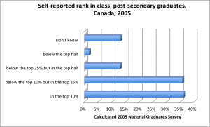
From Frances Woolley at the economics blog ‘Worthwhile Canadian Initiative’

Canada’s 2005 National Graduates Survey asked respondents the following question: “Compared to the rest of your graduating class in your field(s) of study, did you rank academically in the top 10? Below the top 10% but in the top 25%…”