With friends like these…
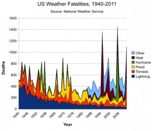
On Ezra Klein’s blog at the Washington Post, Dylan Matthews has published one of the least convincing scary climate change graphs I’ve even seen. The graph purports to show that weather fatalities are increasing in the USA, and this is attributed to climate change.
The most obvious feature of the graph is the decrease in deaths due to lightning, which is partly because people spend less time outside and partly because of better forecasting. This is also an excellent illustration of the fact that stacked plots don’t work very well for unordered categories.
There’s an increase in the light blue section in recent years, but it’s obvious that the data weren’t recorded far back into the past. Matthews says “Other” includes cold, winter/snow, rip current and miscellaneous weather events. Part of the increase in that category reflects better NWS record-keeping, but the spike is striking, nonetheless.” Deaths from cold and snow are certainly not a new phenomenon in the US, and on average are probably decreasing with climate change.
The 1995 Chicago heat wave is visible. This genuinely was an event of the sort that is going to be more common with climate change, but again, the deaths from heat weren’t recorded back into the past. Just off the graph to the left is 1936, when more than 5000 people died in the worst heat wave in US history, a number that would swamp the weather events of recent years.
Even the hurricane trend is misleading: most hurricanes now kill relatively few people because of better warnings and better buildings. There’s a big spike for Katrina, again a major disaster, but only the third worst US hurricane in terms of deaths. The Galveston hurricane of 1900 killed more than four times as many people.
And even taking the numbers at face value, the population of the US now is 2.5 times what it was in 1940, on the left-hand side of the graph. The death rate from weather in the US is lower than it was in the past. It’s also lower than it’s going to be in the future, a conclusion which, unfortunately, is grounded in a lot more than this graph.
Thomas Lumley (@tslumley) is Professor of Biostatistics at the University of Auckland. His research interests include semiparametric models, survey sampling, statistical computing, foundations of statistics, and whatever methodological problems his medical collaborators come up with. He also blogs at Biased and Inefficient See all posts by Thomas Lumley »

And, as usual, America’s Finest News Source has it better: Nation suddenly realizes this just going to be a thing that happens from now on.
12 years ago