Let’s-all-panic colour scheme
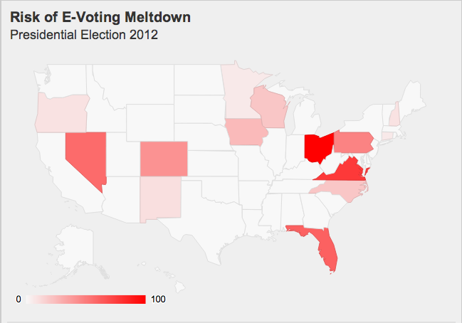
The excellent blog Freedom to Tinker, which focuses on political and social policy concerns related to computing, has an interactive graphic showing where problems with electronic voting are most likely to have a serious impact on the US election. Here’s a snapshot:
The ‘risk’ is scaled so that the top state, Ohio, is at 100. Because of the association of 100 with 100% that probably tends to exaggerate the impact, but the color scheme is worse. There’s almost no visible difference between Ohio at 100 and Virginia at 77, but Pennsylvania (47) is visibly paler than Nevada (57). For comparison with the colour scale in the map, here’s a colour scale that tries to be uniform (a straight line in CIE Lab space)
Looking at this scale (and using a color picker program for better matching), Virginia seems to be at about 85, and Florida(61) well above 70. So there really is a distortion of the visual impression. The distortion probably isn’t deliberate, but comes from using linear interpolation on a scale that doesn’t match visual perception as well.
Thomas Lumley (@tslumley) is Professor of Biostatistics at the University of Auckland. His research interests include semiparametric models, survey sampling, statistical computing, foundations of statistics, and whatever methodological problems his medical collaborators come up with. He also blogs at Biased and Inefficient See all posts by Thomas Lumley »
