Posts from October 2012 (66)

October 31, 2012

Diet story with added fizz

According to Stuff, a Japanese research study has found that sugary drinks cause strokes. In women, not men (they found a weak association in the opposite direction in men).  And only strokes, not heart disease. And when they say “sugary”, this isn’t based on the sugar content, since 100% fruit juices were excluded.   The researchers have some fairly unconvincing excuses for why only strokes were increased, and only in men.

The headline was “Female? Put down the fizzy drinks”, which manages to capture the implausible part of the findings while getting the plausible part completely wrong: the research looked at drinks with added sugar, not drinks with added fizz.

The story does better than the headline, at least putting the research in context with the other findings that suggest the impact isn’t restricted to strokes in women. They also quoted an expert from the Cleveland Clinic, who sensibly ignored most of the details of the study findings and said:

”It makes sense, if (sugar sweetened beverages) increase the risk for obesity, diabetes, insulin resistance, inflammation, then it should, in fact, raise the risk for cardiovascular disease, and that’s what we’re seeing,” said Adam Bernstein, a researcher at the Cleveland Clinic, who was not involved with the study.

Other sources did far worse than Stuff. For example, the site Food Navigator completely misrepresented the results, saying that “one fizzy soft drink per day could bump up the risk of stroke by up to 80%”, when the actual figure in the abstract is 21% for total stroke (something that they got right later in their story). They also said the risk was increased in men, which is the opposite of what the paper says, and that the participants were all between 40 and 49, when in fact they were between 40 and 59 at the start of the study and between 58 and 77 at the end of the study.

The really interesting question is why this study, which doesn’t actually add much to what we already know, has made global news.  We’d have to ask Reuters about that.
With friends like these…

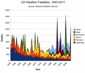
On Ezra Klein’s blog at the Washington Post, Dylan Matthews has published one of the least convincing scary climate change graphs I’ve even seen.  The graph purports to show that weather fatalities are increasing in the USA, and this is  attributed to climate change.

The most obvious feature of the graph is the decrease in deaths due to lightning, which is partly because people spend less time outside and partly because of better forecasting.   This is also an excellent illustration of the fact that stacked plots don’t work very well for unordered categories.

There’s an increase in the light blue section in recent years, but it’s obvious that the data weren’t recorded far back into the past. Matthews says “Other” includes cold, winter/snow, rip current and miscellaneous weather events.  Part of the increase in that category reflects better NWS record-keeping, but the spike is striking, nonetheless.”  Deaths from cold and snow are certainly not a new phenomenon in the US, and on average are probably decreasing with climate change.

The 1995 Chicago heat wave is visible.  This genuinely was an event of the sort that is going to be more common with climate change, but again, the deaths from heat weren’t recorded back into the past.  Just off the graph to the left is 1936, when more than 5000 people died in the worst heat wave in US history, a number that would swamp the weather events of recent years.

Even the hurricane trend is misleading: most hurricanes now kill relatively few people because of better warnings and better buildings.  There’s a big spike for Katrina, again a major disaster, but only the third worst US hurricane in terms of deaths. The Galveston hurricane of 1900 killed more than four times as many people.

And even taking the numbers at face value, the population of the US now is 2.5 times what it was in 1940, on the left-hand side of the graph. The death rate from weather in the US is lower than it was in the past.  It’s also lower than it’s going to be in the future, a conclusion which, unfortunately, is grounded in a lot more than this graph.

Hurricane map

The Guardian has a map (also with animated thingies) of all the hurricanes since 1851.

d

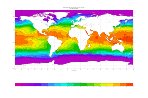
One of the most dramatic features is the semicircle of hurricanes in the Southern Hemisphere.  That’s because the ocean isn’t warm enough in the other half: see this graph from NOAA

Since the oceans are getting warmer, you might expect hurricanes to be getting worse.  It’s a bit more complicated than that, since climate change is warming the upper atmosphere more than the surface, which would tend to decrease hurricanes.  Still, NOAA expects more really intense hurricances and greater total rainfall from them, and they think it’s more likely than not that the overall frequency will go up.

October 30, 2012

Some people don’t know when to give up

After teaching an online course “Computing for Data Analysis” to 50,000 people through Coursera, Roger Peng has decided to do it all again on his blog next month.

Think of it as an Advent calendar for aspiring DIY statisticians.

October 29, 2012

Data visualisation tools

A list of 20 from NetMagazine, via BetterPosters.

Yes, I did check that R was on the list before passing it on.


Cocoa not-so-boom

The Herald is enthusing about the new worlds of chocolate, and the boom in consumption in various parts of the world.

Japan aside, chocolate sales are also growing 30 per cent year on year in China, while in India – even though one in two Indians have never tasted chocolate – growth is 20 per cent, for a treat taken ultra sweet and milky.

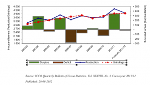
The Quarterly Bulletin of Cocoa Statistics, as you would expect from the name, takes a less effervescent attitude. Their data show a steady increase of about 3% per year for the past decade, with modest year-to-year fluctuations in production smoothed out by stockpiles.

70% of Auckland train trips to/from two stations

That’s Britomart and Newmarket. I just thought it was an interesting statistic, in the Herald’s coverage of the new “integrated” ticketing system (it works on trains, and also on trains.)

Auckland still larger than Wellington

Stuff, this time:

Auckland teenagers had the highest number of convictions for drink-driving, with 1553 in the past two years.

Christchurch teenagers weren’t far behind, with 1383, while 793 Hamilton teenagers were convicted and 728 Wellingtonians.

That’s out of a national total of about 9700 per two years (so this could also have been in our ‘think of a number and double it’ series).  Based on total population it looks as though the drink-driving rate in Auckland is about half that in the rest of the country — and any journalist should know that Auckland is roughly 1/3 of the country and Wellington and ChCh are each very roughly 1/3 of Auckland.

With a few minutes at Stats New Zealand we can check the denominators and see if teenagers are distributed differently than people.  At the 2006 Census, the number of 15-19 year olds was 99,000 for the Auckland region, 33,000 for the Wellington region, and 36000 for the Canterbury region (ChCh is about 60% of Canterbury), out of 300,000 for the whole country.  These follow the overall population pretty accurately

So, the numbers are showing a news story that’s the opposite of what was actually reported: Auckland has dramatically lower rates of conviction for drink-driving among teenagers than the country as a whole and than the other major cities.

Stat of the Week Competition: October 27 – November 2 2012

Each week, we would like to invite readers of Stats Chat to submit nominations for our Stat of the Week competition and be in with the chance to win an iTunes voucher.

Here’s how it works:

  • Anyone may add a comment on this post to nominate their Stat of the Week candidate before midday Friday November 2 2012.
  • Statistics can be bad, exemplary or fascinating.
  • The statistic must be in the NZ media during the period of October 27 – November 2 2012 inclusive.
  • Quote the statistic, when and where it was published and tell us why it should be our Stat of the Week.

Next Monday at midday we’ll announce the winner of this week’s Stat of the Week competition, and start a new one.

(more…)

Stat of the Week Competition Discussion: October 27 – November 2 2012

If you’d like to comment on or debate any of this week’s Stat of the Week nominations, please do so below!