Pie charts: threat or menace?
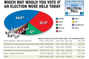
Stuff has a story based on a real and useful poll, but summarised with a dreadful graph. You will have heard statisticians ranting about pie charts and may have wondered whether their medications need to be adjusted. Here’s why we rant.
Notice that the pie isn’t round; it’s an ellipse. Presumably we’re supposed to imagine it being tilted away at some angle (in contrast to the table, the headline, and the legend, which are aligned with the page. Also notice that the wedges have numbers on them — that’s often a sign that the graph can’t be interpreted by itself. The red wedge looks a lot smaller than the blue wedge.
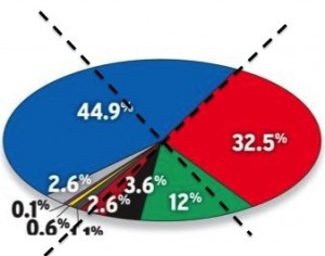
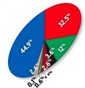
We can see how much smaller the red wedge is either by sticking some reference lines on top of the pie, or by rotating it so the edge between red and blue is vertical — the brain is much better at vertical symmetry than most other visual tasks.
Either way, it’s clear that the blue wedge is close to half the pie, but the red wedge is less than a quarter of the pie.
I don’t think Stuff are doing this deliberately, but it shows how pie charts and fake 3-d both make your brain work a lot harder to get the right answer. That’s why those of us whose graphs are primarily designed to convey quantitative information don’t like pie charts and don’t like fake 3-d perspective. Communication is hard enough without extra obstacles.
Thomas Lumley (@tslumley) is Professor of Biostatistics at the University of Auckland. His research interests include semiparametric models, survey sampling, statistical computing, foundations of statistics, and whatever methodological problems his medical collaborators come up with. He also blogs at Biased and Inefficient See all posts by Thomas Lumley »


Evidently Tracey Watkins and her graphic artist have been moved to introduce us to the ellipsoid chart – from the Greek ἔλλειψις elleipsis, a “falling short”… :)
Another interesting side-bar is that in the 2011 election a million eligible voters didn’t vote – 26.2% – this consideration doesn’t appear anywhere in Watkins’ analysis.
13 years ago
I just can understand why pie-charts are still the number ‘one’ used graph. Can’t someone find a cooler way to present results and comparisons? get back to me if you do and I will integrate it in our new Survey tool that is to be launched soon.
12 years ago