Global Innovation Barchart
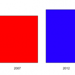
So. The 2012 Global Innovation Index is out and NZ looks quite good. Our only Prime Minister has a graph on his Facebook page that looks basically like this.
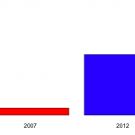
The graph shows that NZ was at rank 28 in 2007 and is now at rank 13.
A bar chart for two data points is a bit weird, though not nearly as bad as the Romney campaign’s efforts at Venn diagrams in the US.
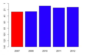
The scaling is also a bit strange. The y-axis runs from 1 to 30, but there’s nothing special about rank 30 on this index. If we run the y-axis all the way down to 141 (Sudan), we get the second graph on the right, which shows that New Zealand, compared to countries across the world, has always been doing pretty well.

Now, there are some years missing on the plot, and the Global Innovation Index was reported for most of them. Using the complete data, we get a graph like
So, in fact, NZ was doing even better on this index in 2010, and we get some idea of the year-to-year fluctuations. Now, a barchart is an inefficient way to display data with just one short time series like this: a table would be better.
More important, though, what is this index measuring. Mr Key’s Facebook page doesn’t say. Some of the commenters do say, but incorrectly (for example, one says that it’s based on current government policies). In fact, the exact things that go into the index change every year. For example, the 2012 index includes Wikipedia edits and Youtube uploads, in early years internet access and telephone access were included. There are also changes in definitions: in early years, values were measured in US$, now they are in purchasing-power parity adjusted dollars.
Some of the items (such as internet and telephone access) are definitely good, others (such as number of researchers and research expenditure) are good all things being equal, and for others (eg, cost of redundancy dismissal in weeks of pay, liberalised foreign investment laws) it’s definitely a matter of opinion.Some of the items are under the immediate control of the government (eg public education expenditure per pupil, tariffs), some can be influenced directly by government (eg, gross R&D funding, quality of trade and transport infrastructure), and some are really hard for governments to improve in the short term (rule of law, GMAT mean test score, high-tech exports, Gini index).
Since the content and weighting varies each year, it’s hard to make good comparisons. On the plus side, the weighting clearly isn’t rigged to make National look good — the people who come up with the index couldn’t care less about New Zealand — but the same irrelevance will also tend to make the results for New Zealand more variable. Some of the items in the index will have been affected by the global financial crisis and the Eurozone problems. New Zealand will look relatively better on these items, for reasons that are not primarily the responsibility of the current governments even in those countries, let alone here.
I’d hoped to track down why New Zealand had moved up in the rankings, to see if it was on indicators that the current administration could reasonably take credit for, but the variability in definitions makes it very hard to compare.
Thomas Lumley (@tslumley) is Professor of Biostatistics at the University of Auckland. His research interests include semiparametric models, survey sampling, statistical computing, foundations of statistics, and whatever methodological problems his medical collaborators come up with. He also blogs at Biased and Inefficient See all posts by Thomas Lumley »

The number of countries has changed over the years: the numbers are 107 130 132 125 141, respectively, so 141 isn’t a good baseline to use.
You could probably also recolour the 2009 bar — all the component measurements are taken, at latest, the year before the report was published.
A line graph would be better much than a table and a bar graph.
13 years ago
Percentiles would be better, to account for the varying number of , but it’s not going to change the look of the graph noticeably.
A line graph would be better than a barchart, but still, I think, inferior to a table for such a short series.
13 years ago