Posts from July 2012 (55)

July 31, 2012

Commuter survey ‘can’t be trusted’ – statistician

This just in from National Business Review – thanks to journo Caleb Allison and  NBR Online for giving us permission to upload the content, which sits behind a pay wall.

Commuter survey ‘can’t be trusted’ – statistician 

A statistician questions the validity of a survey promoting flexible working conditions for employees.

A recent survey by Regus – which describes itself as “the world’s largest provider of flexible workspaces” – said 67% of New Zealand employees would spend more time with family if they had a shorter commute as a result of flexible working conditions.

While the survey claimed to have polled more than 16,000 people in 80 countries, NBR ONLINE can reveal the company polled just 54 people in New Zealand.

Auckland University’s Dr Andrew Balemi says while it is a very low number, that alone does not suggest the poll is dodgy.

“Most people obsess about the sample size, but what I obsess about is the sample quality,” Dr Balemi says.

The only way to know if the information is credible is to know how the company undertook the survey.

However, the methodology was not included with the poll.

Dr Balemi says not only does this survey have a small sample size, it doesn’t tell the reader how it was obtained.

“In the absence of any explanation of how they’ve collected the data I wouldn’t trust this information.

“If they can’t even do that, I wouldn’t dignify it with any more consideration.”

He says the company may have a valid methodology and the poll could be worthy, but they should have included that information in the survey.

This follows another recent example of dodgy polling by the Auckland Council.

A press release claiming 63% of Aucklanders favour mayor Len Brown’s city rail loop turned out to have surveyed only 112 people.
July 30, 2012

Stat of the Week Competition: July 28 – August 3 2012

Each week, we would like to invite readers of Stats Chat to submit nominations for our Stat of the Week competition and be in with the chance to win an iTunes voucher.

Here’s how it works:

  • Anyone may add a comment on this post to nominate their Stat of the Week candidate before midday Friday August 3 2012.
  • Statistics can be bad, exemplary or fascinating.
  • The statistic must be in the NZ media during the period of July 28 – August 3 2012 inclusive.
  • Quote the statistic, when and where it was published and tell us why it should be our Stat of the Week.

Next Monday at midday we’ll announce the winner of this week’s Stat of the Week competition, and start a new one.

(more…)

Stat of the Week Competition Discussion: July 28 – August 3 2012

If you’d like to comment on or debate any of this week’s Stat of the Week nominations, please do so below!

July 29, 2012

Not quite, but thanks for playing

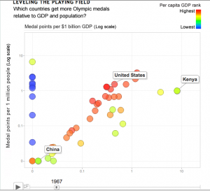
An interesting attempt at data visualization for Olympic medal counts, from US progressive magazine Mother Jones.  Dave Gilson looks to have used Google’s Motion Chart tools, which give the look of the GapMinder animations to your own data.  Unfortunately, it doesn’t quite work.


The first problem (as the article goes on to admit) is that the Olympics happen only every four years, but the animation is continuous — the snapshot above shows the medal counts for 1967, when the Olympics would have been held 3/4 of the way from Tokyo to Mexico City.

There’s also data problems: the vertical line of blue points should correspond to countries that do well on medals per capita, and poorly on medals per $GDP — ie, infinitely rich countries.  They are actually Eastern Bloc countries whose GDP was not available.  The article actually says a GDP of zero was used, but that’s not what the graph shows.

The whole idea of standardizing to total GDP and total population doesn’t really make sense here: GDP and population are roughly proportional for large sets of countries, so you’d expect a strong diagonal tendency in the graph even if wealth wasn’t all that important.   To spread the points out a bit and help disentangle GDP from population, it would be better to use population on one axis and per capita GDP on the other.  Han Rosling, in the original GapMinder animation, uses per capita GDP.

Incidentally, GapMinder also has much more complete data on GDP, which could have improved the medal graph.


July 26, 2012

Cancer deaths rates down (slightly)

The Herald has a story that, I think, satisfies all the best-practice guidelines for scientific news.

They are reporting on new Ministry of Health cancer mortality statistics for 2009, and trends up to that year. In particular

  • The source of the information is described well
  • They quote both total deaths and rates per 100,000 population, and explain why the trends are different.
  • They ask experts for comment and context, and give reasonable explanations of what might be causing the trends

A couple of things I would add to the story:  first, the mortality rates per 100,000 population are also age-adjusted, so they take into account the aging population, and second, an important contributing factor to the reduction in the cancer mortality rate over time is the reduction in smoking.  Improvements in diagnosis and treatment also help, but they are not the whole story, especially for lung cancer.

If you want the actual numbers, they are here.

Good reporting of a poll

The Herald has a fairly good story about a poll on motorway tolls:  the target population (Auckland City), the sample size, the results, and the sampling method are all described.

The sample wasn’t a random sample, but according to the description, it was still a reasonable sample

Those surveyed were drawn from a research panel recruited by Horizon in accordance with the demographics of Auckland’s adult population at the last Census, weighted to match age, gender, personal income, employment and education levels

The respondents will be a biased sample, but the pollers have made efforts to correct this bias.  That’s what is done in good-quality national surveys even if a random sample is taken, because non-response inevitably makes the sample less representative than it should be.

There are two points that would have been welcome in the story which weren’t there.  Firstly, there is no margin of error.  Using a biased sample and reweighting will typically give a larger margin of error than using a random sample, though not so large as to make a big difference to the conclusions the Herald reports.  Secondly, the respondents were asked for their opinions about different ways of raising 10 billion dollars to pay for major city projects, but it’s not clear whether they were asked about just not doing the projects and saving the 10 billion dollars.

July 25, 2012

NRL Predictions, Round 21

Team Ratings for Round 21

Here are the team ratings prior to Round 21, along with the ratings at the start of the season. I have created a brief description of the method I use for predicting rugby games. Go to my Department home page to see this.

Current Rating Rating at Season Start Difference
Bulldogs 7.75 -1.86 9.60
Rabbitohs 3.99 0.04 3.90
Warriors 3.65 5.28 -1.60
Broncos 3.45 5.57 -2.10
Cowboys 3.36 -1.32 4.70
Storm 3.09 4.63 -1.50
Sea Eagles 2.29 9.83 -7.50
Wests Tigers -0.26 4.52 -4.80
Knights -0.61 0.77 -1.40
Raiders -1.78 -8.40 6.60
Titans -1.90 -11.80 9.90
Dragons -3.07 4.36 -7.40
Sharks -4.28 -7.97 3.70
Roosters -5.26 0.25 -5.50
Panthers -6.87 -3.40 -3.50
Eels -7.28 -4.23 -3.00


Performance So Far

So far there have been 144 matches played, 84 of which were correctly predicted, a success rate of 58.33%.

Here are the predictions for last week’s games.

Game Date Score Prediction Correct
1 Sea Eagles vs. Bulldogs Jul 20 12 – 20 0.37 FALSE
2 Titans vs. Broncos Jul 20 14 – 10 -1.77 FALSE
3 Warriors vs. Knights Jul 21 19 – 24 11.38 FALSE
4 Eels vs. Storm Jul 21 16 – 10 -8.13 FALSE
5 Rabbitohs vs. Dragons Jul 21 36 – 14 9.58 TRUE
6 Sharks vs. Raiders Jul 22 4 – 36 8.47 FALSE
7 Panthers vs. Roosters Jul 22 28 – 16 1.16 TRUE
8 Cowboys vs. Wests Tigers Jul 23 29 – 16 7.19 TRUE


Predictions for Round 21

Here are the predictions for Round 21

Game Date Winner Prediction
1 Dragons vs. Storm Jul 27 Storm -1.70
2 Roosters vs. Titans Jul 27 Roosters 1.10
3 Bulldogs vs. Cowboys Jul 28 Bulldogs 8.90
4 Sea Eagles vs. Warriors Jul 28 Warriors -1.40
5 Sharks vs. Panthers Jul 28 Sharks 7.10
6 Raiders vs. Knights Jul 29 Raiders 3.30
7 Rabbitohs vs. Wests Tigers Jul 29 Rabbitohs 8.80
8 Broncos vs. Eels Jul 30 Broncos 15.20


Super 15 Predictions, Week 23

Team Ratings for Week 23

Here are the team ratings prior to Week 23, along with the ratings at the start of the season. I have created a brief description of the method I use for predicting rugby games. Go to my Department home page to see this.

Current Rating Rating at Season Start Difference
Crusaders 9.41 10.46 -1.10
Sharks 5.91 0.87 5.00
Stormers 4.55 6.59 -2.00
Hurricanes 3.40 -1.90 5.30
Chiefs 3.09 -1.17 4.30
Bulls 2.93 4.16 -1.20
Reds 0.41 5.03 -4.60
Brumbies -0.89 -6.66 5.80
Blues -2.77 2.87 -5.60
Waratahs -3.13 4.98 -8.10
Highlanders -3.17 -5.69 2.50
Cheetahs -3.99 -1.46 -2.50
Lions -8.75 -10.82 2.10
Force -9.18 -4.95 -4.20
Rebels -11.11 -15.64 4.50


Performance So Far

So far there have been 122 matches played, 87 of which were correctly predicted, a success rate of 71.3%.

Here are the predictions for last week’s games.

Game Date Score Prediction Correct
1 Crusaders vs. Bulls Jul 21 28 – 13 10.20 TRUE
2 Reds vs. Sharks Jul 21 17 – 30 1.30 FALSE


Predictions for Week 23

Here are the predictions for Week 23. The prediction is my estimated points difference with a positive margin being a win to the home team, and a negative margin a win to the away team.

Game Date Winner Prediction
1 Chiefs vs. Crusaders Jul 27 Crusaders -1.80
2 Stormers vs. Sharks Jul 28 Stormers 3.10


July 23, 2012

Road toll stable

From the Herald this morning

More people have died in fewer car smashes since January 1 than at this time last year, prompting a Government reminder about the responsibility drivers hold over others’ lives.

“The message for drivers is clear,” Associate Transport Minister Simon Bridges said yesterday of a spate of multi-fatality crashes that have boosted the road toll to 161.

The number of fatal crashes is 133, compared to 144 last year at this time, and the number of deaths is 161, compared to 155 last year.

How do we calculate how much random variation would be expected in counts such as these?  It’s not sampling error in the sense of opinion polls, since these really are all the crashes in New Zealand.  We need a mathematical model for how much the numbers would vary if nothing much had changed.

The simplest mathematical model for counts is the Poisson process.  If dying in a car crash is independent for any two people in NZ, and the chance is small for any person (but not necessarily the same for different people) then number of deaths over any specified time period will follow a Poisson distribution.    The model cannot be exactly right — multiple fatalities would be much rarer if it were — but it is a good approximation, and any more detailed model would lead to more random variation in the road toll than the Poisson process does.

There’s a simple trick to calculate a 95% confidence interval for a Poisson distribution, analogous to the margin of error in opinion polls.  Take the square root of the count, add and subtract 1 to get upper and lower bounds, and square them: a count of 144  is consistent with underlying averages rates from 121 to 169.   And, as with opinion polls, when you look at differences between two years the range of random variation is about 1.4 times larger.

Last year we had an unusually low road toll, well below what could be attributed to random variation.  It still isn’t clear why, not that anyone’s complaining.  The numbers this year look about as different from last year’s as you would expect purely by chance.  If the message for drivers is clear, it’s only because the basic message is always the same:

yellow road sign: You're in a box on wheels hurtling along several times faster than evolution could have prepared you to go

Stat of the Week Winner

No winner this week but thank you for your nominations. Please continue to nominate!