Posts from March 2012 (64)

March 8, 2012

Not all heart disease is the same

The Heart Foundation is calling for approval of a new drug, ivabradine (for subsidy — it’s already approved for prescription).  The report in Stuff, unfortunately, puts in a bunch of numbers of varying relevance.

We are told the pill costs “as little as $3 a day” and that “Up to 160,000 people” in New Zealand have heart disease.  If ivabradine was actually useful in all those 160,000 people, the total cost would be $175 million per year, or about a quarter of Pharmac’s budget.   And you would know about it already.

The randomized trials of ivabradine, which do look very promising, are in people with one specific type of heart failure.  Heart failure is a particularly nasty form of chronic heart disease where the heart can’t pump enough blood to supply oxygen to the body.  Slowing down the heart rate helps — for centuries, foxglove extract (digitalis) was used, and the introduction of standardised versions of digitalis in 1785 is regarded as the start of modern therapeutics.  Fortunately, heart failure is a relatively small part of heart disease in the population.   There’s about 10,000 hospitalisations per year for heart failure, but that’s not 10,000 different people.  A 2005 paper found 8000 deaths over 9 years, or about 900 per year.   Not all of these will be the specific type of heart failure where ivabradine works.

If ivabradine works as well in practice as in the trials, and there don’t turn out to be any nasty side-effects, the Heart Foundation could be right — it could potentially prevent (actually, postpone for a bit) hundreds of deaths per year in NZ.   But the 160,000 people with heart disease or the one death every 90 minutes from all types of heart disease are not relevant to this much more specialised medical question.
March 7, 2012

Smoking wrecks the economy

Our Stat-of-the-Summer was a miscalculation of the individual costs of smoking.  A correspondent has pointed me to an international correlation on the same topic.  Economists at ConvergEx have found a strongish correlation across countries between debt:GFP ratio and smoking.  The economists went as far as saying

“The relationship is strong enough that counting the cigarette butts in the ashtrays of street-side cafes around the world could be safely called `sovereign credit research’,” said Nicholas Colas, chief market strategist at ConvergEx.

That’s clearly nuts, but is the correlation telling us something useful or even interesting?  Could it really be true, as the correlation would suggest, that sovereign debt is the biggest factor affecting smoking rates (or, almost equally plausibly, vice versa)?

One empirical indication that ashtrays are not the best place to find national debt data comes from looking at changes over time.  Public debt is a cumulative process, so even more than usual we can quote the biologist D’Arcy ThompsonEverything is the way it is because it got that way”.

Over time, in the US, Britain, Australia, New Zealand, and many other countries, smoking reached a maximum among people born at the start of the twentieth century and has now been decreasing in popularity (because it, you know, kills you and stuff).  The pattern of public debt in those countries has been quite variable.  In Australia, debt ballooned and has now shrunk again.  In NZ, debt is increasing.  In the USA then debt:GDP ratio went down to a post-war minimum in the Clinton years and has been increasing again.  Also, the reasons for the changes are different in different countries — US debt is up largely because of tax cuts, but Australian debt is down in part because of better commodity prices.

So, over time, there is no consistent correlation between smoking and sovereign debt:GDP.  That being the case, it’s hard to see how the correlation across countries right now could be anything other than a coincidence.

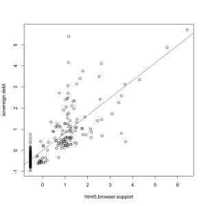
If you ask Google Correlate what is correlated with “sovereign debt” as a web search term, you find out that “html 5 browser support”, rather than “smoking” has the strongest correlation (0.82) among terms that aren’t specifically debt-related, as in the graph on the left.  That makes about as much sense.


Hardcore music has a use

News outlets around the world and locally are reporting on a study that found loud music made alcohol taste sweeter.  The research participants drank various concentrations of cranberry & vodka while listening to nothing,  loud annoying music, a news track that they had to repeat back, or both the music and the news.

People who listened to the music rated the drinks as sweeter.  The researchers suggest this explains why people drink more in clubs.  I think they’re missing an important point.  The sweetness of alcoholic drinks is under the control of the manufacturer and the drinker, and there’s no reason to think that people in quiet settings deliberately choose drinks that are less sweet than they would prefer.  If the noise effect is strong enough to be meaningful in practice, it should just mean that people choose less sweet drinks when it’s loud and sweeter ones when it’s quiet — the same way that people allegedly drink more tomato juice on aeroplanes because taste sensations are different at altitude.

The researchers also found that the combination of the music and the news task “was accompanied by increased negative mood”, so if you need to take dictation, choose a bar that plays country and western, not hardcore.

March 6, 2012

Ban icecream sniffing?

The Herald headline is “Icecream cravings like cocaine: study”, and it’s another paper from our friends at the American Journal of Clinical Nutrition, but this time filtered through the British press.

Co-author of the study, Dr Kyle Burger, from the Oregon Research Institute, told The Daily Telegraph overeating high fat or high sugar foods appeared to change the way the brain responded to the food.

That’s not quite what the paper said he found.  The study looked at brain activity in people drinking a milkshake compared to a tasteless drink, and found that the milkshake effect was smaller in people who had eaten icecream frequently in past weeks.  But it wasn’t smaller in people who had eaten cookies, chocolate, hamburgers, cake, or chips, and there wasn’t any relationship to total dietary fat and sugar.   So, in fact, the study found that overeating high fat or high sugar foods did not appear to change the way the brain responded to the food.  As far as I can tell (and, unlike you, I can get the whole paper), the study does not report at all on the relationship between craving for icecream and the brain activity measurements.

So. The study found that brain response to a milkshake was weaker in people who eat a lot of icecream, but was unrelated to other high-fat or high-sugar foods, and that people who have cravings for icecream eat more icecream than people who don’t have cravings for it.


Humans not yet obsolete

Stuff has a story on robot-assisted surgeries, claiming

Patients who have robot-assisted surgeries on their kidneys or prostate have shorter hospital stays and a lower risk of having a blood transfusion or dying – but the bill is significantly higher, a study found.

That’s not quite what the study found.  The abstract says

While robotic assisted and laparoscopic surgery are associated with fewer deaths, complications, transfusions and shorter length of hospital stay compared to open surgery, robotic assisted laparoscopic surgery is more costly than laparoscopic and open surgery.

The researchers used the Nationwide Inpatient Sample, a random subset of US hospital admissions, to compare three approaches to prostate and kidney surgery: laparoscopic (‘keyhole’) surgery by hand, robot-assisted laparoscopic surgery, and open (non-keyhole) surgery.  They found that laparoscopic surgery, whether robot-assisted or not, was safer than open surgery, but they didn’t report an advantage of robot over non-robot keyhole surgery, just an increase in cost.

Now, you might well be muttering about causation and correlation, and asking “How do we know the open surgeries weren’t just more difficult cases?” If you aren’t, then you can start now and I’ll let you pretend you were doing it all along.  Since surgeon experience makes a big difference, we should also worry whether it’s the most experienced surgeons who get the expensive and shiny new robots.

The researchers did try to cope with this problem using a technique called propensity scores.  Essentially, they tried to classify patients according to how likely they were to have an open surgery vs manual laparoscopic surgery vs a robot surgery, and match the patients so comparisons were done only between similar cases.  However, the researchers did say in the main body of the paper  “Results from unadjusted and propensity adjusted analyses were largely similar”, ie, the attempt to remove bias didn’t actually remove any bias.  The optimistic view is that this means there wasn’t any bias; the pessimistic realistic view is that it means the adjustment probably failed.

Surgical robots have been a bit of a disappointment.  It’s not that they don’t work, but they were supposed to have huge and dramatic advantages (over and above “ooh, shiny”) and these huge advantages don’t seem to have materialized.

March 5, 2012

Stats Crimes

Thank you for all the suggestions for Stats Crimes (feel free to continue to add your thoughts there too).

We thought you might be interested in a little insight into what the Department of Statistics at the University of Auckland came up with as their pet peeve Stats Crimes during their annual staff retreat recently.

Here’s just a few of them, I’ll post more soon:

Random vs ‘random’

Talkback radio and others not understanding that their listeners and viewers (audience) are not a random population, however ‘random’ they may be.

Definitions and changing definitions

Defining the “measure” they are talking about e.g. poverty, quality of life, employment data. Not stating that “measures” have changed – i.e. definition or classification. Often changes in definition or classification is part of the reason for an increase e.g. autism.

Not really that amazing

Coincidences are more likely than you think.

Association vs causation

Causal headlines from observational studies. “People who are poor watch too much TV. Get rid of TV no more poor people!” (Made this up.)

Bad graphs

Pie charts should be outlawed as comparison of size (areas) are impossible – should use barcharts. 3D graphs should also be outlawed. Chart junk. Uninformative graphics.

Stat of the Summer Competition Winner!

Thank you for all the fantastic Stat of the Summer nominations.

Two of them generated popular posts on Stats Chat:

The winner was chosen to be Eric Crampton’s nomination of smoker costs from The Quit Group, quoted on Radio NZ for smokers each costing the economy $139,000/year.

If it were true, the sky would fall in.

While the original source provided a form of correction to Eric for the smoking number, as far as we know Radio NZ didn’t correct the report.

Congratulations Eric for winning a copy of Tufte’s book “Beautiful Evidence”.

Thank you to everyone who took part and we are now resuming our weekly competition, so please keep your nominations coming in!

Think of a number, then double it

The Herald

More than 25,000 animals including fish have died during research and teaching at the University of Otago since 2009, and the figures are expected to increase significantly when statistics are collated for 2011.

No, really?  Going from a two-year total to a three-year total will result in an increase?

We collect multiple years of data for two main reasons: to compute averages (reducing statistical noise) and to compute differences (to learn about trends). Computing totals across multiple years is rarely helpful.

The Otago Daily Times does a better job: it uses the multiple years of data to give trends

Animal use by different groups in New Zealand has dropped by 29% during a three-year period from a record high of 341,520 recorded in 2008.

and

The number of animals being used for research purposes by universities in 2010 has dropped 43% from a high of 123,739 in 2008.

Stat of the Week Competition: March 3-9 2012

Each week, we would like to invite readers of Stats Chat to submit nominations for our Stat of the Week competition and be in with the chance to win an iTunes voucher.

Here’s how it works:

  • Anyone may add a comment on this post to nominate their Stat of the Week candidate before midday Friday March 9 2012.
  • Statistics can be bad, exemplary or fascinating.
  • The statistic must be in the NZ media during the period of March 3-9 2012 inclusive.
  • Quote the statistic, when and where it was published and tell us why it should be our Stat of the Week.

Next Monday at midday we’ll announce the winner of this week’s Stat of the Week competition, and start a new one.

(more…)

March 3, 2012

Too late for Valentine’s Day


The American Journal of Clinical Nutrition missed an opportunity when they put a meta-analysis of randomized studies of chocolate in the March issue rather than the February issue, but that hasn’t stopped the media coverage.  Stuff has a headline asking “Is chocolate really heart-healthy?”  There’s a law of journalism that states any headline ending in a question mark can be answered by the word “No”, and Stuff does not disappoint us here.

The newspaper story is actually pretty good — very good by the standards of nutrition journalism.  There are four key points, and the story makes three of them clearly and alludes to the fourth (more…)