According to the Herald,
Figures compiled from 2006 to 2010 show, on average, Auckland makes up about one third of all intersection crashes around the country.
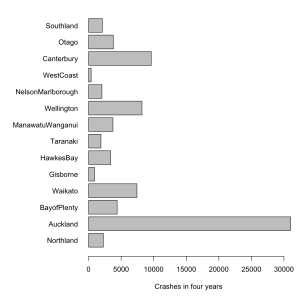
They don’t say how they are defining “Auckland”, but since the comparisons are with Canterbury and Wellington, it looks like the Auckland Region is what they mean. The Auckland region has 1/3 of the country’s population and just over 1/3 of the crashes. Canterbury, with 13% of the population, had 12% of the crashes.
Failing to divide by population size makes it impossible to see any real variations between regions. For example, you would expect more intersection crashes in more urbanised regions and it would be interesting to see how big this effect is. The first graph is what the Herald is telling you, total intersection crashs over five years (with more complete data
from NZTA).
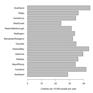
The variation between regions is almost all due to differences in population, and so doesn’t tell us anything we didn’t already know. The second graph is intersection crashes per year, per 10000 population, which might actually be useful.
Even better would be a graph that indicated the uncertainties, but I don’t have time right now.
NZTA, whose press release is responsible for the story, says
The NZ Transport Agency (NZTA) is providing media organisations with background data on intersection crashes in New Zealand to assist with coverage of the implementation of new give way rules which come into force at 5am on Sunday 25 March.
It probably did assist in getting stories into the paper. Unfortunately, the story didn’t emphasize what they wanted, which is that intersection crashes are common. The story tried to do a comparison — as the old journalism rule says, “when you have two numbers, do something with them”. Unfortunately, they divided the wrong two numbers.


