Posts from February 2012 (42)

February 9, 2012

Stats Chat on Radio New Zealand National this morning

A warm welcome to everyone who has come by via Radio New Zealand National after Gavin Ellis talked about Stats Chat on the Nine to Noon show this morning.

Gavin Ellis said it’s something “every journalist and member of the public should look at… it really is worthwhile”. Thanks Gavin!

He mentioned these posts:

Stats being discussed on Media7 tonight

I’m part of a panel discussion on Media7 tonight (TVNZ7, 9:05pm) on the future of public broadcasting.

We discuss an erroneous weekly cumulative audience statistic which originated from the then broadcasting Minister, Jonathan Coleman: why you just can’t take the monthly cumulative audience and divide by four to get the weekly cumulative audience.

February 8, 2012

Breakfast wars

“High carb breakfasts boost brain power”.  Now, why does that sound familiar.. Oh, yes.  Last month it was the Egg Foundation pushing “Eggs may increase alertness”. This time it’s the Glycemic Index Foundation.

As the school year gets under way, new research is adding further weight to evidence that breakfast is the most important meal of the day, especially for children.

Research published last June, so it’s hardly new for the new school year. And the research only studied children who regularly eat breakfast, so it can’t really be evidence that breakfast is the most important meal of the day, or say whether this is more true for children.

Research by three British institutions 

Author names? Journal names? Institution names?  I’ve seen at least five universities in Britain with my own eyes, and am reliably informed there are several more.

has shown a strong link  between low GI, higher carbohydrate breakfasts and better academic  performance.

We can allow “strong link” as mere puffery, but the research did not include any data whatsoever about academic performance

The study, which involved 60 students, found that a low GI,  higher carbohydrate breakfast helped students do maths tasks more  quickly and accurately, and improved attentiveness.

I suppose counting backwards from 100 by 7s just about qualifies as a maths task, even for teenagers, but it’s a bit of a stretch.

The Glycemic Index (GI) is a measure of how effective  carbohydrates – sugars and starches – are on blood glucose levels.

GI is a measure of how fast or slowly carbohydrates affect blood glucose levels.  Wikipedia has it much more clearly Carbohydrates that break down quickly during digestion and release glucose rapidly into the bloodstream have a high GI; carbohydrates that break down more slowly, releasing glucose more gradually into the bloodstream, have a low GI.”

At least, by quoting Dr Alan Barclay, of the Glycemic Index Foundation, the story did make it possible to track down the real research. Dr Barclay’s blog has a link to the paper, which was published in the European Journal of Clinical Nutrition.   Unless you’re at a university, you will have to pay to read it, so I will summarise.

Of the 60 children recruited, 19 had a “High GL, low GI” breakfast. This meant they were in the lower half for GI and the upper half for glycemic load (total carbohydrates), not that their breakfasts were high or low GI on an absolute scale.  There were three other groups, from the three other combinations of high/low GI and  GL.

The children had seven cognitive function tests. Three of the seven didn’t show any differences between the breakfast groups. For the other four tests the results were mixed:

Specifically, high-GI was associated with better immediate recall (short-term memory), high-GL with better matrices performance (inductive reasoning), and low-GI and high-GL with better speed of information processing (vigilance, sustained attention) and serial sevens performance (vigilance, working memory).

And this is before we start worrying about the correlation vs causation issue, the fact that the high-GL,low-GI breakfast averaged more total calories, or the fact that 13 of the 19 teenagers in the high-GL, low-GI group were girls.

Day care wars

There’s a good article in Stuff today on day-care.  The reporters describe the anti-daycare research of Dr Aric Signman being pushed by Family First, but also the reaction of the scientific community to that research.    As usual, no-one links to sources, so as a public service


[Update: The Herald now also has a story, and it is also good.  On the other hand, their bogus poll for today asks “Is daycare harmful for young children?”  They could at least stick to questions where majority opinion would be relevant.]

February 7, 2012

Superbowl statistics

American football games, like many sporting events, start with a coin toss, in this case to decide which team is playing in which direction.   At the last 14 Superbowls, the team from the National Football Conference has won the toss (via).  In a standard test of the hypothesis that the coin was fair, the p-value would be 0.0001.  So, does this mean the NFC is cheating? Well, no.  We have overwhelmingly good reasons to believe that coin tosses are very close to fair, and a mere 1 in 8000 coincidence shouldn’t change our minds.   As Tom Stoppard put it in  Rosencrantz and Guildensten Are Dead: “A spectacular vindication of the principle that each coin, spun individually, is just as likely to come up head as tails, and should cause no surprise each individual time it does.”

The generalization of this principle to studies purporting to find small, but statistically significant, benefits of homeopathy is left as an exercise to the reader.

Inequality graph

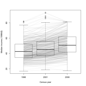
I think this graph is an improvement over the density plot from StatsNZ I showed earlier.  It’s a box plot of median income for all census meshblocks in the Auckland region, in 1996, 2001, and 2006 (except for the ones that were too small to have data released publically). The data are from Stats New Zealand, rescaled to 1996 dollars

It’s clear from this graph that most areas had an increase in median income, but that the increase was larger in wealthier areas.   A few areas went up sharply, then down again, presumably in the dotcom crash.  Some of the larger decreases are probably due to changes in housing mix: two meshblocks in Auckland Central have declined a lot, and I expect that’s due to more small apartments.

It’s also worth noting that the percentage increase in median income is much closer to being constant across meshblocks.  In that sense the increase in inequality is not as bad as in the US, where increases in GDP have almost entirely ended up with the rich.


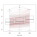
[Update: here’s a version where the areas that decreased from 1996 to 2006 are in a different color.  I don’t know if it helps for seeing the overall pattern.  Given more time and if WordPress took SVG, it would be possible to have mouseover labels for the meshblocks so you could see which is which.]

Drug driving tests

Stuff is reporting on drugged drivers caught since the new laws were introduced in November 2009.  The results show the police are a lot better than I expected at picking people to test:  of 514 who had a compulsory field impairment test,  455 failed, and 429 of those tested positive for one or more illegal drugs.   The drug-driving policies, at least so far, are targeting people who are a real risk (in sharp contrast to workplace drug testing, for example).

Income, taxes, and gaps

Today’s ‘Divided Auckland’ story in the NZ Herald is on taxes, claiming that taxes on the rich are lower and taxes on the poor are higher here than anywhere else in the OECD.  Now, I moved from another OECD member country about eighteen months ago, and while I’m not in the John Key category I would be safely in the upper 20% of household income both here and in the USA.  There is no question that I pay more taxes here — and I’m fine with that.

(more…)

February 5, 2012

Who is really buying New Zealand? And it’s not what they plotted.

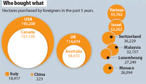
Today’s front page of the Sunday Star Times has a bubble chart showing the amount of hectares purchased by foreigners in the past 5 years:

Sunday Star Times, 5 February 2012, “Who is really buying New Zealand?” A1

While bubble charts are a trendy way to present data, it is well-known that people find it hard to judge areas and even more so when the circles are not concentric (their centres don’t coincide) or when the shapes overlap as in the Sunday Star Times’ chart.

However, there’s more problems with this graph. The bubble sizes just don’t match the data.

Compare USA with Canada – the area bought by Canadians was about 81% of the amount brought by Americans but the area in their chart is only about 58%.

It should have looked like this:

Compare China with Italy and you definitely know something has gone wrong in the calculations.

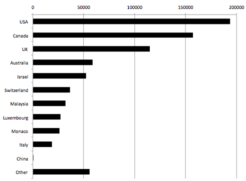
A better way to compare is via a bar chart: not quite as sexy looking but much easier to make comparisons:

Explaining risks

Stuff has an article on home birth, including statistics from the Oz & NZ obstetricians (whose policy is uniform disapproval, in contrast to British obstetricians) showing that home birth is more dangerous for the infant.

Getting a good idea of the risks is not easy:  you don’t want to compare births that end up at home with those that end up in the hospital, since some births at home were planned to be in the hospital, until something went wrong, and some hospital births were planned to be at home, until something went wrong.   You also can’t just compare births where nothing went wrong, since that misses the whole point of risk estimation.  The statistics compare women who planned to give birth at home with those who planned to give birth in the hospital (but didn’t have any special risks that would have prevented a home birth).  That’s the closest you can get to a fair comparison, though it’s obviously not perfect.    In general, people who tend to do what their doctors want also tend to be healthier — even if what their doctors are telling them isn’t actually helpful — and we know that obstetricians want women to give birth in hospital.  You could also think of biases in the other direction if you spend a few minutes on it.

However, if the numbers are more or less correct, there’s still the question of how to present them.  The obstetricians say the rate of neonatal death was almost three times higher for the women in the studies who planned to have a home birth.  The article in Stuff points out that this is 0.15% vs 0.04%, so the absolute risk is small.  A better way to present numbers like this is in terms of deaths per 10,000 births. Although the information is the same, there’s a surprisingly large amount of evidence that people understand counts better than proportions, especially small proportions.  So: 10,000 pregnant women similar to those in the studies would have about 15 neonatal deaths if they all planned a home birth and about 4 neonatal deaths if they all planned a hospital birth. For context, 10,000 births is all Auckland births for about five months, or all Wellington births for about 18 months.
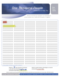
It’s even better to present this sort of information in visual form, using something like the Paling Palettes from the Risk Communication Institute.  These allow you to see both absolute and relative risks easily.  The example on the left is from their website, and is a pregnancy-related example.  On the background of 1000 people are two colored risks. The red is the risk of miscarriage from amniocentesis; the green is the risk of Down Syndrome in a child of a 39-year-old woman.

[Updated to add:  of course, you should do the same thing with the various reduced risks for the mothers — the 10,000 planned home births would also prevent nearly 1500 cases of vaginal laceration, about 130 of them serious (3rd degree)]